Read the statement by Michael Teeuw here.
Apple Calendar integration
-
@brentmatthews
So… what you expected and what you got really that looked hideous? -
@MMRIZE I’m not sure I understand your comment.
The calendars work well and have many different uses for my family. What part of it looks hideous to you? Certainly welcome to take on board any thoughts as this is my first MM setup.
-
@brentmatthews
Ah sorry. It was not about you. I had confusing @srobison62 and you.
-
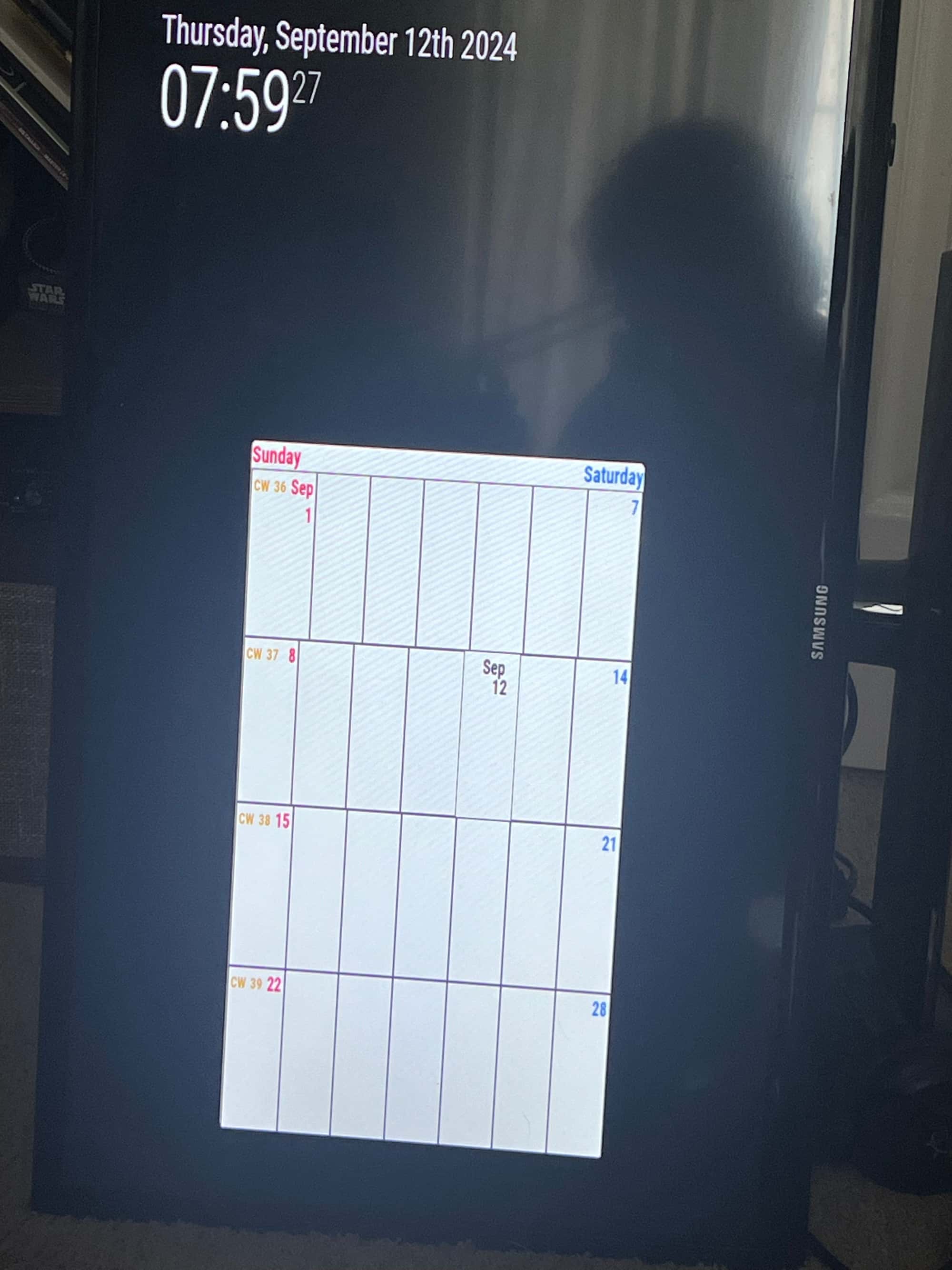
Its definitely not working how i want but here’s what I have now:

Its also not bringing in my calendar details for some reason.What I am looking for is something to replace our Kitchen calendar.
so basically 90% of the screen would be our family apple calendar and then at the top would be the date and time on one side and maybe weather on the other. -
@MMRIZE haha all good. Any feedback still welcome. :)
-
-
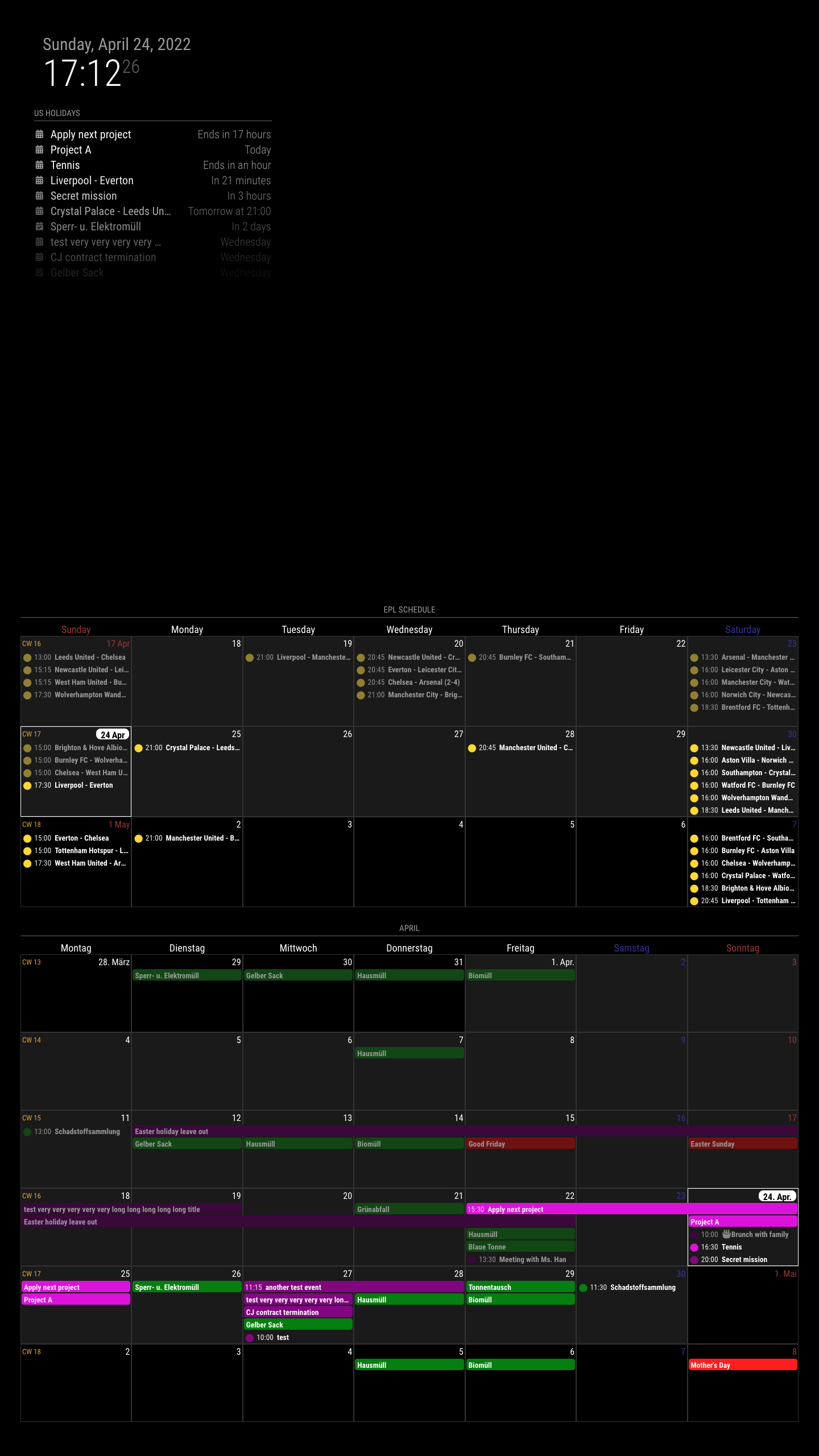
XXX_centeris not a good place to use CX3 module.centerposition too narrow and doesn’t have a fixed width because it is decided byleftandrightwidth by calculation. Especially in the vertical screen? Terrible. You may have only around 1000px(considering the gap of margin) width of the vertical screen, and that number should be shared with another region,leftandright. Usually, a pretty side region would have over 300px, so yourcenterregion will have only 300~400px. It is not enough for 7 days cells of the calendar.
I recommendbottom_bar. -
The CX3 module doesn’t handle ICS data directly. You may need the default calendar module as a calendar events provider. You also need to set the `broadcastEvents’- related properties properly.
-
It seems you already did CSS modification; it’s your taste. I’ll not mention about it. Anyway, I cannot agree that the default CSS would be awful at all.

-
-
@MMRIZE Ok yea that position looks way better. Is there a way to make it taller?
Right now its only taking up about 60% of the screen and itsgot alot of space on the sides -
Is there a way to make it taller?
It depends on how big the font size is and how many events will be shown in one cell.
These properties are related to that.

Of course you can adjust more details with CSS overriding.
-
@srobison62 said in Apple Calendar integration:
Right now its only taking up about 60% of the screen and itsgot alot of space on the sides
How is your current
config.jsandcustom.css?
To make things simple; disable all other modules(of course, except the default calendar module) then focus on this module alone, then adjust things. -
S sdetweil has marked this topic as solved on
