Read the statement by Michael Teeuw here.
MMM-CalendarExt
-
@Vauxdvihl said in MMM-CalendarExt:
1.)
Can you please share your config for the 2nd above standing screen (with the “current” and the “upcoming” one) as an example?config: { system: { show: ['upcoming', 'current'], //you can select views which you want to show. }, views: { upcoming: { position: "top_left", title: "UPCOMING EVENTS", limit: 5, }, current: { position: "top_left", title: "CURRENT EVENTS", limit: 5, } }, calendars: [ { name: "US Holiday", url: "webcal://www.calendarlabs.com/templates/ical/US-Holidays.ics", } ], }For more detailed configuration, See https://github.com/eouia/MMM-CalendarExt/wiki/Configuration
2.)
Is it possible to load an ical file from the storage?You can put your ical to MagicMirror root directory and use it as
http://localhost:8080/yourIcal.ics. I think it could be, but i didn’t try. After some test, I could tell you more exact information. -
@Vauxdvihl
You can use like this;- put your ical file (
test.ics) to MMM-CalendarExt directory - Use this url.
http://localhost:8080/modules/MMM-CalendarExt/test.ics
It works.
- put your ical file (
-
Thanks a lot
Both worksI have a few more questions
3.)
Having the month view, it displays me 6 weeks (2 old ones)
Is there a “screw” where i can change it
Display “only” 4 weeks and no “old” one4.)
Can i overrite dates and make them to “complete day meetings” (like in your example “Hausmüll”)
Here in me ical is it a entry from 10 to 11 and in the view “upcoming” there is an entry in the calendar which is viewn as [object Object] ==> Also i want to save some space with a complete date entry5.)
Is there a possibility instead of using symbols to use names?
Like “Mama” or “Papa”…Thanks a lot
-
3.)
Having the month view, it displays me 6 weeks (2 old ones)
Is there a “screw” where i can change it
Display “only” 4 weeks and no “old” oneWhat did you mean ‘screw’?
Anyway month view cannot be done for that.
But you can use ‘daily’ view for that purpose.(with ‘counts:28’) However some css adjusting might be needed for your mirror’s look.4.)
Can i overrite dates and make them to “complete day meetings” (like in your example “Hausmüll”)
Here in me ical is it a entry from 10 to 11 and in the view “upcoming” there is an entry in the calendar which is viewn as [object Object] ==> Also i want to save some space with a complete date entryCan you send me your ical file? I need to inspect.
For fulldayevents, you should have created that events as fullday. Or you could modify event time from 00:00-24:00
For saving space, see the wiki page. And some css technics would be help.5.)
Is there a possibility instead of using symbols to use names?
Like “Mama” or “Papa”…Well, I think you can prepend or append some text in specific style with css virtual selector(‘:before’).
Sorry for my non-pragmatic answers.
I’m not in front of device now, so I cannot make any real solution with real code. During weekends, I have no time for console works. I’ll check your questions again on Monday. -
3.)
With a “screw” i mean something to adjust…no problem ok4.)
Here u are…
Seems to me i do not have the right to upload here something
Here is some extract…
STATUS:CONFIRMED
END:VEVENT
BEGIN:VEVENT
DTSTART:20170201T080000Z
DTEND:20170201T090000Z
LOCATION;LANGUAGE=de:, 82343 POECKING
TRANSP:OPAQUE
SEQUENCE:0
UID: 2171943
DTSTAMP:20171014T081346Z
DESCRIPTION;LANGUAGE=de:
SUMMARY;LANGUAGE=de:Restmuelltonne
PRIORITY:9
CLASS:PUBLIC
URL:
STATUS:CONFIRMED
END:VEVENT
BEGIN:VEVENT
DTSTART:20170215T080000Z
DTEND:20170215T090000Z
LOCATION;LANGUAGE=de:, 82343 POECKING
TRANSP:OPAQUE
SEQUENCE:0
UID: 2171944
DTSTAMP:20171014T081346Z
DESCRIPTION;LANGUAGE=de:
SUMMARY;LANGUAGE=de:Restmuelltonne
PRIORITY:9
CLASS:PUBLIC
URL:5.)
Ok,
i will play a little bitThanks
-
Thank you for a great module! I second @Vauxdvihl about only wanting see the the current week, plus the next 3. Google calendar has that feature. Basically, a clone of the month view, but not starting from the 1st of the month, but from the first day of the current week.
I tried doing what you suggested with using daily and 28 and it’s close to what I want. But I am only seeing 6 per row. What do I need to modify to make sure I am seeing 7 days?
Also, is there a way to completely remove the icon and the space for it? I don’t see it in any on the defined styles. I would prefer to have a little more extra breathing room on my fairly narrow monitor.
Again, thanks for a great module!
-
@Zooooooom I’ll provide some tricks for ‘next 28 days(7 per week) view’ on Monday. It needs some css tricks.
Your other question also could be considered at that time.
Thanks for using. -
@Zooooooom @Vauxdvihl
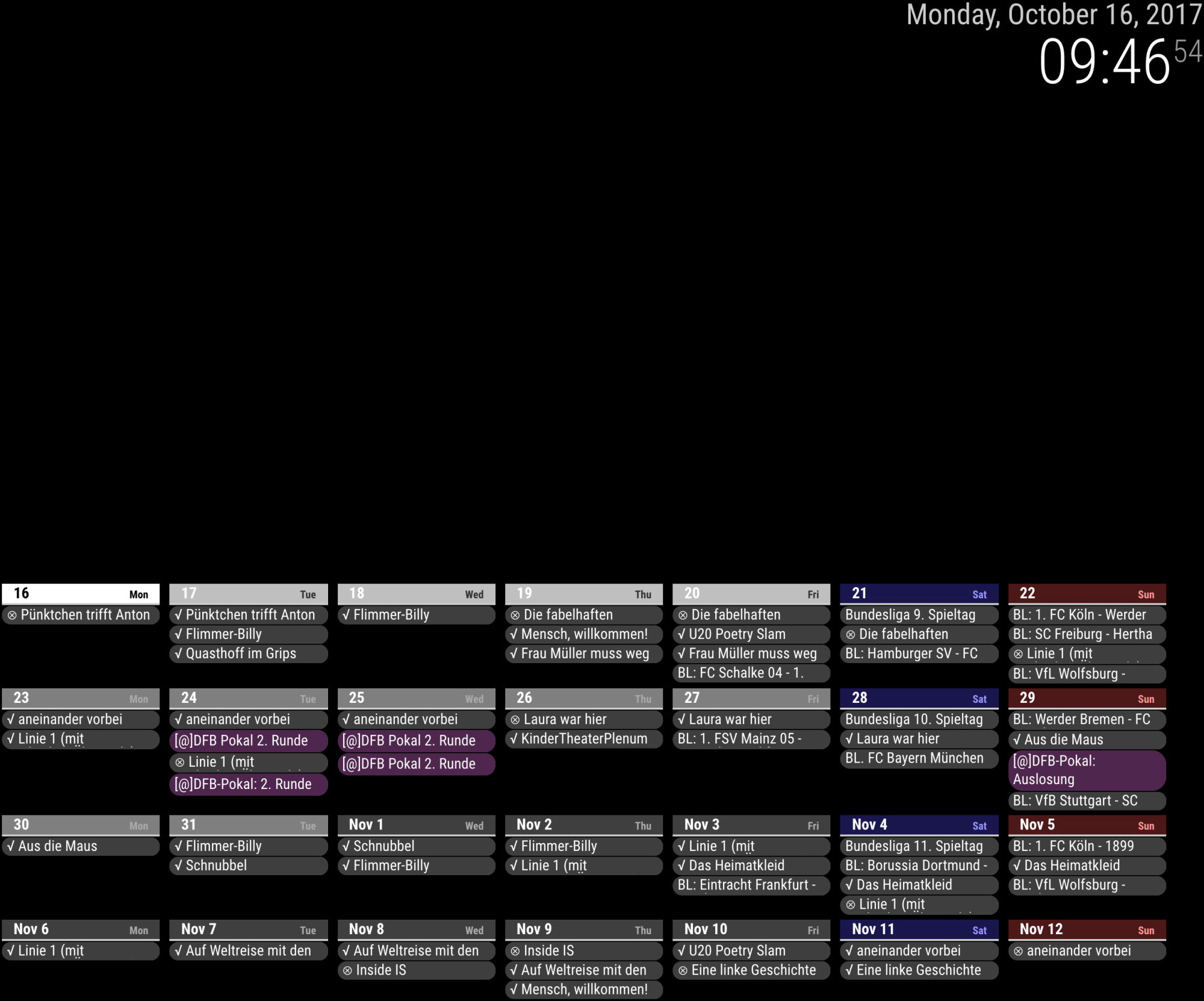
Here is some ‘next 28 days view’ sample.

- Open your css/custom.css and append these code;
/* CSS adjusting for 28days view */ /* hide unnecessary components */ #CALEXT_daily .eventTime, #CALEXT_daily .eventLocation, #CALEXT_daily .symbol { display:none; } /* smaller size for events */ #CALEXT_daily .eventContent { font-size:0.8em; font-weight:normal; } /* makes "slot" 1/7 of 100% */ #CALEXT_daily .slot { max-width:13%; flex-basis:13%; } /* smaller size for events */ #CALEXT_daily .slot .header { font-size:0.5em; border-radius:0; font-weight:normal; } /* add some style sample */ #CALEXT_daily .style_custom2 { background-color:rgba(255, 127, 255, 1.0); } /* add some additional content sample */ #CALEXT_daily .style_custom2 .eventContent::before{ content: "[@]"; }- open your config.js, put these codes.
{ module: 'MMM-CalendarExt', position: "top_center", // ignore this. config: { system: { show: ['daily'], locale: 'en', }, views: { daily: { position:'bottom_bar', counts:28, //overflowRolling:1, //overflowHeight:50, }, }, calendars :[ { name: "bundesliga", styleName: "style_custom1", oneLineEvent: 1, url: "webcal://www.google.com/calendar/ical/en5624jps9pfbtgsd7op2him0k%40group.calendar.google.com/public/basic.ics", }, { name: "DFB POKAL", styleName: "style_custom2", //oneLineEvent: 1, url: "webcal://www.google.com/calendar/ical/0efdnrqt4c9qruabf7u33742ps%40group.calendar.google.com/public/basic.ics", }, { name: "Theater GRIPS", styleName: "style_custom3", oneLineEvent: 1, url: "http://ical.grips-theater.de/grips.ics", } ], } },-
You can refer also https://github.com/eouia/MMM-CalendarExt/wiki/Manipulation-of-looks
-
Main trick is
/* makes "slot" 1/7 of 100% */
#CALEXT_daily .slot {
  max-width:13%;
  flex-basis:13%;
}
You might need to adjust the value
13%to your circumstances. Because of margin and padding,14%might not work.- You can also consider
overflowandoneLineEventandtitleReplacefor saving spaces.
Anyway, under 700px width, this could not work. That is too narrow to display 7 slots.
-
@Vauxdvihl said in MMM-CalendarExt:
BEGIN:VEVENT
DTSTART:20170201T080000Z
DTEND:20170201T090000Z
LOCATION;LANGUAGE=de:, 82343 POECKING
TRANSP:OPAQUE
SEQUENCE:0
UID: 2171943
DTSTAMP:20171014T081346Z
DESCRIPTION;LANGUAGE=de:
SUMMARY;LANGUAGE=de:Restmuelltonne
PRIORITY:9
CLASS:PUBLIC
URL:
STATUS:CONFIRMED
END:VEVENTI found what’s wrong. you ical location format is slightly different with others.
I’ve committed hotfix for that.git pullagain and re-run your mirror. -
And I also added
weeksview for your exact wish. pull new source and see the wiki.So, you have two options.
28days view
vs
4weeks view.both are slightly different. 28days always starts from today. 4weeks always starts from weekday(0) - Monday or Sunday - of this week.
Use anything you want. -
@Sean Beautiful! Exactly what I wanted.
-
Great Job
Thanks a lot -
Hi Sean,
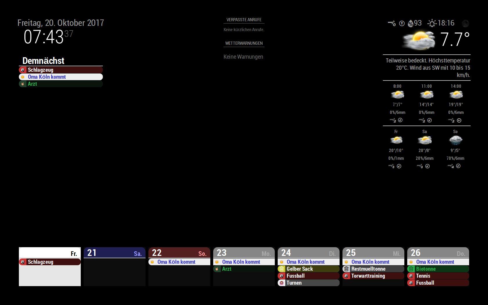
i have a few more questionsPlease look to my attached screen:
a.)
Today is “not viewable” because it is “more or less” complete white
Any Ideab.)
Is there a chance to increase the size of the symbols (i mean the symbols in front of the date…like the football)c.)
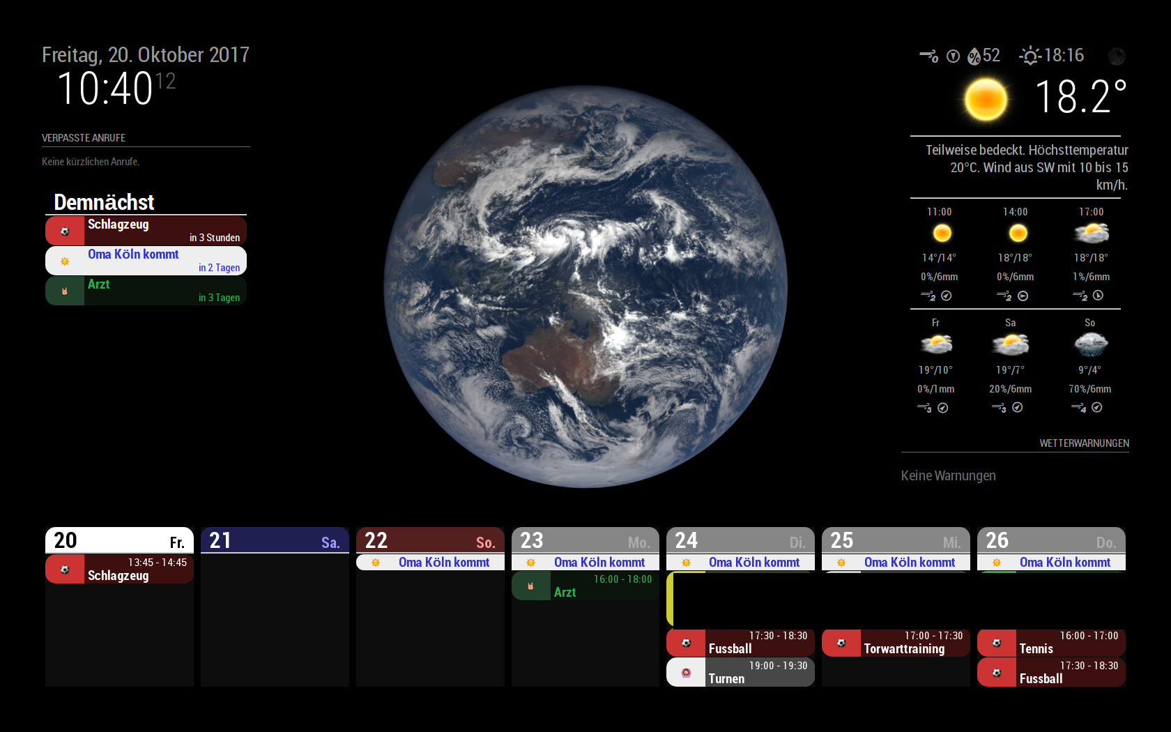
I was wondering that your dates a looking a little bit different
In your dates you have the information about the timing and the location.
I have put the same infos in my google calendar but they will not be shownThats a lot

-
a.)
Today is “not viewable” because it is “more or less” complete white
Any IdeaThat is my fault. After some CSS test, my experimental CSS was committed by accident, I thought.
I’ll fix it ASAP.(after answer of this)b.)
Is there a chance to increase the size of the symbols (i mean the symbols in front of the date…like the football)in your css/custom.css
you can put these;div.CALEXT .event .symbol { order:1; display:block; flex-basis: 30px; // Modify this text-align:center; min-width: 30px; // Modify this font-size: 150%; // Add this }c.)
I was wondering that your dates a looking a little bit different
In your dates you have the information about the timing and the location.
I have put the same infos in my google calendar but they will not be shownThats a lot
This is also same with answer of a). Sorry again.
-
@Vauxdvihl
I think I’ve fixed it. pull the source and try again. -
Amazing
Thanks a lot -
Hi Sean,
according to b.)
Sorry to asked again.
While playing a little bit with the config parameters, i can “only” adjust the size of the area within the symbol is located.
But it doesn’t change the size of the symbol itself
Thanks a lot -
@Vauxdvihl
Did you add this?font-size: 150%; // Add thisGive bigger value for that.(And you need to change value of
*-widthfor adjusting) -
@Sean
I am not a programmer :-)
I have played a little bit…also with big values, but the symbol size does not change.
Maybe i am doing something wrong?/***************************************************** * Magic Mirror * * Custom CSS * * * * By Michael Teeuw http://michaelteeuw.nl * * MIT Licensed. * * * * Add any custom CSS below. * * Changes to this files will be ignored by GIT. * *****************************************************/ div.CALEXT .event .symbol { order:1; display:block; flex-basis: 40px; // Modify this text-align:center; min-width: 50px; // Modify this font-size: 800%; // Add this }
-
@Vauxdvihl
Ok. I know what’s the problem. I’ve forgotten emoji belongs different section.
put this in your css.div.CALEXT .events .symbol.emoji { font-size: 100%; //Adjust this as your wish. you can use px or % }
Hello! It looks like you're interested in this conversation, but you don't have an account yet.
Getting fed up of having to scroll through the same posts each visit? When you register for an account, you'll always come back to exactly where you were before, and choose to be notified of new replies (either via email, or push notification). You'll also be able to save bookmarks and upvote posts to show your appreciation to other community members.
With your input, this post could be even better 💗
Register Login