Read the statement by Michael Teeuw here.
Messed up CSS between Portrait and Landscape monitors
-
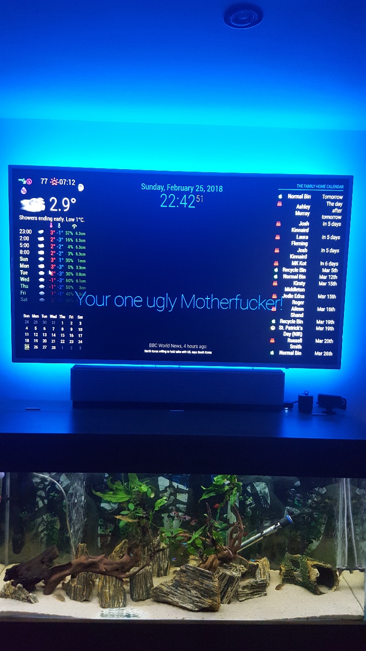
Thanks for the input guys, I have managed to reduce the news feed, which now looks more in keeping with screen size, but I cannot make compliments any slimmer - more central and not spreading over my weather and calendars?
I have just removed simple logo as that was just impossible to place anywhere.
The weather, calendar monthly, on left, and home calendar on right, goes weird with any alteration to font sizing, half of calendar goes off screen to right, and weather icons drop from grouping, meaning the temp now goes under the cloud instead of being close together.
I understand what you mean by having more flexibility when using in portrait, but I would have thought that there was some way of reducing say the weather sizing as a whole, same as calendars? By shrinking the zone/padding or whatever constraints they work under?
Portrait seems really easy and straight forward, but surely there must be another set of rules for landscape users of calendar and wunderground?
I wanted to sort all this out perfect before I started on MMM. Lucy, so I can fit the image in there somehow, but looks like I have my work cut out to re-arrange and minimise what I have now, first.
Edit. Even if there was a way to shrink Compliments, for now that would be acceptable until I get more time to play around trying to shrink wunderground, calendar monthly, and my family calendar. It just takes up whole width of screen and looks horrible 😯
-

-
@Damian Does this work?
.module.compliments { font-size: 73%; } -
Unfortunatley not ☹
I am now at a loss as to what to try now as this is first time trying MM on Landscape, and I am not liking it at all because I am unsure how to minimise the modules… a simple Zoom out would be perfect as my screen looks like its 100% zoomed in.😣 -
@Damian Use the built-in DOM inspector to see what styles are currently applied. Right-click on the compliments module and select “Inspect”.
Worst case, using
!importantshould work:.module.compliments { font-size: 73% !important; } -
Nope, that never worked either😣
I cannot fathom out what is going on, even when I first loaded up the default MM it all looked too big. Thats why I then added in my config.js and CSS stuff from my Pi foders to see if they would help minimise things any.
-
@Damian Inspect the element, and share a screenshot of the
div.module.complimentselement styles. At this point, either (1) your CSS is not being applied, or (2) those aren’t the right classes to use to target that element. I suspect the latter. -
Thanks, but do I download something onto the Pc to view? How do i inspect the element? There is nothing on that page to download, so how does the Dom inspector work?
-
@Damian You don’t need to download anything. Use your mouse on the MagicMirror. Right-click the compliments module, and select “Inspect element”. Or, stop MM, then run
npm start devwhich will start in development mode with Chromium’s developer tools already open. You then just need to navigate the DOM to find the.complimentselement. Follow these instructions to take a screenshot on an RPi. -
😂… by pure fluke I just found the very setting I was looking for, and never even knew it was there, or even noticed it until now when instead of my usual > alt > File > Exit… or >Window > Minimise, my mouse flicked on View, and there right in front of me was Zoom In - Zoom Out!
Only trouble is if I restart/reload MM it reverts back, and I have to zoom out again x 6 so it looks good… anyone know how to set it so it stays at my set zoom?
Thanks to all who assisted here to try and solve this… I will now sneak off in embarrasment😶
