Read the statement by Michael Teeuw here.
MMM-cryptocurrency side by side top bar
-
Currently, the currencies are displaying vertically with lots of padding. How can I alter the css to have them displaying side by side in the top bar?
This is what it currently looks like.

And this is what I would like it to look like

Any help is greatly appreciated!
-
Update: I have taken the cowards way out and trimmed the currencies and duplicated the modules config into different regions of the config.js like top_left, top_center, and top_right. This has solved the issue.
-
Hi @StacheEnthusiast, in
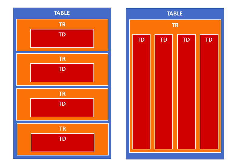
getDom()atMMM-cryptocurrency.js:164it creates the layout for the module in atable. It loops through, and for each currency creates atr(table row) andtd(table cell).It looks a bit like this:

So I think if you take the
trcreation outside of the loop, it should work:getDom: function() { if (this.config.displayType == 'logo' || this.config.displayType == 'logoWithChanges') { this.folder = (this.config.coloredLogos ? 'colored/' : 'black-white/') return this.buildIconView(this.result, this.config.displayType) } var data = this.result var wrapper = document.createElement('table') wrapper.className = 'small mmm-cryptocurrency' var tableHeader = document.createElement('tr') tableHeader.className = 'header-row' var tableHeaderValues = [ this.translate('CURRENCY'), this.translate('PRICE') ] if (this.config.headers.indexOf('change1h') > -1) { tableHeaderValues.push(this.translate('CHANGE') + ' (1h)') } if (this.config.headers.indexOf('change24h') > -1) { tableHeaderValues.push(this.translate('CHANGE') + ' (24h)') } if (this.config.headers.indexOf('change7d') > -1) { tableHeaderValues.push(this.translate('CHANGE') + ' (7d)') } for (var i = 0; i < tableHeaderValues.length; i++) { var tableHeadSetup = document.createElement('th') tableHeadSetup.innerHTML = tableHeaderValues[i] tableHeader.appendChild(tableHeadSetup) } wrapper.appendChild(tableHeader) var trWrapper = document.createElement('tr') // moved from below trWrapper.className = 'currency' // moved from below for (i = 0; i < data.length; i++) { var currentCurrency = data[i] // var trWrapper = document.createElement('tr') // trWrapper.className = 'currency' var name if (this.config.displayLongNames) { name = currentCurrency.name } else { name = currentCurrency.symbol } var tdValues = [ name, currentCurrency.price, ] if (this.config.headers.indexOf('change1h') > -1) { tdValues.push(currentCurrency.percent_change_1h + '%') } if (this.config.headers.indexOf('change24h') > -1) { tdValues.push(currentCurrency.percent_change_24h + '%') } if (this.config.headers.indexOf('change7d') > -1) { tdValues.push(currentCurrency.percent_change_7d + '%') } for (var j = 0; j < tdValues.length; j++) { var tdWrapper = document.createElement('td') var currValue = tdValues[j] // If I am showing value then set color if (currValue.includes('%')) { tdWrapper.style.color = this.colorizeChange(currValue.slice(0,-1)) } tdWrapper.innerHTML = currValue trWrapper.appendChild(tdWrapper) } // wrapper.appendChild(trWrapper) } wrapper.appendChild(trWrapper) // moved from above return wrapper },I’ve not run this code, as I don’t use
MMM-cryptocurrency, but I think it should work. Just be careful when modifying yourMMM-cryptocurrency.jsto only replace thegetDom()function. I also don’t think this should break any of the module’s functionality or styling.Worst case, you can always use
git checkout MMM-cryptocurrency.jsto revert to the original version. -
@ninjabreadman
Wow, terrific answer and thank you. I will give this a shot and post what I come up with. My attempt at setting the tr widths from custom.css was getting no where. -
@StacheEnthusiast You’re right. Tables don’t take styling very well; table rows (
tr) insist on taking their own line, so there’s no easy way to move them beside each other. The proposed solution above should circumvent this, putting all the cells (td) into a single row.
Hello! It looks like you're interested in this conversation, but you don't have an account yet.
Getting fed up of having to scroll through the same posts each visit? When you register for an account, you'll always come back to exactly where you were before, and choose to be notified of new replies (either via email, or push notification). You'll also be able to save bookmarks and upvote posts to show your appreciation to other community members.
With your input, this post could be even better 💗
Register Login