Read the statement by Michael Teeuw here.
How can elements in the default weather module be moved
-
I am trying t get things lined up but I don’t know enough to get this looking good and would really appreciate some help. In the default Weather module I have made some changes to hide the wind info and move the Feels Like temp into the same area as the icon and temperature. I changed the icons to a set of svg images in a custom css. In the custom css I added the following to change the size of the weather icon size:
.weather .weathericon {
	width: 2.75em !important;
	height: 2.75em !important;}
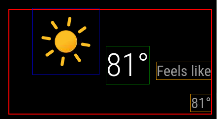
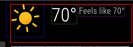
Currently I have:

And would like to get to:

Following is my current.njk
{% macro humidity() %} {% if current.humidity %} <span class="humidity"><span>{{ current.humidity | decimalSymbol }}</span><sup> <i class="wi wi-humidity humidity-icon"></i></sup></span> {% endif %} {% endmacro %} {% if current %} {% if not config.onlyTemp %} <div class="normal medium"> {# Start of config setting I added #} {% if config.showWindInfo %} <span class="wi wi-strong-wind dimmed"></span> <span> {{ current.windSpeed | unit("wind") | round }} {% if config.showWindDirection %} <sup> {% if config.showWindDirectionAsArrow %} <i class="fas fa-long-arrow-alt-down" style="transform:rotate({{ current.windFromDirection }}deg)"></i> {% else %} {{ current.cardinalWindDirection() | translate }} {% endif %} </sup> {% endif %} </span> {% endif %} {# End of config setting I added #} {% if config.showHumidity === "wind" %} {{ humidity() }} {% endif %} {% if config.showSun %} <span class="wi dimmed wi-{{ current.nextSunAction() }}"></span> <span> {% if current.nextSunAction() === "sunset" %} {{ current.sunset | formatTime }} {% else %} {{ current.sunrise | formatTime }} {% endif %} </span> {% endif %} {% if config.showUVIndex %} <td class="align-right bright uv-index"> <div class="wi dimmed wi-hot"></div> {{ current.uv_index }} </td> {% endif %} </div> {% endif %} <div class="large"> {% if config.showIndoorTemperature and indoor.temperature or config.showIndoorHumidity and indoor.humidity %} <span class="medium fas fa-home"></span> <span style="display: inline-block"> {% if config.showIndoorTemperature and indoor.temperature %} <sup class="small" style="position: relative; display: block; text-align: left;"> <span> {{ indoor.temperature | roundValue | unit("temperature") | decimalSymbol }} </span> </sup> {% endif %} {% if config.showIndoorHumidity and indoor.humidity %} <sub class="small" style="position: relative; display: block; text-align: left;"> <span> {{ indoor.humidity | roundValue | unit("humidity") | decimalSymbol }} </span> </sub> {% endif %} </span> {% endif %} <span class="light wi weathericon wi-{{ current.weatherType }}"></span> <span class="light bright">{{ current.temperature | roundValue | unit("temperature") | decimalSymbol }}</span> {# Start of changes I made #} {% if (config.showFeelsLike) and not config.onlyTemp %} <span class="normal medium feelslike"> <span class="dimmed"> {{ "FEELS" | translate({DEGREE: current.feelsLike() | roundValue | unit("temperature") | decimalSymbol }) }} </span> </span> {% endif %} {# End of changes I made #} {% if config.showHumidity === "temp" %} <span class="medium bright">{{ humidity() }}</span> {% endif %} </div> {# {% if (config.showFeelsLike or config.showPrecipitationAmount or config.showPrecipitationProbability) and not config.onlyTemp %} #} {% if (config.showPrecipitationAmount or config.showPrecipitationProbability) and not config.onlyTemp %} <div class="normal medium feelslike"> {% if config.showFeelsLike %} <span class="dimmed"> {% if config.showHumidity === "feelslike" %} {{ humidity() }} {% endif %} {#{{ "FEELS" | translate({DEGREE: current.feelsLike() | roundValue | unit("temperature") | decimalSymbol }) }}#} </span> <br /> {% endif %} {% if config.showPrecipitationAmount and current.precipitationAmount %} <span class="dimmed"> <span class="precipitationLeadText">{{ "PRECIP_AMOUNT" | translate }}</span> {{ current.precipitationAmount | unit("precip", current.precipitationUnits) }} </span> <br /> {% endif %} {% if config.showPrecipitationProbability and current.precipitationProbability %} <span class="dimmed"> <span class="precipitationLeadText">{{ "PRECIP_POP" | translate }}</span> {{ current.precipitationProbability }}% </span> {% endif %} </div> {% endif %} {% if config.showHumidity === "below" %} <span class="medium dimmed">{{ humidity() }}</span> {% endif %} {% else %} <div class="dimmed light small">{{ "LOADING" | translate }}</div> {% endif %} <!-- Uncomment the line below to see the contents of the `current` object. --> <!-- <div style="word-wrap:break-word" class="xsmall dimmed">{{current | dump}}</div> -->Thank you for taking a look at this.
-
@DDE12 can you use the developer window to get the generated html? With the class assignments
See the second link in my signature below
-
@sdetweil
Thank you for helping me.<div id="module_3_weather" class="module weather" style="transition: opacity 1.5s ease 0s; position: static; opacity: 1;"> <header class="module-header" style="display: none;"></header> <div class="module-content"> <div> <div class="normal medium"> </div> <div class="large"> <span class="light wi weathericon wi-day-sunny"> ::before </span> <span class="light bright">81°</span> <span class="normal medium feelslike"> <span class="dimmed"> Feels like 81° </span> </span> </div> <!-- Uncomment the line below to see the contents of the `current` object. --> <!-- <div style="word-wrap:break-word" class="xsmall dimmed">{"date":"2024-10-06T16:11:01.142Z","windSpeed":5.81,"windFromDirection":237,"sunrise":"2024-10-06T11:39:13.000Z","sunset":"2024-10-06T23:11:13.000Z","temperature":26.76,"minTemperature":null,"maxTemperature":null,"weatherType":"day-sunny","humidity":0.45,"precipitationAmount":null,"precipitationUnits":null,"precipitationProbability":null,"feelsLikeTemp":null}</div> --> </div></div></div> -
@DDE12 that ::before is what makes the first elevated
Then you have
the temp 81
And feels like in different spans w different stylesI dont know how to override the before (yet)
-
i ‘think’
span.light.wi.weathericon.wi-day-sunny {}
note no spacesbecause css doesn’t support widcard(*)
you will have to make separate lines for each possible weather icon
then on the others, you will have to make the styles produce the same results
-
@DDE12 and if you need to style the icon more, then settings inside the {}
-
@sdetweil
In tinkering around, I am able to move it in custom.css with the following and possibly avoid addressing every individual icon..weather .weathericon { display: inline-block; transform: translate(-31px, -32px) !important; outline: 1px solid blue; }The problem with what I have above is that it will only make it look okay on one screen resolution. How do I move it to the top left of the module space so that it is relative (stays in the top left regardless of screen resolution).
-
@DDE12 you can try
position:relative;
top:0;
left:0;that will put the selected thing top left of its parent
you may have to play w the selector
-
@sdetweil
I’ve made some headway with the temperatures but the icon is not behaving. I think part of the problem is that it is being treated as a font or the original icon that is a font is hanging around causing a problem. It there a way with the CSS to clear all the settings and remove the font setting for the icon container? -
@DDE12 I do not know. this ::before is likely the problem.
-
@sdetweil
I have made some progress. I commented out everything in vendor\node_modules\weathericons\css\weather-icons.css. and changed .weather . larger to flex and have more control of the icon..weather .large { line-height: 1; display: flex; } .weather .weathericon { font-size: unset !important; line-height: unset !important; transform: unset !important; outline: 1px solid blue; width: 2em !important; height: 2em !important; position:relative; top: -18px; left: -15px; } .weather .light.bright { outline: 1px solid green; position:absolute; top: 2px; left: 147px; } .weather .normal.medium.feelslike { outline: 1px solid purple; position:absolute; top: 3px; left: 242px; }
The icons in this set have a lot of background “dead space” so it is skewed up and left to get it to the corner. The height of the module space is being controlled by the height of the icon. How can I decrease the height of the module space by the amount I moved the icon up plus a little extra for the dead space?
-
@DDE12 make the icon 1.5em
then you need to size the div the spans are in
Hello! It looks like you're interested in this conversation, but you don't have an account yet.
Getting fed up of having to scroll through the same posts each visit? When you register for an account, you'll always come back to exactly where you were before, and choose to be notified of new replies (either via email, or push notification). You'll also be able to save bookmarks and upvote posts to show your appreciation to other community members.
With your input, this post could be even better 💗
Register Login