Read the statement by Michael Teeuw here.
Alignmend of modules
-
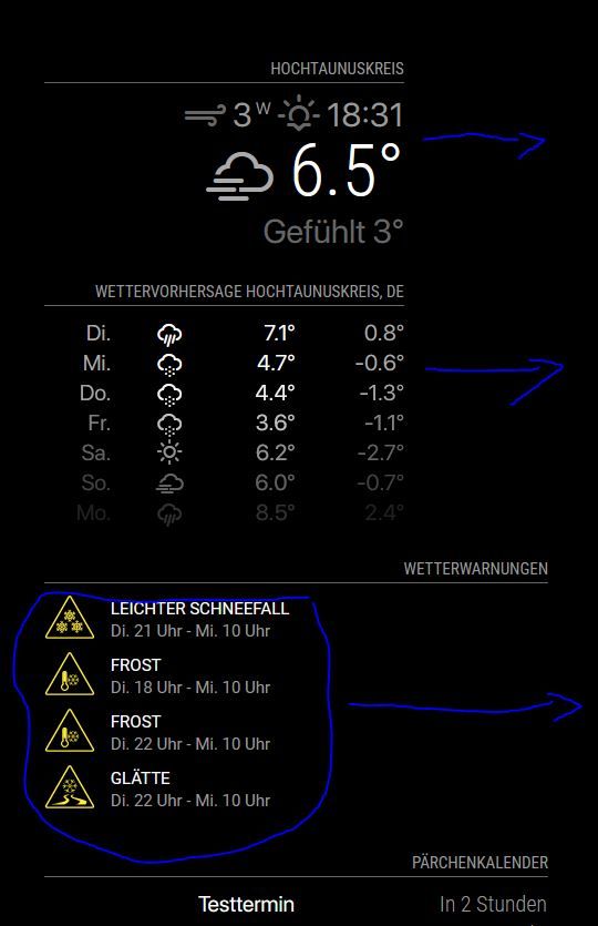
As I have the default calendar plugin, which needs a width of 475px, the upper modules currentweather, weatherforecast and MMM-DWD-WarnWeather are not really right-aligned. As you can see on the screenshot, I would like to keep the module on the right border of the frame. For the DWD-WarnWeather module, the module itself is placed correct, but the content is not right aligned.
What Do I need to do in order to fix that?

-
@codac all these modules have the same position
top_right?For the warnings module you could use
custom.cssand overwrite thetext-align: left;in the module css withtext-align: right;You can also play with css in the browser, e.g. see this thread.
-
@karsten13 correct they are all top_right. Your suggestion worked:
.MMM-DWD-WarnWeather .status {
    font-family: "SFPro";
    text-align: right;
}
Your hint with playing with css in my browser helped to figure out that currentweather and weatherforecast behave like this because of a max-width of 325 that I already had set in the custom.css, as where the calendar has 475px.
-
@codac I think you have to add
.MMM-DWD-WarnWeather .description { text-align: right; } -
I have a similar problem.
I would like to have the yellow icon closer to the right in the module: ‘MMM-DWD-WarnWeather’.

And I would like to get rid of the space on the right in the module: “MMM-DWD-Pollen”.

-
@majorc The question with the MMM-DWD-WarnWeather module I can answer. Was a bit tricky to find out, but what works for me is to set the follwing into the custom.css:
.MMM-DWD-WarnWeather .warning { float: right; } -
@codac said in Alignmend of modules:
.MMM-DWD-WarnWeather .warning {
float: right;
}Thanks, that is a good one!
-
@majorc u could try the same float-right for the pollen module
u may need to look in the developers window, elements tab to see the class used
ctrl-shift-i, select the elements tab, expand the nav tree in the left column to locate the module (top, top-right…)
set the module background to blue, to see the whole thing
and then add styles to the contentsee how to use the elements tab info here
https://forum.magicmirror.builders/topic/14782/make-a-remove-header-space-or-overlap-two-modules/5 -
@sdetweil for MMM-DWD-Pollen you can change the following classes in CSS:
tab-center
pollen-low
pollen-low-medium
pollen-medium
pollen-mediumhigh
pollen-high
pollen-nodata
and just make
text-align: rightThat should do the trick. Float will not work - it pushes everything to the right w/o spacing.
I am still thinking how one can save the space on the right side but I am not an CSS / HTML expert.
-
@carstend said in Alignmend of modules:
but I am not an CSS / HTML expert
me neither… i hate working on the UI
-
@carstend I added the question to the DWD-Pollen thread, but no respond so far.
https://forum.magicmirror.builders/topic/12247/mmm-dwd-pollen/19?_=1616656403635
text-align: rightwill move the text, so it is not centered anymore. But the goal is, to get rid of the space on the right side.
Update:
I now use:.MMM-DWD-Pollen table { margin-left: auto; margin-right: -40px; }Not sure if this is a good way, but it works for me at the moment.
Hello! It looks like you're interested in this conversation, but you don't have an account yet.
Getting fed up of having to scroll through the same posts each visit? When you register for an account, you'll always come back to exactly where you were before, and choose to be notified of new replies (either via email, or push notification). You'll also be able to save bookmarks and upvote posts to show your appreciation to other community members.
With your input, this post could be even better 💗
Register Login