Read the statement by Michael Teeuw here.
Calendar - How to align symbol and text to left
-
Hi @all,
I’m running my MM for a while (now @ v2.16.0), but since the update, the formating for calender seems to has changed.
I run 3 (default) calendars, the upper two with whole width of the column, the third in the left column of two.
I did some adjustments in custom.css for format my calendars.
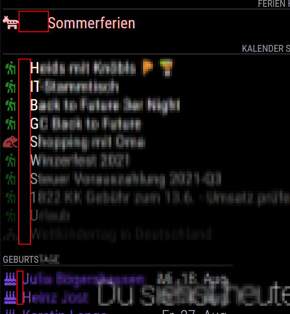
I tried to get the same column with for the symbol col and symbol an title left aligned. But there are some spaces, I do not how to resize them.It now looks like this

But I would like to get the red areas all same width.
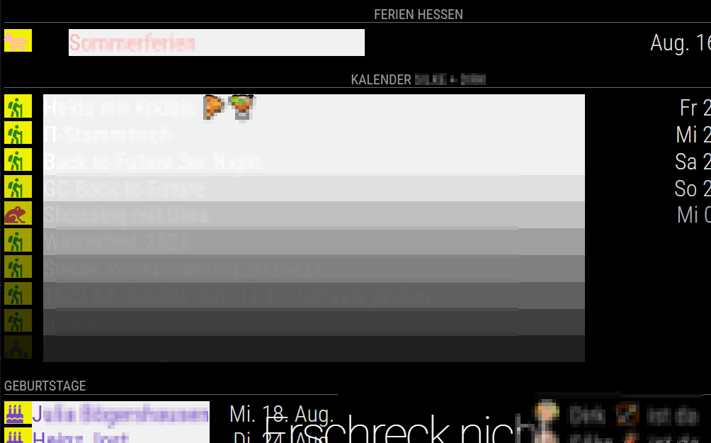
For testing I colored the fields and they show up like this

Why are the title fields of the upper two calendars different?
These are my custom.css entries for calendars
/* Calendar Einträge - Symbol */
.calendar .symbol {
  font-size: 30px;
  text-align: left;
  width: 34px;
}

/* Calendar Einträge - Text */
.calendar .title {
  font-size: 36px;
  text-align: left;
  line-height: 40px;
}

/* Calendar Einträge - Zeitpunkt */
.calendar .time {
  font-size: 36px;
  line-height: 40px;
  color: #dddddd; /* white! */
}
Some advices?
How do I align symbol and title to the left?
Is there a way to get this without custom.css?
What is the correct way to control the size of the fields and the size of the space between?
Hello! It looks like you're interested in this conversation, but you don't have an account yet.
Getting fed up of having to scroll through the same posts each visit? When you register for an account, you'll always come back to exactly where you were before, and choose to be notified of new replies (either via email, or push notification). You'll also be able to save bookmarks and upvote posts to show your appreciation to other community members.
With your input, this post could be even better 💗
Register Login