Read the statement by Michael Teeuw here.
Monthly Calendar View
-
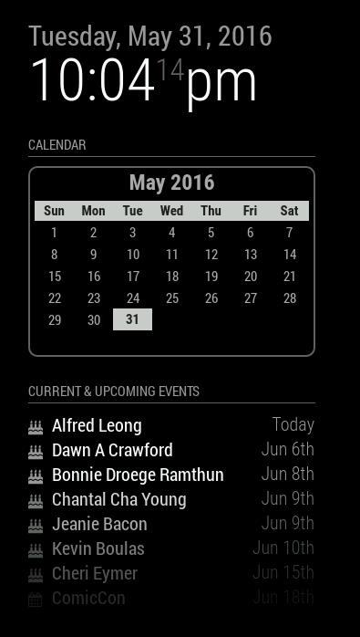
@MichMich, it is, by default, B/W. Users can set a custom CSS to change the colors, like I did as a test.
-
@KirAsh4 Nice work!
-
I can spend days coming up with style ideas, but I think I’m done fiddling with this. It’s time to move on to the next step in the process. I’m cleaning up the branches on GitHub and getting ready to open the flood gates. In the mean time, here’s the 4 styles that I’m including. Note that the ‘slate’ style is really meant for people who have a mirror-less display as the colors probably won’t show very well through a 2-way mirror.
- The calendar is language aware, meaning it will translate to your language setting.
- The calendar will automatically start on either Monday or Sunday depending on your language setting.
- The header (month and year) can be suppressed (not shown) if desired.
- Customization can be done through the custom CSS file
- Current day is highlighted through CSS styling.
- Probably more stuff I forget at the moment … I’ll have it all written out in the README file, including the full styling tree.
-
Could you try a version where the active day is black text on a white background? So a little white square with a black number in it? Preferably with rounded corners. (Radius 1 or 2).
-
Oh I suppose …
Keep in mind that the styling can be changed by the user to whatever they want it to look like. The sky isn’t the limit … it’s their imagination. :)
-
@KirAsh4 I understand. But I think this is the best default style … 😈
-
It won’t be the “default” style, but the config will set it as'default'
. The reason is because the actual'styleDefault.css'
file needs to be clean and not have anything in it other than setting the proper margin, padding, and table/cell views for the calendar and it gets included always. Custom CSS files are pulled in on top of that. That way, the user doesn’t need to set any of that themselves, but rather just over ride what they want with their own styles. So I can have a'styleMichMich'
[*] that I can set as the default style to have today highlighted in a white box.[*] actual name to be determined still …Never mind, went a slightly different route …
-
@KirAsh4 Don’t you just love it when you type loads of useless text online … LOL.
-
I left it all for posterity. :)
-
Ok all, for all intents and purposes, the current state of the monthly view calendar is done. While I do plan on incorporating more features in it, there’s really nothing that is preventing me from releasing it … except maybe a proper name for the module. And the reason I say that is because of the future plans I have. I could easily call it ‘monthlycalendar’, however when I roll in the weekly view as well, that makes the name not accurate anymore. So yeah … bit of a conundrum. Either I will split out the weekly one into a separate module all together, or I will end up naming this ‘that-calendar-thats-not-the-default-but-has-other-features-in-it’ … you get what I’m saying here.
Time to ponder some things I guess …