Getting a 404 on GitHub. Can you check permissions and verify URL please?
Also, what mechanism are you using to poll the printer(s)? Will it work with multiple printers?
Computer Guy into computers, photography, psychology, drones, reading, writing , Raspberry Pi, Oxford Commas, and haiku!
Getting a 404 on GitHub. Can you check permissions and verify URL please?
Also, what mechanism are you using to poll the printer(s)? Will it work with multiple printers?
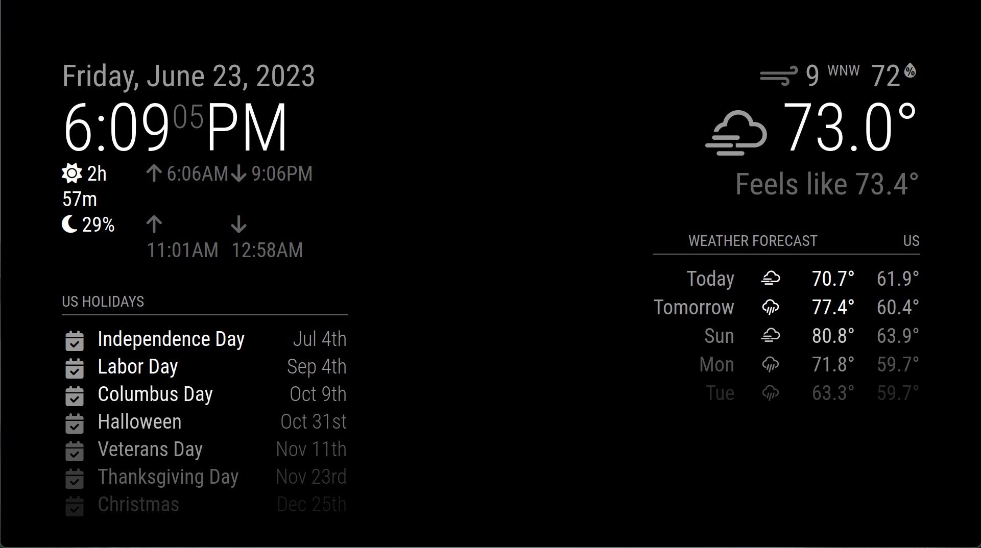
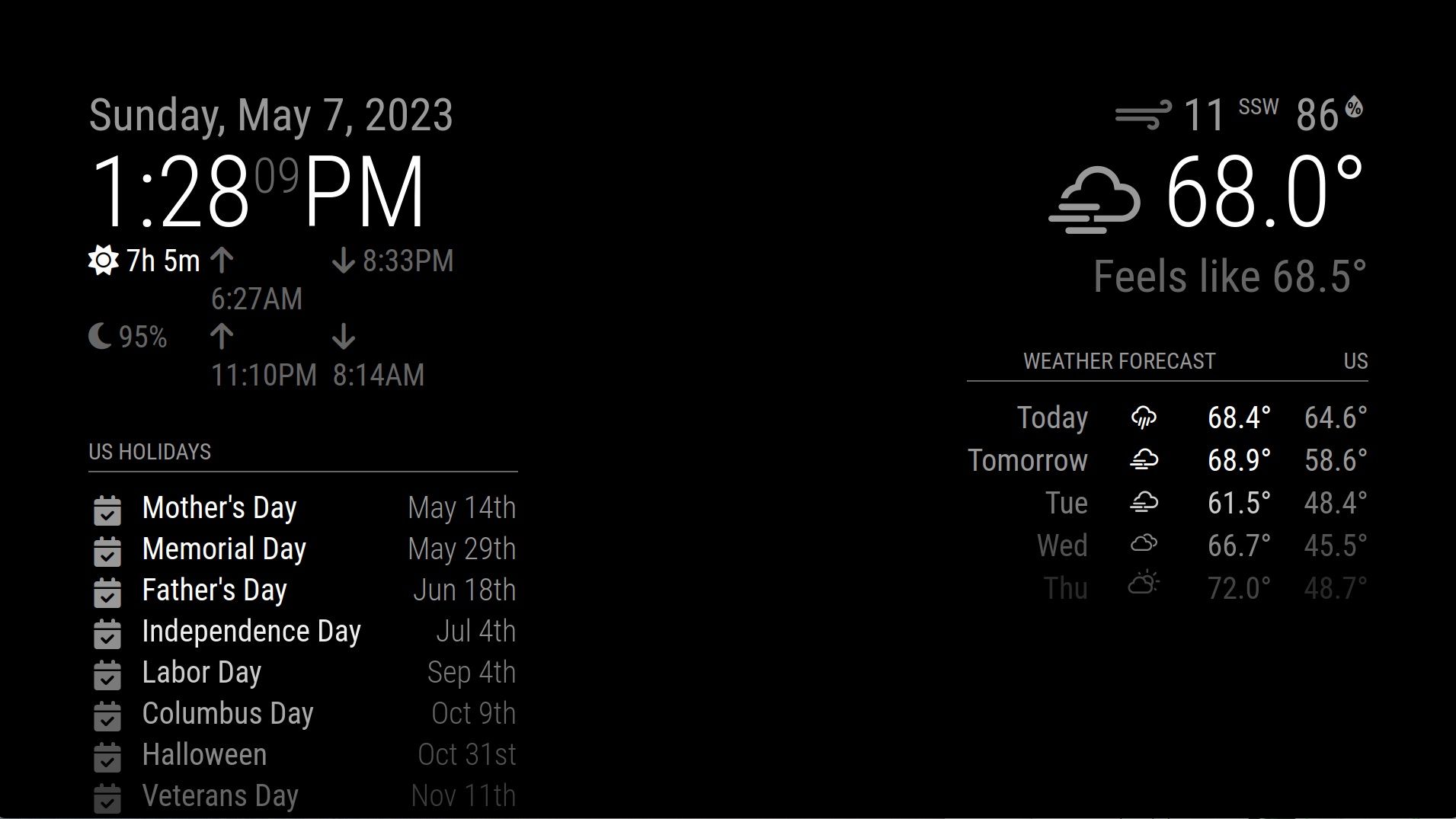
Could someone please help me resize the middle/center, so that the outside sets of modules on the left and right can stop “word wrapping” like that?

I’m at wit’s end with this one. I asked back in 2021 and none of the solutions worked. Not sure what I’m doing wrong.
I’ve asked this question before. At least twice. The answer has always been “edit the CSS” and/or “figure it out yourself.”
This is supposed to be a project that everyone can figure out.
All I want to do, is make the middle smaller, so that I don’t have issues with the left and right (the only sides I use!) resizing.
Look at all that space in the middle. It’s useless. Now notice how the sunrise/sunset module has to word-wrap? Why?

Is there a SIMPLE, consistent way to make the center smaller, so that the left and right can fill the available space?
This should not be custom CSS. This should not be rocket science. This should be reproducible, and honestly, I think it should be baked into the configuration file as a binary switch. “Make the middle disappear so that the left and right can fill the space.” Or “Make the middle smaller, because you’re not using it for anything, so why waste all that space?”
I honestly don’t know if this is a feature request (it’s something that MagicMirror should do natively, but doesn’t), or a bug (maybe I missed something, and there is an easy way to make the middle smaller), or if I’m literally the only person in the MagicMirror community who experiences this sort of thing and no one actually cares?
Why have I had to ask this question for literally years?
I am so sorry, but is there a MagicMirror related CSS tutorial somewhere that explains all of the possible configuration settings that I can change/override in the custom.css, maybe with examples?
For example, I agree, I think it’d be awesome to be able to change the column background colors to see how things are adjusting, but so far, I’ve only been able to figure out how to change the entire module area color by adding the following to the body section of my custom.css file:
–color-background: #800;
It makes the 60px “gaps” around the outside glaringly obvious (black versus red).
Is there specific custom.css code I need to use, to make the center column narrower, and the right and left columns wider to fit that space?
Is there an easy way to make the center area less wide?
I don’t have any modules placed in the center, so it’s a lot of wasted space (1/3rd of the overall space?) and I’d like to reclaim some of that. I’m also not using it as a traditional “mirror” where you’d want to see yourself in the center. It’s for informational display only.
Is there a way to change it from 1/3 of the overall space to, say, 1/4 or something?
I’m assuming this is a “Custom CSS” thing, but I can’t figure out how to make that happen. Is there a tutorial that explains how to resize the columns (not the modules themselves, but the relative width of the columns that contain the modules).
Thanks!
Patch worked for me, thank you!