Read the statement by Michael Teeuw here.
Make Center Smaller
-
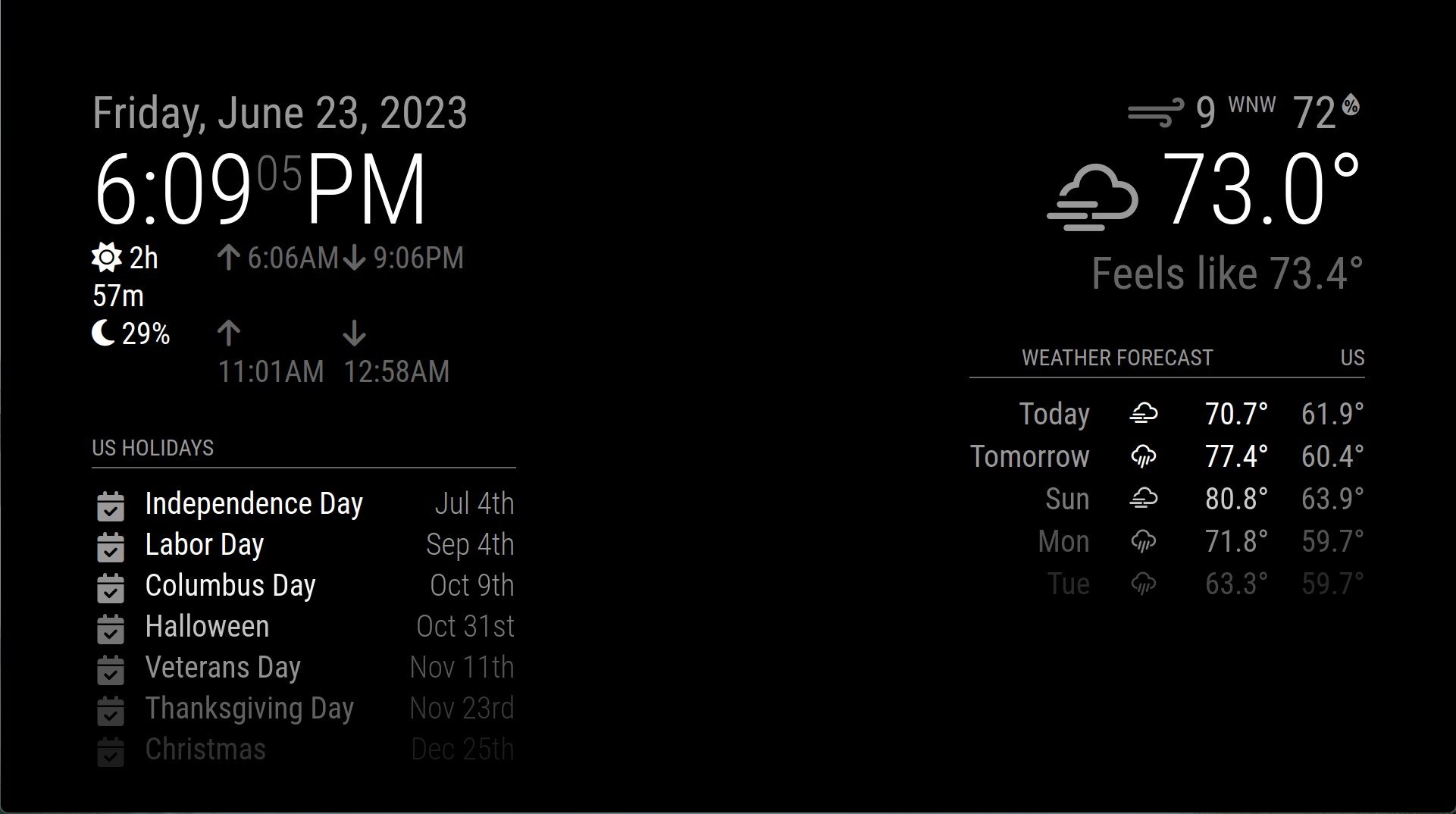
Could someone please help me resize the middle/center, so that the outside sets of modules on the left and right can stop “word wrapping” like that?

I’m at wit’s end with this one. I asked back in 2021 and none of the solutions worked. Not sure what I’m doing wrong.
-
@amarand you need to make the module wider,
IF there was content in the middle they would be overlapping…
custom.css
.modulename .....maybe a specific element class/id {
     width:....;
}
you can use the developers window to discover and play with these settings before adding them to custom.css
see
https://forum.magicmirror.builders/topic/14862/help-with-a-couple-css-issues?_=1687475216962 -
I’ll toss out a similar problem I had a long time ago and it was tied to the FontAwesome ICONS.
I wish I could remember what all I did but it took me a while to figure out it was like padding around the icons or something like that. -
This post is deleted!
Hello! It looks like you're interested in this conversation, but you don't have an account yet.
Getting fed up of having to scroll through the same posts each visit? When you register for an account, you'll always come back to exactly where you were before, and choose to be notified of new replies (either via email, or push notification). You'll also be able to save bookmarks and upvote posts to show your appreciation to other community members.
With your input, this post could be even better 💗
Register Login