Read the statement by Michael Teeuw here.
Easy Center Resizing?
-
I’ve asked this question before. At least twice. The answer has always been “edit the CSS” and/or “figure it out yourself.”
This is supposed to be a project that everyone can figure out.
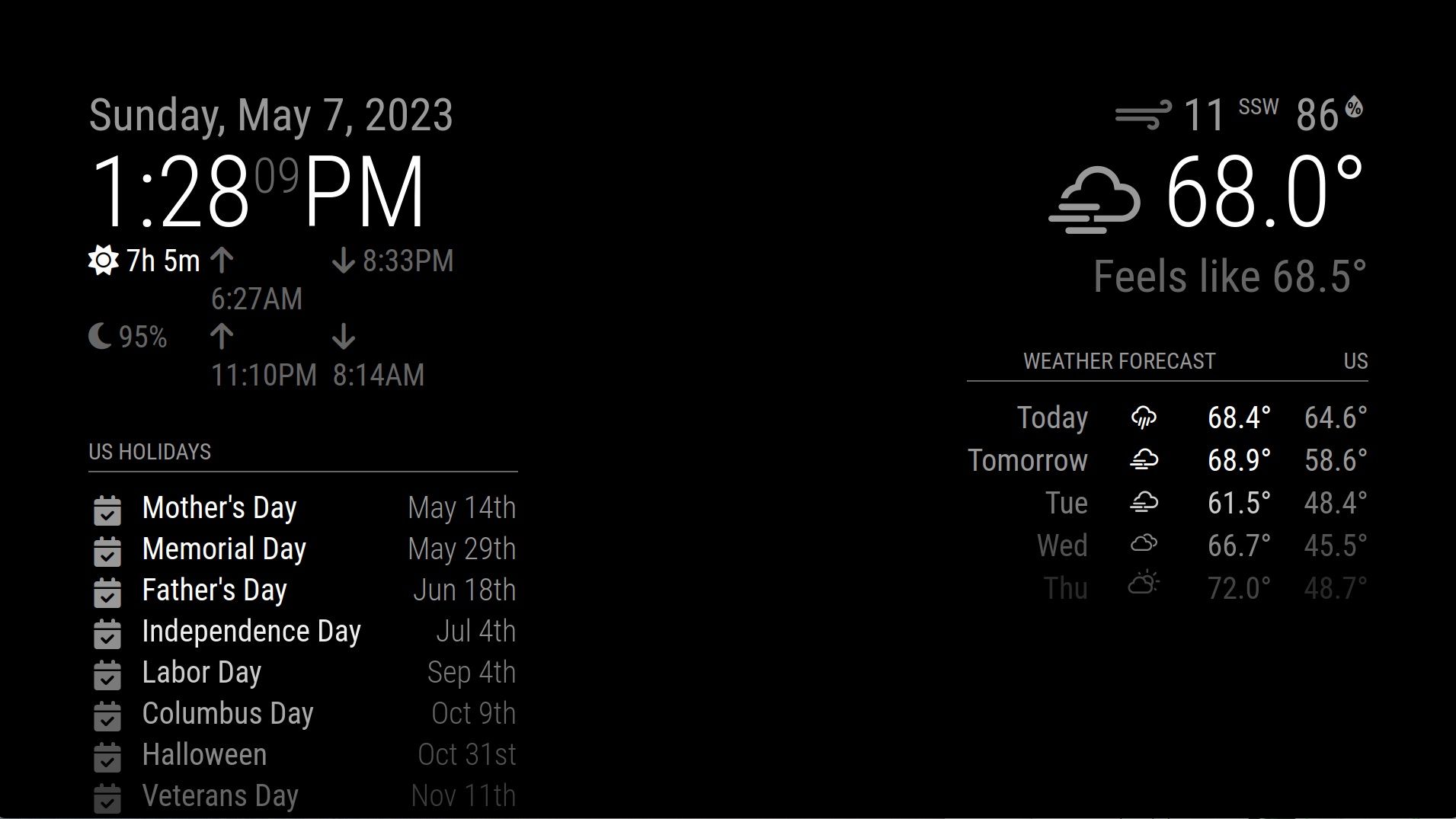
All I want to do, is make the middle smaller, so that I don’t have issues with the left and right (the only sides I use!) resizing.
Look at all that space in the middle. It’s useless. Now notice how the sunrise/sunset module has to word-wrap? Why?

Is there a SIMPLE, consistent way to make the center smaller, so that the left and right can fill the available space?
This should not be custom CSS. This should not be rocket science. This should be reproducible, and honestly, I think it should be baked into the configuration file as a binary switch. “Make the middle disappear so that the left and right can fill the space.” Or “Make the middle smaller, because you’re not using it for anything, so why waste all that space?”
I honestly don’t know if this is a feature request (it’s something that MagicMirror should do natively, but doesn’t), or a bug (maybe I missed something, and there is an easy way to make the middle smaller), or if I’m literally the only person in the MagicMirror community who experiences this sort of thing and no one actually cares?
Why have I had to ask this question for literally years?
-
@amarand sadly there is no ‘easy’ way
the default section/position/regions layout is like this
https://forum.magicmirror.builders/topic/286/regions?_=1683231109633no two authors do styling the same way. every thing u tweak makes trouble somewhere else…
using the developers console is one good tool, but its all still hard work.
https://forum.magicmirror.builders/topic/14862/help-with-a-couple-css-issues?_=1683231109642 -
@amarand ps. I’ve been here since 2017, and do a lot of css, and modules… but I couldn’t tell you how to do it, cause I can’t myself.
-
@amarand I’d do it like this:
.region.right {
	min-width: 450px;
}

.region.left {
	min-width: 450px;
}
there’s also
max-widthif you want to lock it solid.Easy.
-
The
centerposition is the weirdest thing of MM. Thewidthof center is decided by this code;.region.top.center, .region.bottom.center { left: 50%; transform: translateX(-50%); }This code looks so intuitive, but not so really. It is calculated and applied after rendering, so that makes some issues;
Anyway, this code would be a help for what you want;
.region.left {
  width: 50%;
  background-color: rgba(255,0,0, 0.2); /* to check how it shows visibly; remove this line later. */
}

.region.right {
  width: 50%;
  background-color: rgba(0,255,0, 0.2); /* to check how it shows visibly; remove this line later. */
}

.region.center {
  display:none;
}
By the way, current structure of MM’s positioning becomes a bit old and stubborn legacy.(almost 7 or 8 years old) Maybe we need to progress with more modern techs.
-
@MMRIZE I would love to see it reworked, mostly to add the missing 2 positions. (middle left, middle right)
Hello! It looks like you're interested in this conversation, but you don't have an account yet.
Getting fed up of having to scroll through the same posts each visit? When you register for an account, you'll always come back to exactly where you were before, and choose to be notified of new replies (either via email, or push notification). You'll also be able to save bookmarks and upvote posts to show your appreciation to other community members.
With your input, this post could be even better 💗
Register Login