Read the statement by Michael Teeuw here.
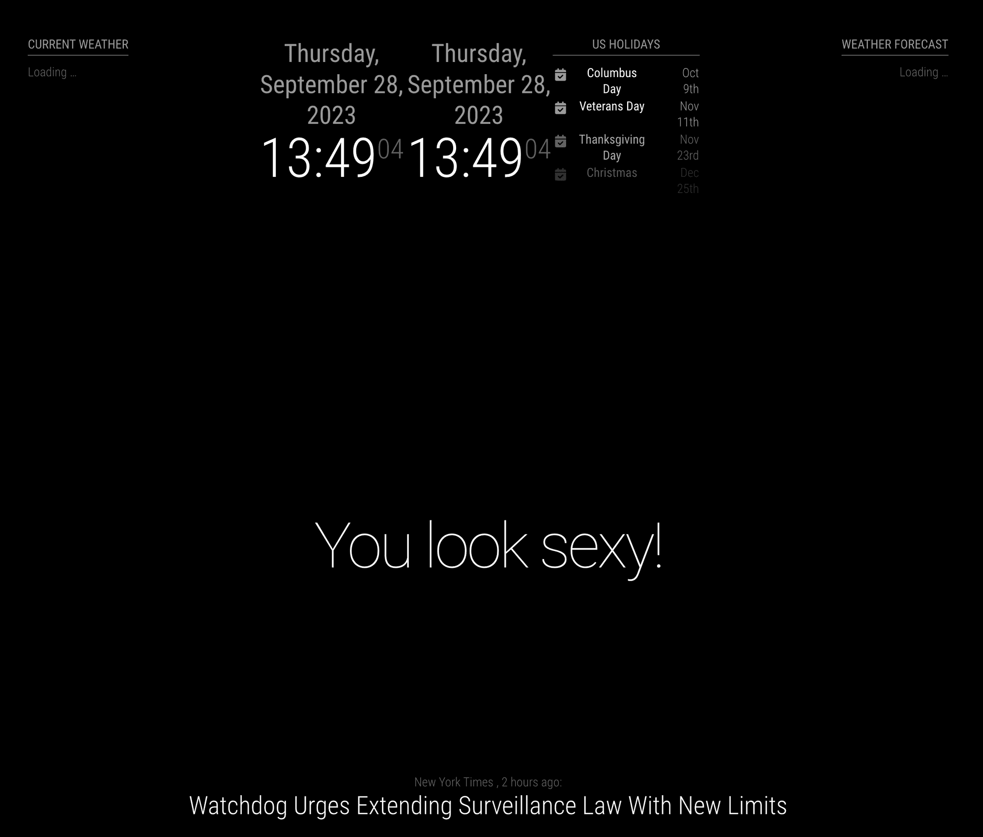
2 modules side by side
-
Hey All,
I have searched the forum and follow as many instructions as I could but I could not get any to work,
My family command center is almost done, I am a complete novice to CSS and HTML so please help me as if I were an alien,
I have both MMM-GoogleTrafficTimes and MMM-AnyList in the “top_center” position however I’d like, if possible, to left align MMM-GoogleTrafficTimes and right align MMM-AnyList, no matter what I do they stacked vertically, all the changes I have done from forum search so far just made them take up more space or less but still vertically stacked,
Any and all help appreciated please
-
Got it guys,
So I have MMM-GoogleTravelTimes and 3x MMM-AnyLists all in the top_center,
I used the following code from MMRIZE and added a margin to creating padding between modules, code below -
.region.top.center .container .module {
float: left;
max-width: 32%;
margin: 0 50px;
}Thanks guys!!
-
@GodSmackedOrange I just replied to your post in discord about the same topic.
there’s no configuration way to do this You may be able to do it with CSS by changing the layout of the region the modules are in top center to display: flex, flexdirection:leftright
you can try this In the developers window by pressing ctrl- alt-i on the magicmirror keyboard
and selecting the elements tab to view the web page contents structured AKA the Dom.if u select an element you can change its properties on the right hand side top box so that’s where you could apply display flex
-
@sdetweil
Unfortunately overridedisplay:flexinto.containeris not so easy. Because, MM’s hide/show mechanism depends oncontainer’s display value (none/block) and it is hard-coded in the HTML tag. (I think it would be a bad legacy approach to be fixed in some day.)Anyway, without that overriding, It is possible anyhow limitedly.
.region.top.center .container .module {
  float: left;
  max-width: 32%;
}
and I put 3 modules (2 clocks, 1 calendar) in
top_centerregion.

-
@MMRIZE Thats not put the side to side but it looks like they are both squished up together, I’m assuming because that top_center is only a thin strip,
anyway to make it wider?
-
@MMRIZE Never Mind, I’ve got it looking kinda of right now, I have added 2 more lists, so now I have travel time, list1, list 2 and list 3, only thing left is maybe if I could add some padding between them?
-
@GodSmackedOrange well center is the center region,
top is across all left/center/right
-
Got it guys,
So I have MMM-GoogleTravelTimes and 3x MMM-AnyLists all in the top_center,
I used the following code from MMRIZE and added a margin to creating padding between modules, code below -
.region.top.center .container .module {
float: left;
max-width: 32%;
margin: 0 50px;
}Thanks guys!!
-
S sdetweil referenced this topic on
-
@GodSmackedOrange said in 2 modules side by side:
.region.top.center .container .module {
float: left;
max-width: 32%;
margin: 0 50px;
}I tried this along with another post and I get the same thing. The two weather modules go next to each other, but they end up in the same spot. The one module isn’t at the same hieght as the other.
-
Just a FYI, it may also work thusly:
/* adjust modules to display side by side */
.MMM-ValuesByNotification, .MMM-OpenWeatherForecast {
	display: inline-flex;
	margin-right: 5px;
	margin-left: 5px;
}
the catch is that you have to have the modules in your config in the exact order you do in this css entry.
Hello! It looks like you're interested in this conversation, but you don't have an account yet.
Getting fed up of having to scroll through the same posts each visit? When you register for an account, you'll always come back to exactly where you were before, and choose to be notified of new replies (either via email, or push notification). You'll also be able to save bookmarks and upvote posts to show your appreciation to other community members.
With your input, this post could be even better 💗
Register Login