Read the statement by Michael Teeuw here.
MMM-CalendarExt2
-
Re: MMM-CalendarExt2
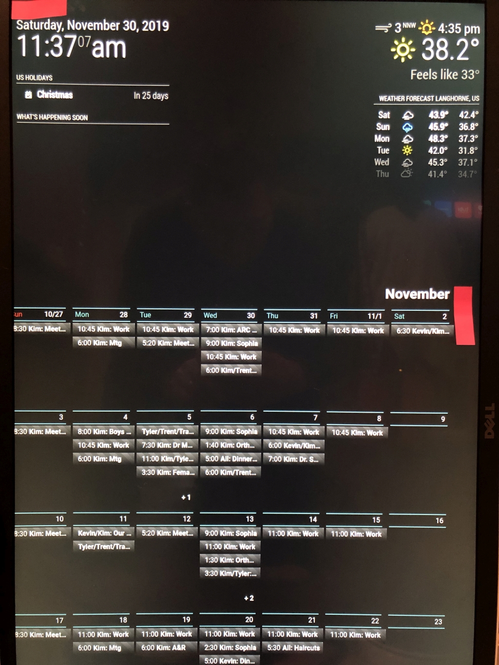
Hello all, loving this project, new to MM… I see lots of things I like but don’t always see how to accomplish then, any help you guys can provide would be awesome.Using a 1920x1080 display rotated, want full month view to replace traditional wall calendar.
-
How can I get events to wrap to second line in month view?
Saw somewhere that it’s not possible due to multi day events? However I think I just saw someone post this. -
My entire left side of my calendar getting cut off - How can I shift the whole calendar to the right? I’m assuming I have some conflict border or margin setting somewhere, but after many edits, I still cannot correct it.
-
Why does calendar disappear for a second and come back? Is it refreshing? Can I stop it from disappearing?
*************  CONFIG.JS **********
 {
                          module: 'MMM-CalendarExt2',
                          config: {
                            calendars : [
                              {
                                url: "https://rest.cozi.com/api/ext/
/*                              url: "https://calendar.google.com/calendar/
                              },
                            ],
                            views: [
                                {
                                  title: "What's Happening Soon",
                                  name: "DailyView",
                                  mode: "daily",
                                  calendars: [],
                                  position:"top_left",
                                  hideOverflow: false,
                                  slotCount: 3,
                                  className: "remove_empty_slot"
                                },

                              {
                                mode: "month",
                                position: "fullscreen_below",
                                timeFormat: "h:mm",
                                hideOverflow: false,
                                slotMaxHeight: "200px",
                                maxItems: 500,
                              },
                            ],
                            scenes: [
                              {
                                name: "DEFAULT",
                              },
                            ],
                          },
                        },]

};


******************CSS*****************

body {
        margin: 10px;
/*      height: calc(100%);*/
        width: 1060px;
}

.CX2 .remove_empty_slot .eventCount_0 {
  display:none;
}

.CX2 .cellSlot .slotSubTitle {
color:#3A6061;
}

.CX2 .cellSlot .slotTitle {
color:#999;
text-alignment: "right";
}

.CX2 .cellSlot.weekday_6 .slotSubTitle {
color:#3A6061;
}

.CX2 .cellSlot.weekday_6 .slotTitle {
color:#999;
}

.CX2 .cellSlot.weekday_7 .slotSubTitle {
color:#661414;
}

.CX2 .slot{
padding:0px 4px;
border:4px solid #000000;
}

/* Formats header */
.CX2 .slot .slotHeader {
background-color:#000000;
border-top:2px solid #3A6061;
border-bottom:2px solid #3A6061;
margin-top:5px;
margin-bottom:15px;
height:calc(var(--font-size) + 6px);
font-weight:normal;
padding:6px 6px 0;
}

.CX2 .today .slotHeader { /* today slot /
background-color:#afcecf;
/* background-color:#080a0a;*/
color:#999;
}

.CX2 .today .slotHeader * {
color:#999;
}

.CX2 .today .slotSubTitle {
color:#3A6061;
}

.CX2 .weekSlot {
position:relative;
}

.CX2 .today.slot {
/*background-color:#afcecf;*/
background-color:#0a1010;
border:4px solid #1d2f30;
}

.CX2 .slot > .slotContent{
position:relative;
width:100%;
background-image: none;
}

.CX2 .module-content { /* fake module body */
color:#999;
font-family: 'Roboto', sans-serif;
}

.CX2 .weeksmark {
display:none;
}

/***** Event *****/
.CX2 .event {
padding:5px;
margin:12px 0 0 8px;
background-color:transparent;
position:relative;
text-align:left;
}

/* how to treat full day events*/
.CX2 .event.fullday {
border-radius:unset;
background-color:transparent;
color:#999;
margin:12px 0 0 8px;
}
-
-
Also would like to know how to remove the extra line at the bottom of the events in each day. This sucks up a bunch of space.
-
@shfaxx Check to see if “hideOverflow: false,” in your view section takes out the extra space. It did for me in another view style.
also, @sean would have the answer on the cutoff, but I suspect it’s something to do with the rotation - I think it’s been covered before, check the main topic at https://forum.magicmirror.builders/topic/9279/
-
@shfaxx said in MMM-CalendarExt2:
How can I get events to wrap to second line in month view?
Saw somewhere that it’s not possible due to multi day events? However I think I just saw someone post this.Can’t wrap. Ideally, it could be done by modification of CSS, but I don’t recommend it.
I regard this table views as a summary or overview, so I didn’t make it show details. MagicMirror screen resolution is not so enough(especially vertical layout). If wrapping would be allowed, the number of showing events should be less. For example, you have 6 events on Nov. 13, 4 are partially shown and 2 are hidden. With wrapping, 1 or 2 events would be displayed fully but others might be hidden. I believe it would be worse than current.My suggestions are;
- To use with other detail views - daily or upcoming, current views - together to get detailed information.
- You can abbreviate titles and give separated styles by
transformoption to distinguish easily with less text.
(Example; you can give an icon and blue font forKim's scheduleand remove the textKimfrom event Title.)
My entire left side of my calendar getting cut off - How can I shift the whole calendar to the right? I’m assuming I have some conflict border or margin setting somewhere, but after many edits, I still cannot correct it.
Maybe. But without whole CSS, I have no idea about it.
Why does calendar disappear for a second and come back? Is it refreshing? Can I stop it from disappearing?
Yes, it is refreshing. Adjust interval from configuration.
Hello! It looks like you're interested in this conversation, but you don't have an account yet.
Getting fed up of having to scroll through the same posts each visit? When you register for an account, you'll always come back to exactly where you were before, and choose to be notified of new replies (either via email, or push notification). You'll also be able to save bookmarks and upvote posts to show your appreciation to other community members.
With your input, this post could be even better 💗
Register Login