Read the statement by Michael Teeuw here.
MMM-HASS & css nightmare (slight exaggeration)
-
Trying to get my list of entities to be aligned for both columns & for hours now (I have no idea about css) I have been googling, reading up on css etc with no luck.
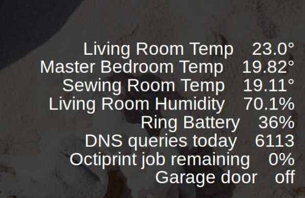
I have the below
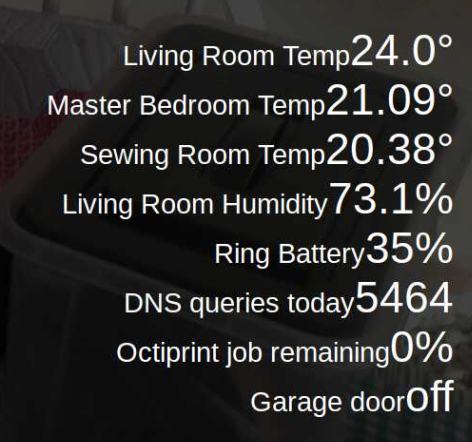
& am trying to get it to be aligned similar to the below:
After playing around with the css I have the two below css files as it stands & would really appreciate someone putting me in the right direction.
MMM-HASS.css
.MMM-HASS .row {
  position: relative;
  padding: 1px;
  min-width: 300px;
  justify-content: center;
  line-height: 30px;
  text-align: right;
}

.MMM-HASS .module-content .flex-item {
  /*margin: auto;*/
}

.region.left .MMM-HASS .row,
.region.center .MMM-HASS .row,
.region.right .MMM-HASS .row {
  position: relative;
  padding: 1px;
  justify-content: left;
}

.region.left .MMM-HASS .row .flex-item > div,
.region.center .MMM-HASS .row .flex-item > div,
.region.right .MMM-HASS .row .flex-item > div {
  display: inline-block;
  min-width: 70px;
}

.MMM-HASS .device {
/*  display: block; */
  font-size: 40px;
  white-space: nowrap;
  margin-right: 40px;
  line-height: 40px;
  position: relative;
  left: 0px;
}

.region.left .MMM-HASS .flex-item .title,
.region.center .MMM-HASS .flex-item .title,
.region.right .MMM-HASS .flex-item .title{
  border-bottom: none;
}

.region.left .MMM-HASS .value {
	  width: 100%;
	    max-width: 400px;
	      min-width: 10vw;
      }

.MMM-HASS table {
	    border-spacing: 10px 0;
	        border-collapse: separate;
	}


.MMM-HASS .value {
  font-size: 40px;
  display: inline-block;
  margin-right: 5px;
  line-height: 40px;
}

.region.left .MMM-HASS .flex-item .value,
.region.center .MMM-HASS .flex-item .value,
.region.right .MMM-HASS .flex-item .value{
  margin: 5px;
  font-size: 1em;
}

.MMM-HASS .value i {
  margin-right: 8px;
  font-size: 0.75em;

}
My custom css (I have removed what I had for the MMM-HASS enteries & edit the above as a last resort)
/*****************************************************
 * Magic Mirror                                      *
 * Custom CSS                                        *
 *                                                   *
 * By Michael Teeuw http://michaelteeuw.nl           *
 * MIT Licensed.                                     *
 *                                                   *
 * Add any custom CSS below.                         *
 * Changes to this files will be ignored by GIT. *
 *****************************************************/
.xsmall {
	  font-size: 35px;
	    line-height: 40px;
    }

    .small {
	      font-size: 40px;
	        line-height: 45px;
	}

	.medium {
		  font-size: 50px;
		    line-height: 55px;
	    }

	    .large {
		      font-size: 85px;
		        line-height: 85px;
		}

		.xlarge {
			  font-size: 95px;
			    line-height: 95px;
			      letter-spacing: -3px;
		      }
		      .normal,
		      .dimmed,
		      header,
		      body {
			          color: #fff;
			  }


			  .MMM-MovieListings .header {
				    color: #FFFFFF;               /* Header color. Default is white. */
			    }

			    .MMM-MovieListings .dimmed {
				      font-size: 18px;
				        color: #FFFFFF;   /* white */
				}

			    .MMM-MovieListings .small.dimmed {
				      font-size: 18px;
				        color: #FFFFFF;   /* white */
				}

				.MMM-MovieListings .xsmall {
					  font-size: 18px;
					    color: #FFFFFF;   /* white */
				    }

				    .MMM-MovieListings .xsmall.dimmed {
					      font-size: 18px;
					        color: #FFFFFF;   /* white */
					}

					.MMM-MovieListings .marginTop.xsmall {
						  font-size: 18px;
						    color: #FFFFFF;   /* white */
					    }
Thanks in advance
-
Remove all changes made in the hass css file
Add
.MMM-Hass .device {text-align: right} .MMM-Hass .value {display: inline-block; text-align: right; width:80px;} -
Tried both adding your snippet to the end of the original hass css which didn’t make any changes. Then removed all & just added your code & got the below
Original hass css
.MMM-HASS .row {
  position: relative;
  padding: 1px;
  min-width: 300px;
  justify-content: left;
  line-height: 20px;
  text-align: right;
}

.MMM-HASS .module-content .flex-item {
  /*margin: auto;*/
}

.region.left .MMM-HASS .row,
.region.center .MMM-HASS .row,
.region.right .MMM-HASS .row {
  position: relative;
  padding: 1px;
  justify-content: left;
}

.region.left .MMM-HASS .row .flex-item > div,
.region.center .MMM-HASS .row .flex-item > div,
.region.right .MMM-HASS .row .flex-item > div {
  display: inline-block;
  min-width: 70px;
}

.MMM-HASS .device {
/*  display: block; */
  font-size: 20px;
  white-space: nowrap;
  margin-right: 40px;
  line-height: 25px;
  position: absolute;
  left: 0px;
}

.region.left .MMM-HASS .flex-item .title,
.region.center .MMM-HASS .flex-item .title,
.region.right .MMM-HASS .flex-item .title{
  border-bottom: none;
}

.MMM-HASS .value {
  font-size: 20px;
  display: inline-block;
  margin-right: 5px;
  line-height: 25px;
}

.region.left .MMM-HASS .flex-item .value,
.region.center .MMM-HASS .flex-item .value,
.region.right .MMM-HASS .flex-item .value{
  margin: 5px;
  font-size: 1em;
}

.MMM-HASS .value i {
  margin-right: 8px;
  font-size: 0.75em;

}
Cheers for looking
-
Use the developer toos in Chrome to see the whole html & css. You can also edit that to try out things quickly.
Hello! It looks like you're interested in this conversation, but you don't have an account yet.
Getting fed up of having to scroll through the same posts each visit? When you register for an account, you'll always come back to exactly where you were before, and choose to be notified of new replies (either via email, or push notification). You'll also be able to save bookmarks and upvote posts to show your appreciation to other community members.
With your input, this post could be even better 💗
Register Login