Read the statement by Michael Teeuw here.
covid bell curve line graph tracker
-
@humdinger44 i see it too… will mess up the charts for a while… boooo
from the data source
**NEW:** Starting with data for May 6th, this data reports the total combined number of confirmed and probable Covid-19 cases and deaths where available. Many states and localities have started to report this data using criteria that were developed by states and the federal government. This will cause a spike in the cases and deaths data for some areas while we work to revise our historical data with those probable cases and deaths. -
I posted an update to github today,
supports displaying US state county dataa little bit trickier on the data entry
counties:[ { ‘county_name’ : ‘state_name’ }, { ‘county_name2’ : ‘state_name2’} ]
on the chart only the county name is shown
-
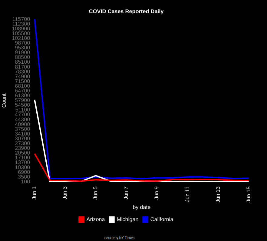
HI guys, thanks for making this! I am trying to show daily totales, I was trying to make it easy to see the totals for each day. However the graph is starting extremly high, see below. Can someone see what I am doing wrong?
THanks !
```{ module:"MyCovid19", position:"bottom_center", config:{ states:['Arizona','Michigan','California'], line_colors:['red','white','blue'], chart_type:"cases", chart_title:"COVID Cases Reported Daily", ranges:{min:0,max:000,stepSize:100}, backgroundColor: "transparent", width: 600, height: 500, debug: true, startDate: '06/01/2020' } -
@darbos max is 0???
-
@sdetweil I had it set at a higher number but took that from an example I found on here. What should those be set at? Ty
-
@sdetweil my goal is really to be able to look and see the daily totals for the past few days.
-
This is the big initial spike i dont know how to get rid of. Sorry last attachment wouldnt work.

-
@darbos I would start with a step of 50 and a max of 50. if the numbers are higher the chart engine will auto adjust.
if U have too many ticks on the left axis, then make the step higher (100) and raise the max to 100
-
@darbos for the spike, move the start day to the 2nd or 3rd
-
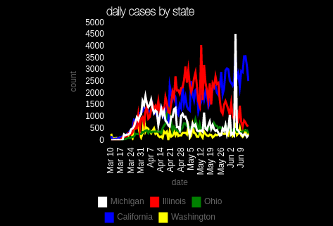
@sdetweil here is my cases by day by state

min 0, max 500, step 500
(chart 300x300)one cool thing, when u make the step low, u can turn off individual sources to see the remaining adjust
just click on the legend entry to turn it offlooks like Michigan had a reporting spike
