Read the statement by Michael Teeuw here.
Meross
-
Hey there. I would really like to have a module to see all my Meross products like plugs for my lights :)
Maybe to see the status of the products AND:
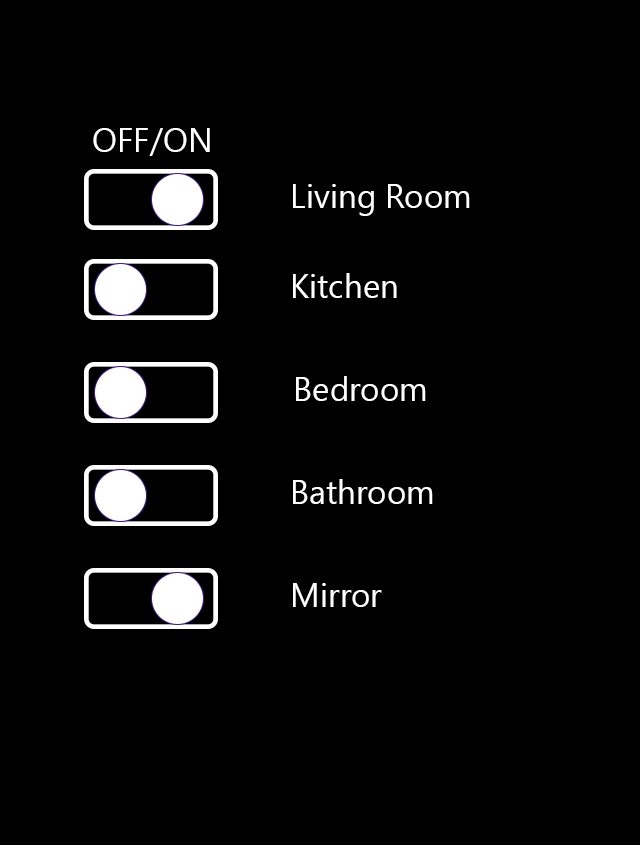
Touch integration to turn ON/OFF the lights :)Maybe something like this, if possible:
(just an idea)

Thank u for help! :)
Toby! -
Meross has a cloud api so shouldn’t be too difficult to mplement.
However I don’t have the hardware nor the time unfortunately.Also, you could easily create touch sliders with some css magic and event listeners.
I have done this for my tasmota module.If you need the code, let me know.

-
@lavolp3 Thank u! The code would be nice. :) Greetings, Toby
-
@thetobyde for the DOM I have created the following elements:
var label = document.createElement("label");
                                label.className = "tasmota-switch";
                                label.id = "switch-" + topic;
                                    var input = document.createElement("input");
                                    input.type = "checkbox";
                                    input.id = "checkbox-" + topic;
                                    input.checked = this.setSwitch(topic);
                                    var span = document.createElement("span");
                                    span.className = "slider round";
                                    span.id = "slider-" + topic;
                                    span.onclick = function() { self.toggleSwitch(topic); };
                                label.appendChild(input);
                                label.appendChild(span);
there is a label (as wrapper), a (hidden) checkbox, and a span that is the actual slider.
The onclick function for the slider looks like this:toggleSwitch: function(topic) { this.sendSocketNotification("TOGGLE_SWITCH", topic); console.log("Switch toggled: " + topic); },So, rather generic. There you need to tell the api that you have toggled the switch.
Also, at every DOM update you need to check the api for the switch state (see the
this.setSwitch-function above). It may have been switched from another endpoint or app.
The result sets the “checked” state of the hidden input.setSwitch: function(topic) { this.log("Setting switch for " + topic); var powerState = this.tasmotaData.tele[topic].STATE.POWER; return (powerState === "ON") ? true : false; },The rest is css:
/*** SWITCHES ***/

.MMM-Tasmota .tasmota-switch {
    float: right;
    position: relative;
    display: inline-block;
    width: 90px;
    height: 34px;
}

/* Hide default HTML checkbox */
.MMM-Tasmota .tasmota-switch input {
    opacity: 0;
    width: 0px;
    height: 0px;
}

/* The slider */
.MMM-Tasmota .slider {
    position: absolute;
    cursor: pointer;
    top: 0;
    left: 30px;
    right: 0;
    bottom: 0;
    background-color: #f00;
    border: 3px solid white;
    -webkit-transition: .2s;
    transition: .2s;
}

.MMM-Tasmota .slider:before {
    position: absolute;
    content: "";
    height: 26px;
    width: 26px;
    left: 3px;
    bottom: 1px;
    background-color: white;
    -webkit-transition: .2s;
    transition: .2s;
}

.MMM-Tasmota input:checked + .slider {
    background-color: #0f0;
}

.MMM-Tasmota input:checked + .slider:before {
    -webkit-transform: translateX(24px);
    -ms-transform: translateX(24px);
    transform: translateX(24px);
}

/* Rounded sliders */
.MMM-Tasmota .slider.round {
    border-radius: 34px;
}

.MMM-Tasmota .slider.round:before {
    border-radius: 50%;
}
I will publish all of that with my MMM-Tasmota module.
Hello! It looks like you're interested in this conversation, but you don't have an account yet.
Getting fed up of having to scroll through the same posts each visit? When you register for an account, you'll always come back to exactly where you were before, and choose to be notified of new replies (either via email, or push notification). You'll also be able to save bookmarks and upvote posts to show your appreciation to other community members.
With your input, this post could be even better 💗
Register Login