Read the statement by Michael Teeuw here.
Album art from LastFm Module covering weekly forecast?
-
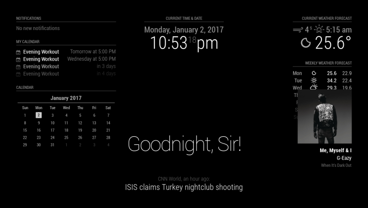
Hey guys, I hope you all had a Happy New Year! I installed the Last FM Module over the recent holiday, but once I started up the MM I realized that the Album Art is covering the forecast as shown below. Unfortunately I only know Python fluently and my CSS isn’t the best hahaha :) I would like to keep this module in the corner is it possible?

Thanks in advance
-Tony -
@Anthony_Haddad i guess the newsfeed is in
bottom_bar?bottom_baris underneath ofbottom_righthttps://forum.magicmirror.builders/topic/286/regions set the region of the newsfeed tobottom_center -
@strawberry-3.141 Yes, you were right! It worked! Thank You! BUT unfortunately the album art is still covering the last two lines of the weekly forecast. Here is the CSS for the module: https://github.com/PtrBld/MMM-Scrobbler/blob/master/MMM-Scrobbler.css Is it possible to reduce the size of the album art? I’ve tried playing with the numbers but only managed to move the module more to the right…
-
There is no class assigned in the js file, so you might have to change some code.
find
<img src='"+ this.songData.image +"' width='200'>in the MMM-Scrobbler.js change it to
<img src='"+ this.songData.image +"' width='150' height='150'> -
@Anthony_Haddad did you try
.MMM-Scrobbler .album-art img { height: 150px; width: 150px; } -
@broberg Thanks mate! It does reduce the size of the album art, you wouldn’t happen to know how remove the title of the album? So the module could drop down a little further as everything is still cramped up. Thank you for your help so far.
-
.MMM-Scrobbler .album-name { display: none; } -
@strawberry-3.141 @broberg Thank you so much guys! It looks perfect!
Hello! It looks like you're interested in this conversation, but you don't have an account yet.
Getting fed up of having to scroll through the same posts each visit? When you register for an account, you'll always come back to exactly where you were before, and choose to be notified of new replies (either via email, or push notification). You'll also be able to save bookmarks and upvote posts to show your appreciation to other community members.
With your input, this post could be even better 💗
Register Login