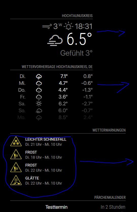
Read the statement by Michael Teeuw here.
Alignmend of modules
-
@codac all these modules have the same position
top_right?For the warnings module you could use
custom.cssand overwrite thetext-align: left;in the module css withtext-align: right;You can also play with css in the browser, e.g. see this thread.
-
@karsten13 correct they are all top_right. Your suggestion worked:
.MMM-DWD-WarnWeather .status {
    font-family: "SFPro";
    text-align: right;
}
Your hint with playing with css in my browser helped to figure out that currentweather and weatherforecast behave like this because of a max-width of 325 that I already had set in the custom.css, as where the calendar has 475px.
-
@codac I think you have to add
.MMM-DWD-WarnWeather .description { text-align: right; } -
I have a similar problem.
I would like to have the yellow icon closer to the right in the module: ‘MMM-DWD-WarnWeather’.

And I would like to get rid of the space on the right in the module: “MMM-DWD-Pollen”.

-
@majorc The question with the MMM-DWD-WarnWeather module I can answer. Was a bit tricky to find out, but what works for me is to set the follwing into the custom.css:
.MMM-DWD-WarnWeather .warning { float: right; } -
@codac said in Alignmend of modules:
.MMM-DWD-WarnWeather .warning {
float: right;
}Thanks, that is a good one!
-
@majorc u could try the same float-right for the pollen module
u may need to look in the developers window, elements tab to see the class used
ctrl-shift-i, select the elements tab, expand the nav tree in the left column to locate the module (top, top-right…)
set the module background to blue, to see the whole thing
and then add styles to the contentsee how to use the elements tab info here
https://forum.magicmirror.builders/topic/14782/make-a-remove-header-space-or-overlap-two-modules/5 -
@sdetweil for MMM-DWD-Pollen you can change the following classes in CSS:
tab-center
pollen-low
pollen-low-medium
pollen-medium
pollen-mediumhigh
pollen-high
pollen-nodata
and just make
text-align: rightThat should do the trick. Float will not work - it pushes everything to the right w/o spacing.
I am still thinking how one can save the space on the right side but I am not an CSS / HTML expert.
-
@carstend said in Alignmend of modules:
but I am not an CSS / HTML expert
me neither… i hate working on the UI
-
@carstend I added the question to the DWD-Pollen thread, but no respond so far.
https://forum.magicmirror.builders/topic/12247/mmm-dwd-pollen/19?_=1616656403635
text-align: rightwill move the text, so it is not centered anymore. But the goal is, to get rid of the space on the right side.
Update:
I now use:.MMM-DWD-Pollen table { margin-left: auto; margin-right: -40px; }Not sure if this is a good way, but it works for me at the moment.

