Read the statement by Michael Teeuw here.
MMM-CalendarExt3
-
@MMRIZE No rush at all, enjoy your holiday! I’ll keep fiddling, but I’ve never been good with CSS :D
-
Hello.
Have been using MMM-CalendarExt2 for some years now and changed to MMM-CalendarExt3 today.
The thing was that my birthday events that i have in my my calender, i would like to say a the age of the person. The Calendar module you can use displayRepeatingCountTitle and repeatingCountTitle to show the years from when you put the event in the calendar. For example i tried put my birthday on the year i was born and put repeat every year on same day and it did show number.
Was wondering if this funktion work in MMM-CalendarExt3?
-
@Rakutsi no… the stuff shown on the screen isn’t broadcast to the other modules…
but you could add an ext3 eventTransformer to add it back on (if you know bd, and some pattern in the event subject)
-
@sdetweil thanks then i know.
well i dont know how to use the eventFilter for that, is there any example then i could try?
I am not the best at those kind of things. Mostly copy paste and trial and error. -
@Rakutsi see the doc and the ext3 wiki (at the module github page)
-
this was the solution i came up with.
eventTransformer: (event) => {
    const currentYear = new Date().getFullYear();
    const age = currentYear - event.firstYear;

    event.title = `${event.title} (${age} year)`;

    return event;
},
Chatgpt is my friend.
-
@Rakutsi awesome!
-
@czabel said in MMM-CalendarExt3:
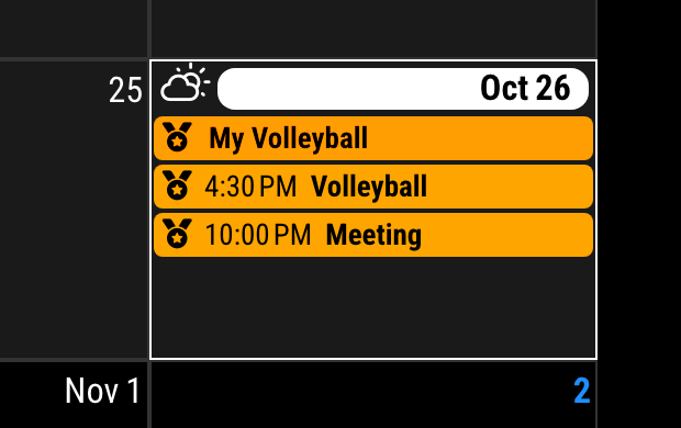
Do you have any insight as to how to change my CSS to get the icons to show up for every event? As I mentioned, my current setup makes my non-fullday events colored in, but this deletes the icon. The icon is still there for the real fullday events. I’d like to keep the icon, if at all possible. Thank you!
Sorry for the late reply. I was on vacation.
Append these codes to your
custom.css/* custom.css */ .CX3 .event.singleday .headline.useSymbol .symbol { color: var(--oppositeColor); }
-
@MMRIZE said in MMM-CalendarExt3:
… Sorry for the late reply…No problem at all, I appreciate the time you spend helping on here.
With that CSS adjustment, the events in the calendar look perfect now, thank you.
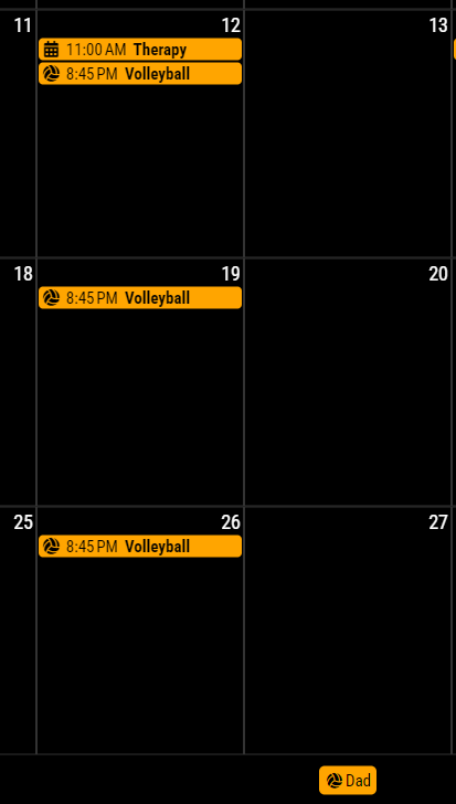
But I have a new problem that seems to have just shown up: the volleyball icon that I’m using in the eventTransformer is now being applied to the Legend somehow:

You can see the events are great (volleyball has the icon, other events are the default)This is especially odd because in the base calendar config, I specify
useSymbol: falsefor the “Dad” calendar, but this element is somehow getting the .useSymbol class.Oh, I just found in a search another user that has this issue, link here
-
@czabel
Well, that is not the bug, however you might be uncomfortable.
It is designed to get the symbol from thefirst(internally structured) event of the calendar group.
Because the default calendar module will broadcast only the events themselves, not the meta-information from the calendar to which the event belonged, So there is no easy way to distinguish thedefault symbolof the specific calendar.To be honest, getting the
defaultsymbol fromconfigof ONLY the defaultcalendarmodule might be easy, but this module is designed to take events from any other possible modules, so I cannot assume all the user will get the events from thedefault calendarmodule only.Not so easy. Has somebody any idea?
