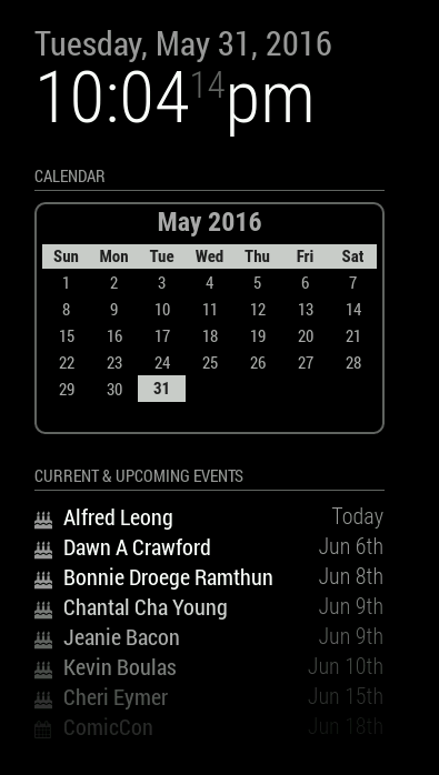
Read the statement by Michael Teeuw here.
Monthly Calendar View
-
You can’t read anything with it being that small, it becomes rather useless unless you also have mouse control (or touch screen) to actually click on the events and open them up.
-
If it can be adjusted to the a legible view I believe it would be great! I googled every where unfortunately I don’t know JavaScript and having a very hard time trying to get it to work. Also that calandra is just an example, I am only shooting the month to show up and not any events. Just a very basic calendar. Think you can help?
-
Oh, you just want a calendar view, not an actual Google (or other) calendar with events on it. That’s different, and relatively easy.
-
I’m definitely thinking more of a full calendar with events. I plan on my screen being in landscape mode, upwards of 23". My “dashboard” so to speak would have a header with a weather module, this monthly calendar taking up about 80% of screen and then maybe an RSS feed along the bottom for news. I’ve tried messing with custom RSS feeds for Google calendar and iframe, and it’s just plain ugly.
-
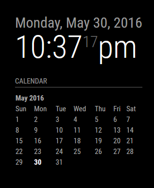
I said I was not going to write any code this weekend. Really, I did. But when thinking of a simple calendar display, it was way easier for me to just sit down and fiddle. This is still in its infancy, but this is what I’m working on for now. It’s a simple, empty calendar display with nothing other than today highlighted. It is still the same (default) calendar module. You just pick which you want displayed, either a blank one, or one where you configure your calendar URLs for it to fetch the data. At least, this is what I did for now. I may end up pulling it out and into a separate module, together with the weekly display one that I’m also working on.
There’s no formatting present, in fact it’s all done with tables, something I am going to change as I really don’t like tables. Much easier to format when you’re dealing with CSS elements. But at least I can give you a taste of what it looks like so far.
Just the blank calendar:
And if I stack them:
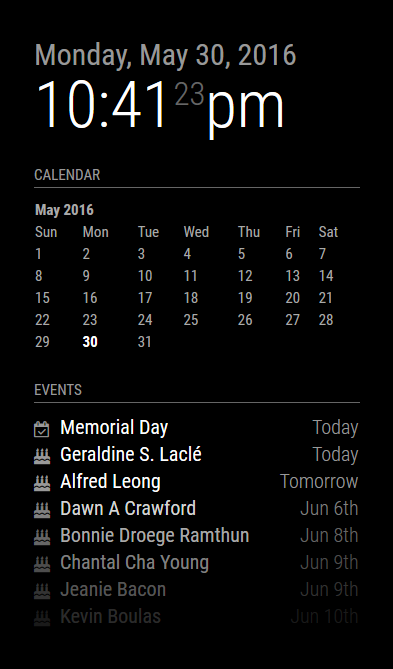
Comments/Suggestions/Requests/Questions … let 'em rip.
Things still todo:
- Replace table with CSS elements
- Allow for proper language translation
- Cosmetics
-
Even the Calender in the form you did it there would be an awesome module to add, or perhaps just build it into the main program, so that we can choose inside the config what kind of look you want to have on the calender…
And something else for your liddle ‘to do’ - list:
Week starts with Monday or Sunday :) -
The better question is, what’s the preferred display, something small and in the corner, or having it take up the full width of the monitor? I’m of the school where I want small, concise and not taking up all the space. However, this isn’t about me, it’s about the user. :)
I think I will pull it out of the default calendar module and keep @MichMich’s default calendar implementation as-is, while I push this into a different module. I need to figure out what to call it, or how to make it work with the other one without breaking things. Having made the decision to pull it out of the default module also means I can easily integrate other features without causing too much bloat on the default one, such as a weekly view version.
And yes, having the week start on Monday vs. Sunday is easily implemented …
-
I like the look of that module you made, but speaking for just myself, I was looking for a large scale calendar with multiple calendars populating the days. I know you had talked about adding a css to iframe, but that seems to have been made more difficult by google. Plus I want to just use it as a module along with other features of this project.
Again, I’m looking for more of a home based dashboard for the family, as opposed to a mirror, but I like the setup of this project.Thanks for your efforts!
-
One thing at a time @billp100. Your request is still in my queue. I did this yesterday because it was on my mind and it’s easier for me to just write the code out while I’m thinking about it, than it is to just ponder ideas and stick to my ‘I shall not write code this long weekend.’ mantra. So yeah, it happened.
Basically, this is what I have in my queue:
- compact monthly view of a calendar (what I’ve done above and still being worked on)
- full screen width calendar with events populated (this has issues I’m trying to address)
- a running week of events (somewhat in progress already)
For the issues I’m referring to above, I look at my own calendar and days where I have so many things going on that it will not all display in the allowable space. On a regular computer, you can click to expand the day and see it all. You can’t do that on a default, touch-free MM install. Adding that ability now relies on the user also including a touch screen, or a mouse to navigate the calendar. To me it does no good if I have a calendar where I can not see all the events.
Now, this may not be an issue for you specifically, but I have to think of the over all population and every possible scenario and how to address them. So yeah, I’m still working on that and trying to figure out a (better) solution.
-
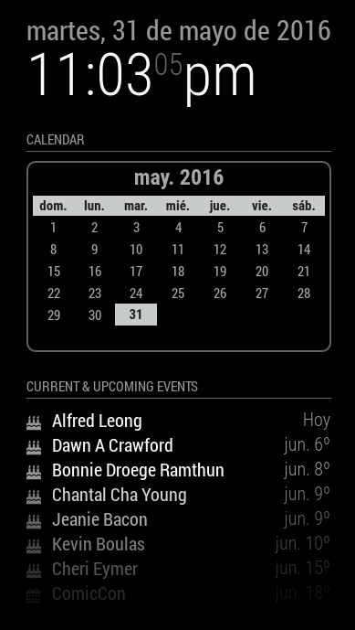
And after a quick rewrite to use Moment.js instead of cumbersome Javascript calculations, I also did a bit of styling. I opted not to go the CSS route because the reality is, this is table-worth data, not CSS. It solves a lot of headaches to be honest. I did incorporate proper language translations. It just reads your locale and uses that.
- Still to-do is allowing for a Sun/Mon start of the week.
