Read the statement by Michael Teeuw here.
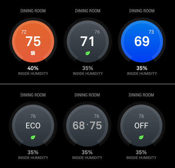
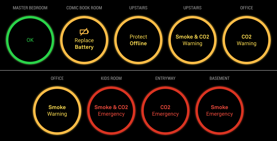
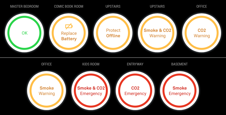
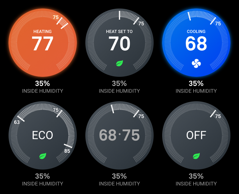
MMM-Nest-Status - New module for your Nest thermostats and protect smoke detectors!
-
@michael5r no freaking way! You’ve made another module I have to have lol 😂
-
The modules not update after the recent upgrade ???
-
Could you give an example of how this is added to the config.js? Please and thank you.
electronOptions: { webPreferences: { webSecurity: false } } -
@mykle1 said in MMM-Nest-Status - New module for your Nest thermostats and protect smoke detectors!:
Could you give an example of how this is added to the config.js? Please and thank you.
electronOptions: {
    webPreferences: {
        webSecurity: false
    }
}
Sure - it’s just another object, just like
modules: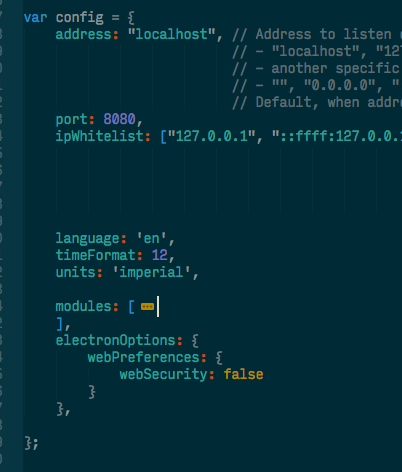
-
@culi831 said in MMM-Nest-Status - New module for your Nest thermostats and protect smoke detectors!:
The modules not update after the recent upgrade ???
Both the nest-status and nest-cameras modules should be working just fine - what issue are you having?
Bear in mind that the latest
1.3.0update added socket notifications for data - which means you will need to restart your MagicMirror application in order for it to receive data, you can’t just reload the browser page (you’ll only have to do this this one time, though). -
Your first module you say? Wow. Coming in strong right out of the gate. Well done!
-
Love the screenshots, its exactly what I am looking for for a dashboard. However I cannot get it to load. I have gone through as much troubleshooting as I can think of, including starting over from scratch with a new RPi image.
I go through the steps for setup and enter the numbers necessary from my Nest Developer account, PIN etc. It gives me the attached response with a token.
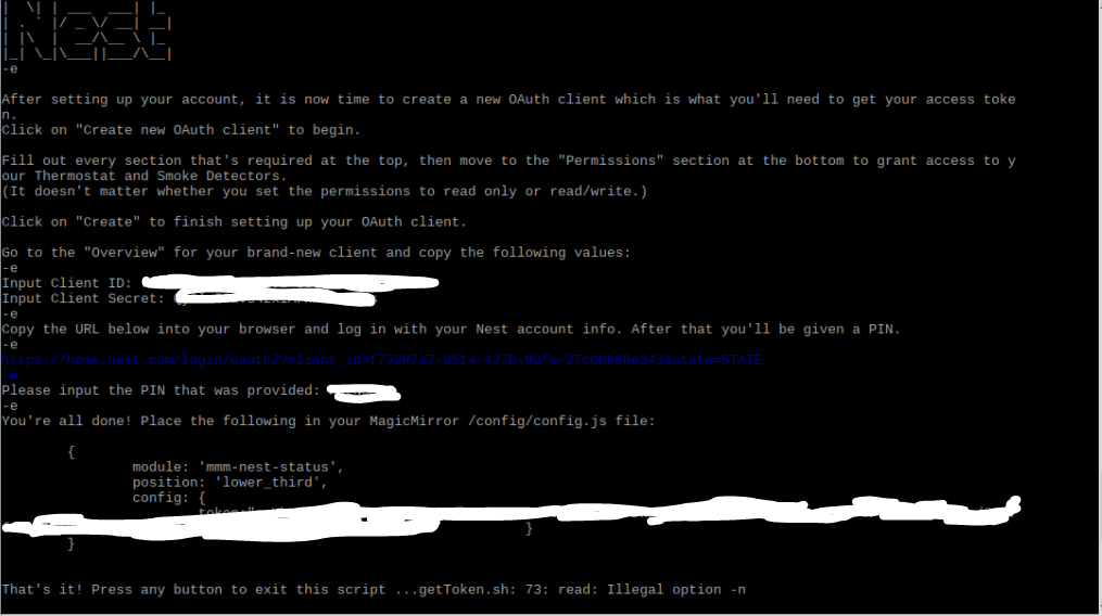
The issues that the token comes across as
token:"c.Ythenabunchofletters
thoseletterscontinue }
}
So my question is - is the "c. part of the token? I have tried copying the whole thing and it throws an error when reloading MM.
module: "mmm-nest-status",
position: "lower_third",
config:  {
               token:"c.Yblah
moreletters           }
}
I have tried copying the "c.yblah without an end quote and add a , and it throws an error.
token:"c.Yblah,When I run config:check in MagicMirror folder it says there are no syntax errors but when I reload MM it throws an error.
I have tried adding a " to the end and a , and MM loads, but my icon looks like this:
token:"c.Yblah",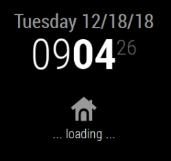
The README shows as an int for the type so I should not need the " ", but thats the only way to make MM load.I have also tried all of the above steps without the c. and it still shows the loading icon.
I apologize if this is something very simple that I just cannot figure out, so any help would be appreciated.
-
@phideltdexter said in MMM-Nest-Status - New module for your Nest thermostats and protect smoke detectors!:
Love the screenshots, its exactly what I am looking for for a dashboard. However I cannot get it to load. I have gone through as much troubleshooting as I can think of, including starting over from scratch with a new RPi image.
I go through the steps for setup and enter the numbers necessary from my Nest Developer account, PIN etc. It gives me the attached response with a token.

The issues that the token comes across as
token:"c.Ythenabunchofletters
thoseletterscontinue }
}
So my question is - is the "c. part of the token? I have tried copying the whole thing and it throws an error when reloading MM.
module: "mmm-nest-status",
position: "lower_third",
config:  {
               token:"c.Yblah
moreletters           }
}
I have tried copying the "c.yblah without an end quote and add a , and it throws an error.
token:"c.Yblah,When I run config:check in MagicMirror folder it says there are no syntax errors but when I reload MM it throws an error.
I have tried adding a " to the end and a , and MM loads, but my icon looks like this:
token:"c.Yblah",
The README shows as an int for the type so I should not need the " ", but thats the only way to make MM load.I have also tried all of the above steps without the c. and it still shows the loading icon.
I apologize if this is something very simple that I just cannot figure out, so any help would be appreciated.
So yours is like this try belows config just put in your token number
{
module: ‘mmm-nest-status’,
position: ‘bottom_left’, // pick whichever position you want
config: {
token: “c.XXXXXXXXXXXXXXXXXXXXXXXXXXXXXXXXXXXXXXXXXXXXXXXXXXXXXXXXXXXXXXXXXXXXXXXXXXXXXXXXXXXXXXXXXXXXXXXXXXXXXXXXXXXXXXXXXXXXXXXXXXX”,
displayMode: ‘all’,
displayType: ‘list’,
thermostatsToShow: ‘all’,
units: ‘metric’,
thermostatSize: ‘small’,
alignment: ‘left’,
// … and whatever else configuration options you want to use
}
}, -
@phideltdexter My bad - there’s a typo in the Read Me, the
tokenshould be astring, not anint(I have updated the module now to reflect this).Try this in your config:
{
    module: "mmm-nest-status",
    position: "lower_third",
    config: {
        token: "c.XXXXXXXXXX",
    }
},
where, of course, you replace
c.XXXXwith your actual token. -
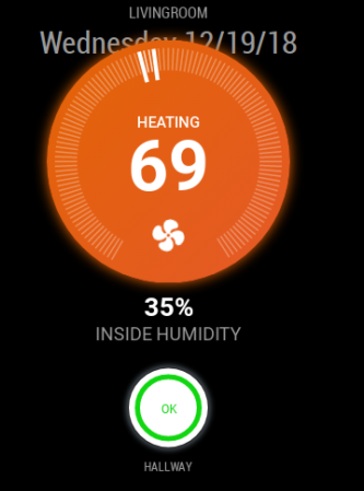
Just wanted to update you. I needed to update both the mmm-nest-status and MM overall and now it appears to be working fine. Thank you for your clarification!
-
@phideltdexter Great to hear - thanks for the update!
-
Would you have any way to add the outdoor temperature reading that the Thermostat has?
-
@phideltdexter said in MMM-Nest-Status - New module for your Nest thermostats and protect smoke detectors!:
Would you have any way to add the outdoor temperature reading that the Thermostat has?
Unfortunately, no - the outdoor temperature reading on a Nest thermostat isn’t actually coming from Nest; they send your location data to the Weather Channel (yes, really!) and then show the returned value on the thermostat itself.
As such, they don’t include the outdoor temperature as part of their API data.
-
Just wanted to announce that there’s a new version out of both my Nest modules!
I added functionality to support Paviro’s MMM-PIR-Sensor module meaning that the modules can now be suspended & resumed based on movement detected through a PIR sensor (or whatever else you’re using for motion detection).
Check out the release notes here:
https://github.com/michael5r/mmm-nest-status/releases/tag/1.4.0And for
mmm-nest-cameras:
https://github.com/michael5r/mmm-nest-cameras/releases/tag/1.1.0 -
This is my first module I am attempting to install, and keep getting a Nest API Error:null. Total noob here, but I have registered as a developer, obtained Nest token/pincode, and believe I input code correctly into config.js file per below.
module: "mmm-nest-status",
position: "top_right",
config: {
    token: "my8characterpinfromnest",
    displayType: "grid",
    displayMode: "all",
    thermostatsToShow: "all",
Any ideas how to resolve the API issue?
-
@eawalker1 If your token is 8 characters long, it’s not the correct Nest token. It should be a long-ass string that usually begins with
c.I think you’re confusing the token with the PIN you get from Nest.Did you run the
getToken.shbash script in the module? It has multiple steps - you start by entering theclient idandclient secretwhich then generates a URL you need to open in a browser to get a PIN.You then enter the PIN in the bash script and on the next screen, it should display your actual token.
-
@michael5r Nope, that did the trick. Thanks.
-
@eawalker1 said in MMM-Nest-Status - New module for your Nest thermostats and protect smoke detectors!:
@michael5r Nope, that did the trick. Thanks.
Great :thumbs_up:
-
thnx for your hard work ,i really like this module,but its not updating right.When i restart MM works fine for few hours and then stops updating.My token is working fine ,i use it also to my Openhab setup .Also my other modules are all updating fine.My config is :
{ module: "mmm-nest-status", position: "top_center", // pick whichever position you want config: { token: "c.xxxxxxxxxxxxxxxxxxxxxxxxxxxxxxxxxxxxxxxxxxxxxxxxxxxxxxxxxxxxxxxxxxxxxxxxxxxxxxxxxxxxxxxxxxxxxxxxxxxxxxxxxxxxxxxxxxxxxxxxxxxxxxxxxxxxxxxxxxxxxxxxxxxxxxxxx", displayType: "grid", displayMode: "all", thermostatsToShow: "all", updateInterval: "60000", showNames: true, thermostatSize: "medium", // ... and whatever else configuration options you want to use } -
@costascontis You configuration looks fine - the
updateIntervalis set to 60000, so it’s only pulling data every 10 minutes.What exactly do you mean that it “stops updating”?
Hello! It looks like you're interested in this conversation, but you don't have an account yet.
Getting fed up of having to scroll through the same posts each visit? When you register for an account, you'll always come back to exactly where you were before, and choose to be notified of new replies (either via email, or push notification). You'll also be able to save bookmarks and upvote posts to show your appreciation to other community members.
With your input, this post could be even better 💗
Register Login