Read the statement by Michael Teeuw here.
MMM-CalendarExt2
-
-
If I have same event in two calendars, can I use filter to filter out one of them? And if so, how is that done?
-
@jani-karna
It could not be easy if the events are totally random. But if there is a rule, it could be easier.For example, you have 2 calendars, “Tom” and “Jane” and there be duplicated events on both calendars and they have the same title - “coworking”.
In that case, you can filter them from one calendar like this;calendars : [ { name: "Tom", url: "...", }, { name : "Jane", url: "...", filter: (event) => { if (event.title.search("coworking") !== -1) { return false } else { return true } } }, ],This code would remove the events which have title “coworking” from calendar “Jane”
-
I am working my way through two issues. Icons are not showing up, and I cannot figure out how to set the maximum width. I have left the default icon from your example, as I can’t even get that to show.
Additionally, there is some blank space underneath the calendar, I suspect I need to set a maximum height to allow for only two events to show. Am I on the right track?
I am also stripping out the details of events so they will not be shown. Real Estate is at a premium, and I am trying to limit this to a specific width (I don’t know that number yet, but I like the default width chosen before any events with long titles extends it), and only the next two events on the calendar.
{ name: "All Sports", title: " ", mode: "upcoming", position: "bottom_right", locale: "en", maxItems: 2, filterPassedEvent: false, timeFormat: "h:mm A", calendars: ["Sports"], useEventTimeRelative: false, transform: (event)=> { if (event.title.search("UConn Men") > -1) { // If the event might include "Birthday" in its title, event.icon = "fxemoji-birthdaycake" // Set icon of that event to "fxemoji-birthdaycake" } return event // Return that event. }, transform: (event)=> { event.description = "" return event } }, ], calendars: [ { name: "Sports", url: "http://p25-caldav.icloud.com/published/2/MTkzMDY3NDkxMTkzMDY3NGCona3XQzhU1KfnWRGk8hK-bMw1Mvd4dCQ3Yp9tNU5USCACQcqmSFeSa3bQfVEyYrzVqH2TVzgLBXzPKzs1MtM", }, -
@feverlabs
You made some wrongs.- you’ve defined
transformtwice, so only the last will be executed. (That’s why your birthday cake icon is not shown) - The better way to remove details of agenda(upcoming/current) view is using CSS. add this into your
css/custom.css
.CX2 .agenda .eventSub { display:none; }- To remove beneath area, use
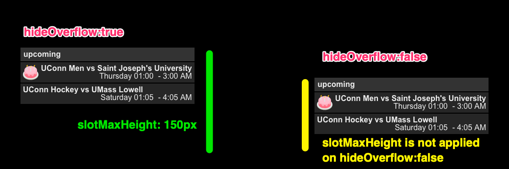
hideOverflow:false. Sorry for confusing.slotMaxHeightis somehow confusing naming. It really set the fixed height. It has only a sense onhideOverflow:true.
- you’ve defined
-
@Sean I think the blank space at the bottom is better.
The icons now show, so that’s great. Do you have a link to a list of the names of icons available in the set?After making those changes, the event details show again.
-
The icons now show, so that’s great. Do you have a link to a list of the names of icons available in the set?
https://iconify.design/icon-sets/
After making those changes, the event details show again.
add this into your
css/custom.css.CX2 .agenda .eventSub { display:none; } -
@Sean Sorry, I should have been more clear. I added that code into the custom css, but I just found an errant closing brace. Thanks.
Final part: how can I set the width on this?
Also, should I use a custom class for it?Thank you!
-
@feverlabs I think it would be this in custom css:
.CX2 .agenda .event { max-width:var(--column-max-width); } -
Final part: how can I set the width on this?
Also, should I use a custom class for it?You can globally control the basic size metric with this; (Hmmm. I think you’d better first read the GitHub wiki about this topic)
https://github.com/eouia/MMM-CalendarExt2/wiki/4.-Styling.CX2 { /* default values which are used frequently or dependently */ --row-min-width: 100px; --row-max-width: 1000px; --column-min-width: 300px; --column-max-width: 400px; --font-size: 16px; }For the specific view, you can set
classNameto a specific view, then can control it in css.
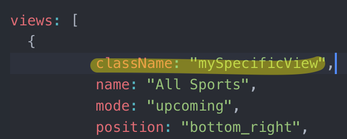
then, in yourcss/custom.css

Will show like this; Only specific view has different width;

But CSS is not so simple how it looks like, so when you modify something, you might need much experience and knowledge.
-
@Sean Yes, thank you. I made the following change in custom css:
.CX2 .agenda .event {
    max-width:290px;
}
This mad ether changes I was looking for. I’ll modify and try your solution as well as implement a class for it.
Is there a bottom padding that is specified? I don’t see much for padding in there, but I can experiment.
Thank you for your help.
-
@feverlabs
exactly, what kind of bottom? Image will be a help to understand. -
@Sean
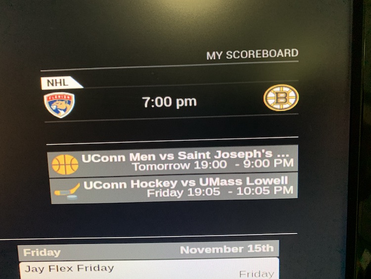
I am just looking to reduce that space on the bottom. Not entirely eliminate it, but reduce it.
You’ll also notice that the start time is in 24h format, the end time is in 12h?
-
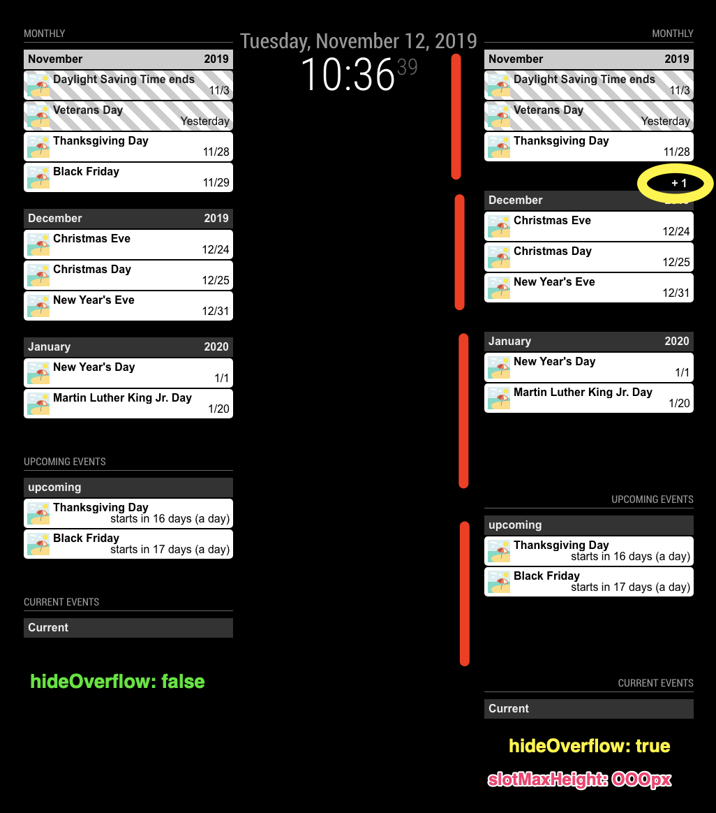
- Some footer is reserved for displaying counter of hidden events. (e.g:
+1)

The red area isslotFooter, so you can control it like this;.CX2 .mySpecificView .slot .slotFooter { display:none; }- For the time format;
Read this first;
https://github.com/eouia/MMM-CalendarExt2/wiki/Event-Time
With your previous config, you’ve set
timeFormat: h:mm A, but there be more. :D
Upcoming view is somewhat different with other views(e.g: daily view), so the events need date and time together.Usual format in upcoming view is something like this;
- If the event starts on a specific day and ends on the same day, it would be good to show like this;
start date/time - end time - If the event starts on a specific day and ends on the other day, it would be;
start date/time - end date/time - If the event is a fullday event and starts/ends in a day;
start date - If the event is a fullday event and ends in another day;
start date - end date
And those could be combined with relative format, humanized calendar format, … :) Looks so complex!
Anyway, so, you need to set
dateFormatanddateTimeFormatalso withtimeFormatSet like this;
dateTimeFormat: {
  sameDay: "[Today] h:mm A",
  nextDay: "[Tomorrow] h:mm A",
  nextWeek: "dddd h:mm A",
  lastDay: "[Yesterday] h:mm A",
  lastWeek: "[Last] ddd h:mm A",
  sameElse: "M/D h:mm A"
},
Or simply like this;
dateTimeFormat:"M/D h:mm A",It will show like this;
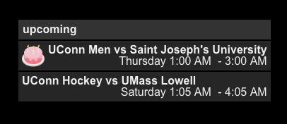
Or
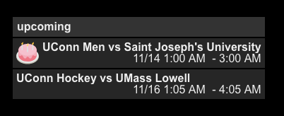
- Some footer is reserved for displaying counter of hidden events. (e.g:
-
@Sean Beautiful! Thank you very much!
-
I’m trying to use local .ics file for two of my calendars. They are holiday calendars that stay the same throughout the year so they don’t need to be fetched from the web. I just can’t get them to work.
I get the same error message on both of them:[CALEXT2] calendar: Suomen juhlapyhät >> write EPROTO 1936543760:error:1408F10B:SSL routines:ssl3_get_record:wrong version number:../../vendor/node/deps/openssl/openssl/ssl/record/ssl3:record.c:252:My url looks like this:
url: "https://192.168.1.187:8080/Pyhat.ics",I tried using
localhost:8080but it tried to force 127.0.0.1 which don’t work.
-
@jani-karna
Well, it’s not the issue of my module, anyway…
It seems, your RPI is not available to handle SSL of itself.
Can you open “https://192.168.1.187:8080/Pyhat.ics” or “https://localhost:8080/Pyhat.ics” on the browser of your RPI when MM is running?
Try “http” instead of “https” -
Have to see if the problem comes back after RPI reinstall. It seems my SD-card just came to the end of its life.
-
I finally had a chance trying this. By trying “https://192.168.1.187:8080/Pyhat.ics” with browser while MM is running I get “ERR_SSL_PROTOCOL_ERROR”. I have no idea how to solve this. “Localhost” gives a little different error, but so does MM. But neither of them work. I know it is not about your module, but if you have any suggestions I’d be glad to hear.
-
@jani-karna
tryhttpinstead ofhttps
Hello! It looks like you're interested in this conversation, but you don't have an account yet.
Getting fed up of having to scroll through the same posts each visit? When you register for an account, you'll always come back to exactly where you were before, and choose to be notified of new replies (either via email, or push notification). You'll also be able to save bookmarks and upvote posts to show your appreciation to other community members.
With your input, this post could be even better 💗
Register Login