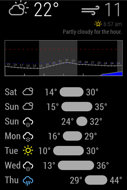
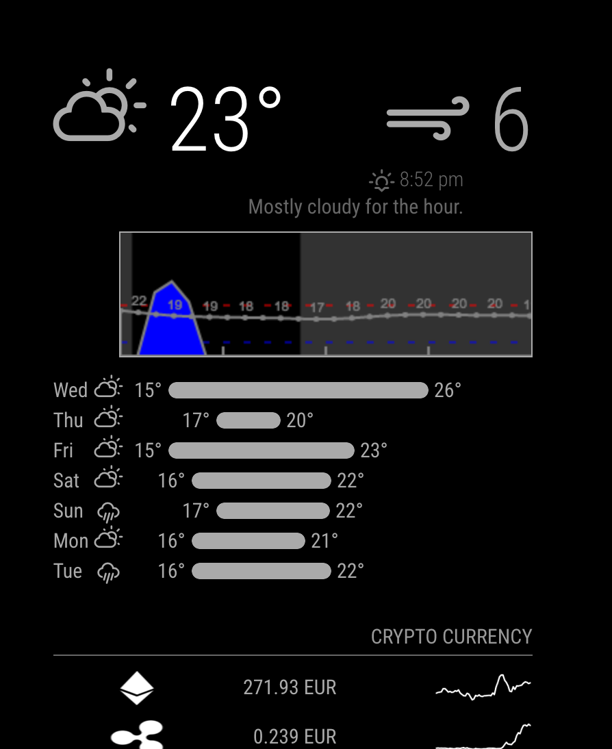
Got it :-)
Playing around with the Chrome inspector and fiddling with additional CSS classes, have it lined up nicely now.
Now the hard(er) part, the visualization changes.
Got it :-)
Playing around with the Chrome inspector and fiddling with additional CSS classes, have it lined up nicely now.
Now the hard(er) part, the visualization changes.
Thx for the quick reply! Yes, the crypto currency module also scales based on the width of the “top right” column of the mirror. Still have to fix that but up until now the other modules above and below were of narrower width.
Screen resolution could be it, I’m using a 24" monitor at native 1080p. I do remember that the sunrise/sunset, hourly forcast line above the graph and the days forcast below the graph were shifted to the left before I made changes but I’ll check to make sure.
Is there a way to “fix” the sunset/sunrise/hourly and the forecast days/bars in place instead of having it auto-scale?
-edit- : I freshly pulled @FlatPepsi and the days/bars and the sunrise/sunset/hourly forecast are shifted to the left as shown in my original picture.
Also pulled @dmcinnes repo and that seems to outline the way I like to see it. Looking at a diff between the files the table generate section seems the same.
The mirror project for me is to work on my coding skills as well (which do need a lottttttt of work :-) ) so pls bear with me when I ask something that might be obvious :-)
@dmcinnes @FlatPepsi Love the module and the changes to it so I forked it. Also made a couple of changes to it (revert back to 24h, hot/freeze lines in metric and have a couple more visual changes I’d like to do).
Anyway, this topic is old so hope you guys still see this now. Could you help me out or point me in the right direction on how the forecast table and bars is build up?
On my mirror the days and bars seem to have shifted one column to the left and do not line up nicely under de graph
@FlatPepsi has it like this:

and mine is like so:

Also the sunset/sunrise and line below are “moved” to the left. Now I did a diff between @FlatPepsi and @dmcinnes code and the table build seem to be the same.
Hope you can help me or point me in the right direction to get it nicely lined out underneath the graph.