Read the statement by Michael Teeuw here.
MMM-PublicTransportHafas from KristjanESPERANTO
-
Hi @KristjanESPERANTO
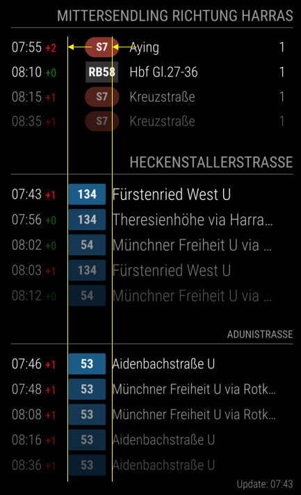
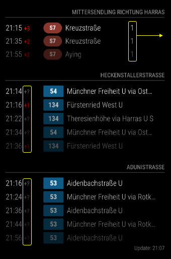
First of all thank your for further developing and maintaining this moduel. I used and older version from @raywo up to now but changed to your updated fork just lately.I got everything perfectly working the only thing I cannot manage is the identical orientation of the line symbols. As you see from the picture I’m using the same module 3 times for displaying the departures of 3 different stops in my neighborhood. Due to my personal design preferences all moduels are the aligned to the right hand side of my mirror. Can you tell me what I have to modify to get a nice left-aligned orientation of all line symbols as well as of the destination names within the particulat columns? I tried to symbolize it with the lines and arros in the picture below.

Thank you
Ben -
@onkelbobby
Hi Ben, I assume you listed the modules several times at the same position in your config.js!?!?!?
I had the same effect when i used top_left for two instances of the module.
Now I changed the second to bottom_left and the symbols are at the same column. You should give it a try.Greetings
Thomas -
Thank you for this hint… I’ll try it once I’m back from my business trip.
-
Hi @onkelbobby,
nice that you use my fork :slightly_smiling_face:
The reason why the columns have different widths is that you enabled the platform in the first module and not in the others. The simplest option would be to display the column for the second and third module as well. But maybe that doesn’t make sense with this two stops, then you could try the approach of setting the width in your custom.css like this:
table.mmm-pth-table { width: fit-content; } .mmm-pth-time-cell { width: 10ch; } .mmm-pth-sign { width: 6ch; } -
thank you @KristjanESPERANTO for your reply and sorry for my late response due to my business trip.
I just implemented your recommendation into styles.css and it worked great. The only thing that’s now different is how to arrange the track number that it is aligned to the right?

Maybe you also have an idea how to solve why all of a sudden several delay times are displayed as “?”
thank you for your great help
-
Try it with that addition to your CSS file:
.mmm-pth-platform-cell  {
width: 3ch;
}
I’ve never noticed the question mark before. I assume that this is displayed when no real time data is available. I just tried it with Adunistraße and didn’t see a question mark. The problem was probably only temporary on the API side.
-
@KristjanESPERANTO
thanks again but unfortunately this did not help. It increases the space between the platform number and the right edge but does not move the platform number to the right. Even if I add.mmm-pth-platform-cell { width: 3ch; text-align: right; }it will stay same.
the question marks indeed traced back to the API. they disappeared the next day.
Hello! It looks like you're interested in this conversation, but you don't have an account yet.
Getting fed up of having to scroll through the same posts each visit? When you register for an account, you'll always come back to exactly where you were before, and choose to be notified of new replies (either via email, or push notification). You'll also be able to save bookmarks and upvote posts to show your appreciation to other community members.
With your input, this post could be even better 💗
Register Login