Read the statement by Michael Teeuw here.
PIR / MQTT - Presence sensor(s) revived
-
@sdetweil Thanks.
I’ve excluded this file from git tracking so the pull should work.
Warm regards,
Ralf -
Dear @htilburgs,
it seems, we are in the same time-zone :-) wouldn’t be surpised even same mother-tongue …Nevertheless, thank you for your patience and the detailed logs — they were extremely helpful in tracking this down.
What we found
The module works perfectly on my system (Pi 5, Debian Trixie, Wayland/labwc, MagicMirror 2.34.0), so we did an intensive
deep-dive comparing your setup, your MMM-Pir configuration, and your MMM-PresenceScreenControl configuration to understand why
the screen comes back after ~6 seconds on your system.The key clue came from your own working MMM-Pir config:
mode: 3
waylandDisplayName: "wayland-0"
MMM-Pir mode 3 uses wlr-randr — the same tool you configured for MMM-PresenceScreenControl. But there’s a critical difference:
MMM-Pir internally sets WAYLAND_DISPLAY=wayland-0 (from your waylandDisplayName parameter) before calling wlr-randr.Your MMM-PresenceScreenControl config, on the other hand, uses:
onCommand: "DISPLAY=:0 wlr-randr --output HDMI-A-1 --on --mode 1920x1080 --transform 270",
offCommand: "DISPLAY=:0 wlr-randr --output HDMI-A-1 --off",
wlr-randr is a Wayland tool — it communicates with the Wayland compositor via the WAYLAND_DISPLAY environment variable.
DISPLAY=:0 is an X11 variable and is meaningless to wlr-randr. Without the correct WAYLAND_DISPLAY, wlr-randr falls back to
guessing the socket, which results in the unstable behavior you’re seeing: the screen turns off but comes back after ~6
seconds.This also explains why your system info shows WAYLAND_DISPLAY: undefined — MagicMirror/Electron doesn’t have it set, so any
screen command executed from the module needs to provide it explicitly.The fix
Replace DISPLAY=:0 with WAYLAND_DISPLAY=wayland-0 in your config. You have two options:
Option A: wlr-randr (matching your working MMM-Pir setup)
onCommand: "WAYLAND_DISPLAY=wayland-0 wlr-randr --output HDMI-A-1 --on --mode 1920x1080 --transform 270",
offCommand: "WAYLAND_DISPLAY=wayland-0 wlr-randr --output HDMI-A-1 --off",
This is the minimal change — same tool, same parameters, just the correct environment variable.
Option B: wlopm (recommended, more robust)
wlopm is purpose-built for display power management on Wayland. Unlike wlr-randr --off (which removes the output from the
compositor layout), wlopm --off uses the Wayland power management protocol (DPMS-level) — it turns the display hardware off
without affecting window layout. This is what I use on my system.First install it (it’s in the Trixie repos):
sudo apt install wlopmThen configure:
onCommand: "wlopm --on HDMI-A-1",
offCommand: "wlopm --off HDMI-A-1",
Note: wlopm doesn’t need WAYLAND_DISPLAY explicitly — the default fallback to wayland-0 works reliably on Trixie. And since
wlopm controls hardware power state, it doesn’t need --mode or --transform on the on command — the display simply wakes up with
its previous settings intact.For reference, the https://github.com/Jopyth/MMM-Remote-Control/blob/master/docs/guide/monitor-control.md documents wlr-randr
as the recommended Wayland screen control option, including the hint to set WAYLAND_DISPLAY if needed.About the startup behavior (screen stays on)
You mentioned the screen stays on after MagicMirror starts until you trigger the PIR. The startup fix from commit 39d28d6 does
work — it turns the screen off ~1 second after startup. But since your offCommand wasn’t working correctly (the DISPLAY=:0
issue), the screen appeared to “stay on.” Once you fix the command, the screen should turn off shortly after startup if nobody
is in front of the PIR.You also asked: “Why not the time from counterTimeout?” — That’s a fair point. On my system, counterTimeout is 600 (10
minutes), so turning off after 1 second is the desired behavior — I want to see that the restart worked, but not wait 10
minutes. For your setup with counterTimeout: 30, having 30 seconds of screen-on after startup would make more sense.I’m planning a new config parameter startupGracePeriod that lets you define how long the screen stays on after module start
before the presence logic kicks in. This way each user can choose independently of their counterTimeout. I’ll include this in a
future release.Upcoming improvement: cronMonitor efficiency
While investigating your issue, I discovered that the internal cron monitor (which checks for always-on/ignore time windows)
sends updates to the frontend every second, even when nothing has changed and the screen is off. This causes unnecessary DOM
rebuilds and is inefficient, though it’s not the cause of your screen-comes-back problem. I’ll fix this in the next release to
make the module quieter after screen-off.About the debug logging
Now that we’ve identified the root cause, you can set debug: “off” in your config again. The debug output you saw (gpiomon
lines in pm2 logs) comes from the PIR library and goes to the console. The module’s own debug logging (updatePresence,
startCounter, updateScreen, etc.) intentionally writes to a separate log file (MMM-PresenceScreenControl_local.log in the
module directory) rather than to pm2 logs. This keeps the debug output focused and separated from the noise of all other
modules — much easier to analyze when troubleshooting a specific issue. If you ever need to debug the module again, check that
file instead of pm2 logs.Summary
- Screen comes back after 6 seconds: Replace DISPLAY=:0 with WAYLAND_DISPLAY=wayland-0 (Option A), or switch to wlopm (Option
B) - Screen stays on after startup: Should be fixed once Option A or B is applied. A startupGracePeriod parameter is planned for
a future release. - Log prefix [MMM-Pir]: Already fixed in your version ✓
Please let me know if Option A or B resolves the screen-comes-back issue!
Warm regards,
Ralf - Screen comes back after 6 seconds: Replace DISPLAY=:0 with WAYLAND_DISPLAY=wayland-0 (Option A), or switch to wlopm (Option
-
@rkorell
I live in the Netherlands.I’m Currently at the office, but I Will test it this evening and give you the results.
-
@htilburgs :-) OK, nearby - Germany …
Thanks for testing/feedback!Ralf
-
@rkorell
Oke, done some testing:
With the ‘new’ strings, I get:onCommand: "WAYLAND_DISPLAY=wayland-0 wlr-randr --output HDMI-A-1 --on --mode 1920x1080 --transform 270", offCommand: "WAYLAND_DISPLAY=wayland-0 wlr-randr --output HDMI-A-1 --off",[ERROR] [MMM-PresenceScreenControl] [updateScreen] ERROR: Error: Command failed: WAYLAND_DISPLAY=wayland-0 wlr-randr --output HDMI-A-1 --on --mode 1920x1080 --transform 270 unknown output HDMI-A-1Why this message, I don’t know.
After a reboot this message didn’t show again.Then I stopped MagicMirror and did the same command from the commandline
WAYLAND_DISPLAY=wayland-0 wlr-randr --output HDMI-A-1 --offAfter 6 seconds my display comes on again.
So it isn’t coming from MagicMirror, but from my system.
I created a simple Python3 script to turn off and on my monitor. Same problem.Next step:
I took a new SD Card and installed a fresh copy of Trixie.
Didn’t do anything else, no updates or something else and tried again withWAYLAND_DISPLAY=wayland-0 wlr-randr --output HDMI-A-1 --offfrom the command prompt.
Display goes off and after 6 seconds back on again.
So I excluded MagicMirror. What else can it be?Next step:
I took an other RPI4b with the new SD Card from previous step. Repeated the test, but still same result. Monitor goes on after 6 seconds. So it is not MagicMirror, not the RPI. But why it works with MMM-PIR and not with MMM-PresenceScreenControl. It is still a riddle for me.Next step:
Original RPI with original SD Card and installed MMM-Universal-Pir. Same result, after 6 seconds screen on.
So I excluded MagicMirror, SD Card, Trixie installation and RPI. It must have something to do with my monitor?!?
Did something happen? Not that I know.After doing a search on the big WWW, I found an interesting article that described exact the same issue I was having.
https://forums.raspberrypi.com/viewtopic.php?t=363966So I searched for my RemoteControl and search for a setting
that automatically scan its input sources (not easy if your MagicMirror screen is rotated 270° ;-)
And I found this setting and indeed it was standing on auto scan. I put it on HDMI as only source and tried it again:YES, IT IS WORKING!!!
And even better than before, now my monitor turns completly off after 15 min. of no signal. So instead of using 75W when on, 26W in standby, it now uses 0W after 15 minutes (it’s a setting on the monitor).
Activating the PIR, it turns back on!So with this I hope that if somebody else has this problem, they can solve it to.
Ralf, thanks for all the help and trying to solve it with me.
I’m looking forward for the startupGracePeriod parameter and think this is going to make the module fully as I like it.
Thank you for your great work with this module and a grownup replacement for MMM-Pir!!! -
YES, IT IS WORKING!!!
I’m SO happy.
Great news - congratulations…
So at least your stubborn issue leds to several code enhancements - during my investigation regarding your symptoms I had the chance to identify some optimization potential, so code is much cleaner now.
Thanks for this gentle “push”.Warmest regards,
Ralf -
@rkorell your welcome…;-)
-
I’m looking forward for the startupGracePeriod parameter and think this is going to make the module fully as I like it.
Good news — your wish came true faster than expected! 😊
v1.5.0 is released and includes the startupGracePeriod parameter you were looking forward to.
How to update:
cd ~/MagicMirror/modules/MMM-PresenceScreenControl
rm -rf node_modules
git pull
npm install
Then add to your config:
startupGracePeriod: 30, // seconds to keep screen on after startupSet it to however many seconds you want the screen to stay on after a restart — enough time to
verify everything came up correctly. After the grace period, normal presence logic kicks in. If
your PIR detects you during the grace period, it seamlessly switches to the regular countdown
timer.Also included in v1.5.0:
- logFileName parameter — debug output now goes to pm2 logs by default (no more hidden log file)
- Several internal fixes found during a code quality review
Full changelog in the README.
Enjoy! 🎉
Warm regards,
Ralf -
@rkorell
Hi Ralf, I implemented the new version and parameter.
It works great!I’m now playing with the CSS.
Made the bar smaller (50%) rounded edges and alligned the counter at the left of my screen.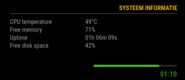
For those who like this setup, just add following in ~/MagicMirror/css/custom.css
/* MMM-PresenceScreenControl */ .psc-linebar { width: 50%; height: 5px; background: #222; border-radius: 4px; margin: 6px 0 6px 0; overflow: hidden; margin-left: auto; margin-right: 0; } .psc-bar { height: 100%; width: 100%; border-radius: 4px; transition: width 0.4s ease, background 0.4s ease; box-shadow: 0 0 6px currentColor; } .psc-timer { font-size: 16px; margin-top: 4px; margin-bottom: 2px; letter-spacing: 1px; text-align: right !important; } -
@htilburgs cool!
happy, that you are satisfied!Warm regards,
Ralfinteresting that you are poistion this counterbar on thr right side of the screen.
For me it feels/looks more natural on the left side.
May this is the reason for my “acceptance” of the colorFrom / colorTo - “mismatch” you had reported … -
@rkorell
My current mirror
This is why I have it on the right. For me this feels better.
On the left side there comes the Spotify information, when I play music.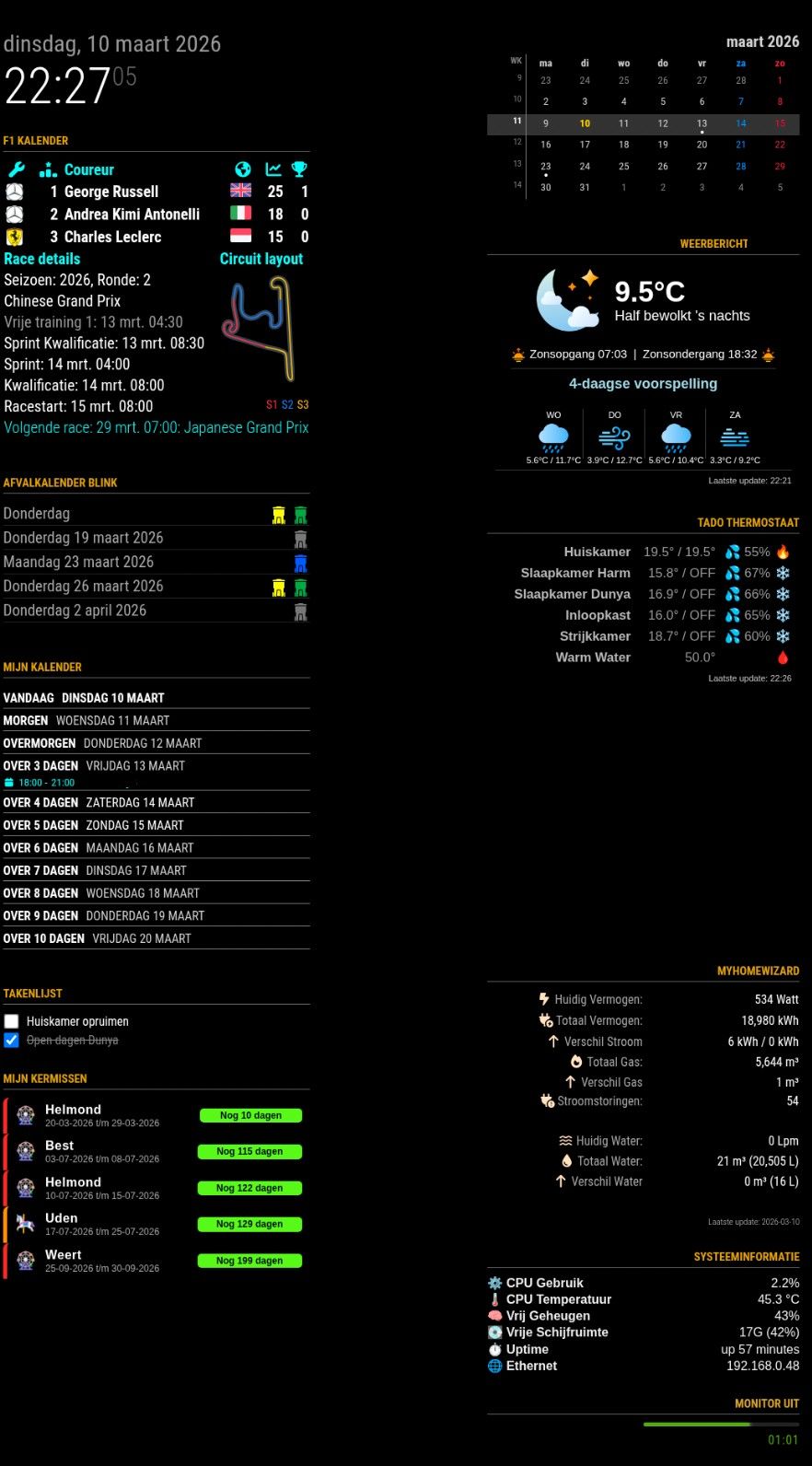
-
@htilburgs

I have a quite similar layout.
My MusicPlayer (Volumio) is on the left side, too but is spreading the region if cover-art is appearing…
Warmest regards,
Ralf -
@rkorell
I see you’re even using one of my Modules (MMM-MyGarbage)My MusicPlayer (Volumio) is on the left side, too but is spreading the region if cover-art is appearing…Did you do something special for this, or is this an option in de Module?
Because when MMM-OnSpotify appears, it just go over everything that is standing there.
So for now I’ve disabled it and looking for a solution. -
Dear @htilburgs,
Yes, I Like your garbage module - it’s really great - thanks for this!
I’m using MMM-NowPlayingOnSpotify …
This has exactly the behavioour as described.
Shows a spotify logo - which I had replaced with Volumio logo (which is my favourite spotify player) and only expands if something is played.
In this case the left corner looks like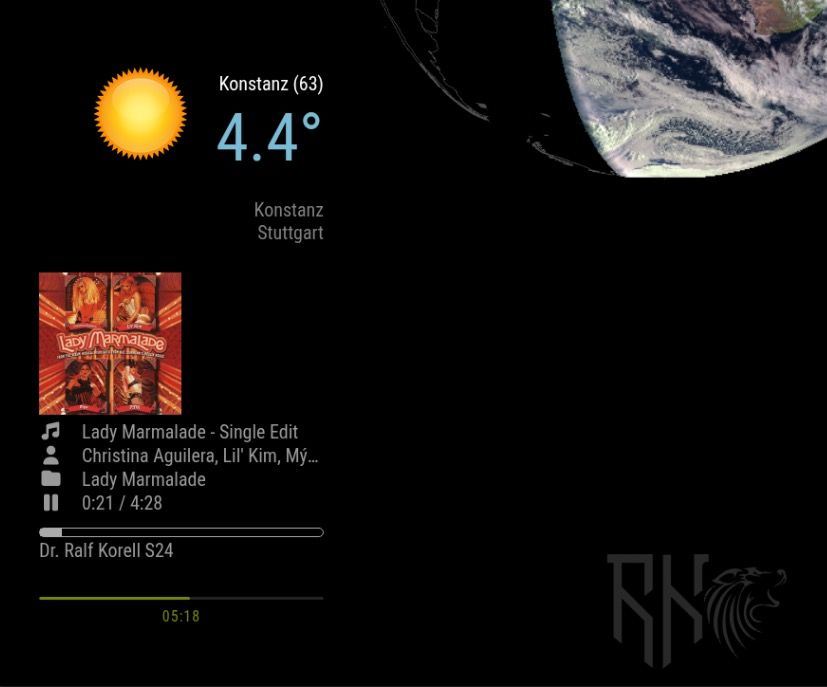
Warm regards,
Ralf -
I’ve just seen that you had invented a solution for your problem - MMM-HideModulesOnSpotify :-)
Cool!Ralf
-
@rkorell
That’s correct!
At the end, because it currently just works with MMM-OnSpotify, it was not so difficult.I Will look into this in the near future to support other Player also.
-
MMM-PresenceScreenControl — two new releases (ecoMode + Notification API)
Dear all
a small but meaningful round of updates for MMM-PresenceScreenControl just landed on main. Both started from a single GitHub issue, so I thought I’d write up the chain of reasoning rather than just drop a changelog — maybe useful for anyone evaluating a migration from MMM-Pir, and definitely useful as a reminder to myself to check the parent project’s feature surface more carefully when forking.
Part 1 — ecoMode (Issue #5)
Rocket78 opened issue #5 with a really well-argued request: even with the screen physically off, Electron keeps repainting hidden DOM. On a Pi 3 with X11, MMM-PresenceScreenControl was leaving things like Newsfeed cross-fades running every 20 seconds — and those repaints showed up clearly as CPU spikes in his graph. He asked for an equivalent of MMM-Pir’s ecoMode, which hides every other module while the screen is off, so the browser skips layout/paint/composite for them.
So I built it, but tried to keep it lean:ecoMode: false, // opt-in, default off → no surprise ecoModeIgnore: [] // module names to keep visibleImplementation notes that might interest other module authors:
Rocket78 also dropped a great ddcutil snippet in the issue for monitors that show a “no signal” splash when the video output is cut — that splash is genuinely immersion-breaking, and ddcutil setvcp D6 sends the actual DDC/CI power command, which is much closer to pressing the hardware power button:
onCommand:  ddcutil setvcp D6 1 --skip-ddc-checks
offCommand: ddcutil setvcp D6 5 --skip-ddc-checks
Added to the README’s offCommand examples. The --skip-ddc-checks is needed because some monitors stop responding to DDC queries when powered off but still process incoming power-on commands — so the check would fail before the command is even sent.
→ Issue #5 closed, commit 42b68a6.
Part 2 — what else did I miss?
Closing the issue could have been the end of it. But Rocket78’s request raised an uncomfortable question: I never used ecoMode in MMM-Pir myself, so I didn’t notice it was missing. What else did I overlook when reviving MMM-Pir?
Three items jumped out as actual gaps that other modules in the ecosystem could legitimately depend on:
-
MMM_PIR-USER_PRESENCE — MMM-Pir broadcasts this notification on presence transitions. Other modules (Remote-Control, voice assistants, smart-home bridges) can listen for it.
-
MMM_PIR-WAKEUP / LOCK / UNLOCK / END — incoming notifications that let other modules control the screen logic externally.
-
MMM_PIR-SCREEN_POWERSTATUS — broadcast when the physical screen turns on or off.
Without these, anyone migrating from MMM-Pir to my fork would suddenly find their automations dead — because they’d be listening for MMM_PIR-USER_PRESENCE and nothing was coming through. Even worse, they wouldn’t know why it stopped working; the screen-on/off behavior would seem fine, but cross-module integration would be silently broken.
So I built a parallel notification API, namespaced MMM_PSC-* rather than impersonating MMM-Pir’s MMM_PIR-*:
Outgoing notifications — emitted on state transitions only:
MMM_PSC-USER_PRESENCE       payload: true / false
                            fires when combined presence changes

MMM_PSC-SCREEN_POWERSTATUS  payload: true / false
                            fires when physical screen turns on/off
Both fire only on actual transitions — no spam every poll cycle.
Incoming notifications — consumed by the module
MMM_PSC-WAKEUP   wake screen, reset timer (equivalent to a touch)

MMM_PSC-END      force screen off immediately

MMM_PSC-LOCK     freeze presence handling — sensors are still tracked internally, but no longer change screen state

MMM_PSC-UNLOCK   resume normal presence handling and re-evaluate the current sensor state
Implementation detail worth flagging: the LOCK guard sits in updatePresence(), which is the single funnel through which all sensor inputs (PIR, MQTT, touch, external wakeup socket) eventually pass. So whatever the trigger source, it’s correctly suppressed while locked. UNLOCK calls updatePresence() again, which re-evaluates the current sensor state — so if you’ve unlocked while a person is still in front of the PIR, the screen comes back on immediately. No need for the caller to send a WAKEUP after UNLOCK.
Useful patterns this enables:
// Wake the mirror when a doorbell event arrives:
this.sendNotification("MMM_PSC-WAKEUP");

// Force-off cleanly from outside (smart-home rule, etc.) without
// bypassing the module and going straight to the screen command:
this.sendNotification("MMM_PSC-END");

// Take exclusive control of the display for a video call,
// then hand it back when done:
this.sendNotification("MMM_PSC-LOCK");
// ... your module is showing its full-screen content ...
this.sendNotification("MMM_PSC-UNLOCK");
END is the clean way to force-off the screen from outside without touching offCommand directly — the module’s internal state stays consistent, all the right outgoing notifications still fire, and any other listeners (logging, analytics, smart home) see the transition.
Tested live end-to-end via MMM-Remote-Control’s notification API:
curl -X GET "http://localhost:8080/api/notification/MMM_PSC-LOCK"
curl -X GET "http://localhost:8080/api/notification/MMM_PSC-END"
    → screen off, stays off
curl -X GET "http://localhost:8080/api/notification/MMM_PSC-WAKEUP"
    → ignored (locked)
curl -X GET "http://localhost:8080/api/notification/MMM_PSC-UNLOCK"
    → screen back on
All four routes verified, log trace clean, outgoing notifications fired in the right order on every transition.
→ Commit 10000ca.
Update / install
If you’re already on the module:
cd ~/MagicMirror/modules/MMM-PresenceScreenControl
rm -rf node_modules
git pull
npm install
Both changes are backwards-compatible. ecoMode is opt-in (default false), and the new notifications are additive — nothing existing is modified. So you can update without touching your config and pick up only what you need.
A genuine thank-you to Rocket78 for the well-reasoned issue and the ddcutil tip — it triggered the full audit, which in turn closed a much bigger latent gap.
Exactly the kind of feedback that improves a fork. If you’ve migrated from MMM-Pir and notice anything else missing that you’d consider load-bearing, please open an issue.
Hope you find it useful.
Warmest regards,
Ralf -
-
For some reason, my mirror is not able to turn on thru MQTT. Below is most of the detail from the log file. MQTT explorer is showing that HomeAssistant is publishing via MQTT “true”. Do you have any suggestions?
[2026-05-22T21:32:28.750Z] PresenceControl: Received config: {“mode”:“MQTT”,“pirGPIO”:4,“mqttServer”:“mqtt://192.168.4.160:1883”,“mqttTopic”:“sensor/presence”,"mqttPayloadOccupancyF>
[2026-05-22T21:32:28.910Z] PresenceControl: [updateScreen] on=true, cmd=“wlopm --on HDMI-A-2”
[2026-05-22T21:32:29.211Z] PresenceControl: [updateScreen] SUCCESS: executed “wlopm --on HDMI-A-2”
[2026-05-22T21:32:29.357Z] PresenceControl: [updatePresence] pirPresence=false, touchPresence=false, presence=false, newPresence=false, locked=false
[2026-05-22T21:32:29.359Z] PresenceControl: Subscribed to MQTT topic: sensor/presence
[2026-05-22T21:33:02.189Z] PresenceControl: [startCounter] Counter expired: presence=false, pirPresence=false, calling updateScreen(false)
[2026-05-22T21:33:02.190Z] PresenceControl: [updateScreen] on=false, cmd=“wlopm --off HDMI-A-2”
[2026-05-22T21:40:24.572Z] PresenceControl: [updatePresence] pirPresence=false, touchPresence=false, presence=false, newPresence=false, locked=false
[2026-05-22T21:40:25.575Z] PresenceControl: [startCounter] Counter expired: presence=false, pirPresence=false, calling updateScreen(false)
[2026-05-22T21:40:25.576Z] PresenceControl: Counter expired, set presence to FALSE and stopped timer. -
Dear @atwist,
first of all apologies for long delay - I was on vacation and offline.
A small disclaimer upfront: I haven’t seen your actual MQTT traffic, so the following is a hypothesis based on the log excerpt you posted. It fits the symptoms cleanly, but please verify before changing anything.
What I see in your log:
- The module connects to the broker fine
- It subscribes successfully to
sensor/presence [updatePresence]fires (so messages ARE arriving — otherwise you wouldn’t see those entries triggered)- But no parse error is logged, which means JSON.parse() did not throw
- The result is consistently
mqttPresence=false, screen turns off after the counter or even never turns on.
Most likely cause: HomeAssistant publishes the value
truedirectly (a JSON primitive), not a JSON object like{"presence": true}.
The module currently expects an object and reads the field onfigured inmqttPayloadOccupancyField(default: “presence”).JSON.parse("true")succeeds and returns the booleantrue, buttrue["presence"]isundefined— which evaluates to no presence.
No exception, no parse error log, just silent false.Quick way to verify what HA actually sends:
mosquitto_sub -h 192.168.4.160 -t sensor/presence -vThat’ll print one line per message. You’ll see exactly what arrives.
If the payload turns out to be a bare value (justtrue,"ON", etc.), there are two paths forward:Either:
1. Update the module — I just pushed support for bare-string payloads exactly because of this case:cd ~/MagicMirror/modules/MMM-PresenceScreenControl git pullThen add to your module config:
mqttPayloadOn: "true"(or whatever HA actually publishes —
"ON","on", etc.; check with the mosquitto_sub command above). With this set, the module compares the raw MQTT payload exactly against your string. Match → presence detected. Anything else → no presence.Or:
2. Configure HA to publish a JSON object like{"presence": true}/{"presence": false}instead of the bare value (e.g. via thepayloadtemplate of your MQTT publish action). Then your existing config works unchanged.The new release also adds two diagnostic improvements that would have made this immediately visible:
- A new
[MQTT] received (field/bare mode): mqttPresence=true/falselog line on every message (debug level “complex”) - The
[updatePresence]line now includesmqttPresence=alongside the other sources
Sorry for the silent-fail behavior in the previous version — that’s been a documentation gap as well as a feature gap. Let me know if my hypothesis turns out to be wrong; if HA publishes something else entirely, the diagnosis would change.
Good luck.
Warmest regards,
Ralf -
That got me fixed up!. Thanks!
Hello! It looks like you're interested in this conversation, but you don't have an account yet.
Getting fed up of having to scroll through the same posts each visit? When you register for an account, you'll always come back to exactly where you were before, and choose to be notified of new replies (either via email, or push notification). You'll also be able to save bookmarks and upvote posts to show your appreciation to other community members.
With your input, this post could be even better 💗
Register Login