Read the statement by Michael Teeuw here.
Dark Material UI
-
Hi Mirror-Lovers :)
I was wondering if anyone besides me would like to see a UI that is oriented towards a dark Material UI theme. I´m thinking of dark boxes (–> cards) with subtle shadows instead of the currently used “white (or colored) text on black”.
Since my explanation is probably not very vivid, here is a dribble of a weather card:
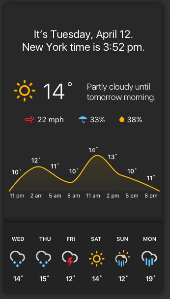
(source: https://dribbble.com/shots/2762058-Magic-Mirror/attachments/562504)I´m still waiting for my mirror glass, but in my imagination this looks quite nice :D
What do you think? Maybe we can create a “Dark Material UI Theme” as an alternative to the current UI.I´m certainly not a CSS ninja, but I´d definitely help to make this happen :thumbsup:
-
@sero well, the reason there is mostly white on black is because the mirror glass usually eats up all the small changes in dark colors.
In my case with very little light transmission your idea wouldn’t show at all,
High contrast interfaces usually gives the best smartmirror appearence at the moment.
-
@broberg said in Dark Material UI:
@sero well, the reason there is mostly white on black is because the mirror glass usually eats up all the small changes in dark colors.
In my case with very little light transmission your idea wouldn’t show at all,
High contrast interfaces usually gives the best smartmirror appearence at the moment.
Thanks for your reply @broberg!
Yes, you are right. The colors of my example are probably to dark - I just thought, that slightly lighter colors might be visible and create the effect I´m looking for. -
@sero yeah, adjusting for the lost light through the mirror should give a similar effect, and as stated, it all depends on the mirrors light transmission, a 30-40% mirror would probably display most of the dark colors without any issues.
-
I think to move the current UI to other aspect the clean route its not the way. If we want reach this goal is add support for multi themes on MagicMirror.
Hello! It looks like you're interested in this conversation, but you don't have an account yet.
Getting fed up of having to scroll through the same posts each visit? When you register for an account, you'll always come back to exactly where you were before, and choose to be notified of new replies (either via email, or push notification). You'll also be able to save bookmarks and upvote posts to show your appreciation to other community members.
With your input, this post could be even better 💗
Register Login