Read the statement by Michael Teeuw here.
Is it possible to have CSS for normal screens and a custom CSS for 7in screen?
-
Currently I do not have a custom CSS defined. Only using default CSS.
What I would like to do is determine screen size and if large screen use my existing CSS.
If 7" screen (or smaller) I only want to display clock, current weather, and forecast vertically. -
@Radnor you could write a script to start magic mirror (in place of the script we use today)… and have two css and two config.js, renaming/copying per the requirements (I would copy over every time, then i can’t get out of synch)
you could add code to config.js and make variables u set for small/large and use those to turn on/off the disabled value for selected modules.
nothing exists out of the box,
I think the xrandr command will tell you the size of the display
xrandr -q| grep connectedreturns (for my dual monitor system)
DVI-I-1 connected primary 1920x1080+0+0 (normal left inverted right x axis y axis) 598mm x 336mm
DVI-D-1 connected 1920x1080+1920+0 (normal left inverted right x axis y axis) 521mm x 293mm
on my pi4 with 4k tv
xrandr --display :0 -q | connected is HDMI-1 connected primary 3840x2160+0+0 (normal left inverted right x axis y axis) 708mm x 398mm -
@sdetweil thank you for the reply. But I think I lead you down the wrong path looking for my solution…
I have MM running on a RPI it’s started by a small script running “npm start”. There it displays all of the info I am looking for. Works GREAT!!!
When I connect to it from a DIFFERENT machine is where I want to detect the screen size and adjust accordingly.
Typing the address in as xxx.xxx.xxx.xxx:8080 from my laptop display all info (same as RPI). But, if I connect and the screen is small (phone, kindle fire, 7" screen, etc) just show time, date, weather, and forecast.I started down the path of (window.size in js) but made my config file very angry. Did not try @media in css yet.
With the COVID and the stay at home thing, have lots of time to explore…
Thank you again and be safe!
-
@Radnor ah well, THAT is a completely different kind of problem.
config is loaded for each browser, just once for the node_helpers
u can turn off modules by setting their disabled property to true
and config.js is code, SO you could do thisthere is a variable available at config load time outerWidth (and outerHeight)
so you could use them to programatically set disabled true and change positions
var small_size=800   // this in front of config=
                                   // rather than coding 800 in all the spots, only one place to change it
for example
{
   module: calendar,
   position: outerWidth == small_size ? 'upper_right':'upper_left',
   disabled: outerWidth == small_size ? false:true,
   config:{
      ...
      ...
   }
}
if u change the main.css to use view size instead of fixed pixels the screen can shrink to fit…
(i have a view based main.css if u want to try it)
every module may have to be modified for view size -
@sdetweil I will try that little later today. Yes, I like the idea of setting a var too.
-
@sdetweil In my config.js file I tried screen.width outerWidth with no luck. Would you mind some code from your main.css?
Tried window.xxxxx too without luck.
-
@Radnor exactly as my sample shows… no screen, no window
just outerWidth (case sensitive)
-
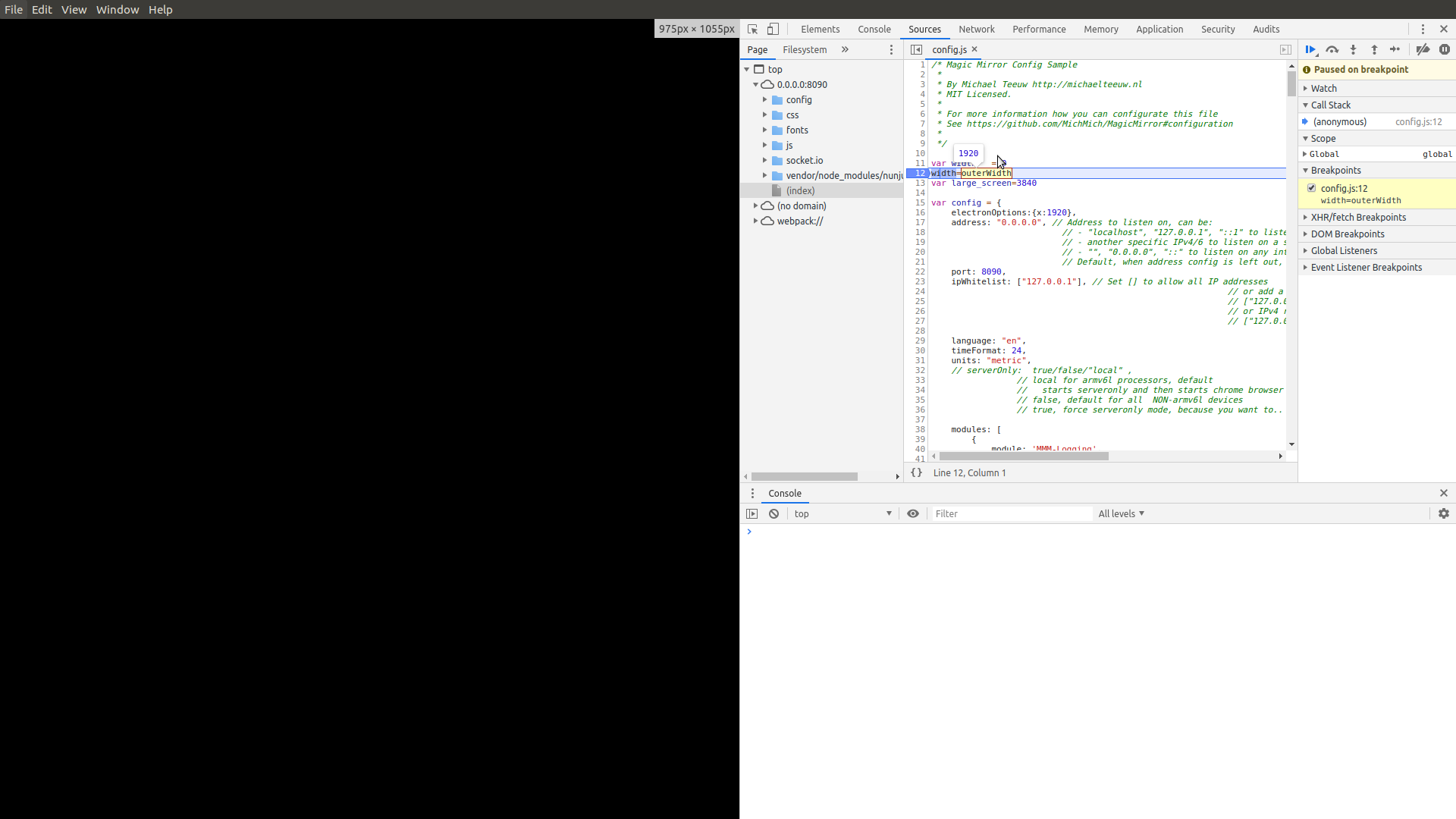
@Radnor to debug, npm start dev
in the developer window, select the sources tab, select config.js on the left
find the 1st line, click on the number on the left column, it will turn blue, now have a program stop
hit f5 to refresh the page, it will stop at that line… you can hover over variables and it will tell u the values.
you can explore the variable on the right, global, scroll downI assume u are running electron browser (its the default)
this is firefox.
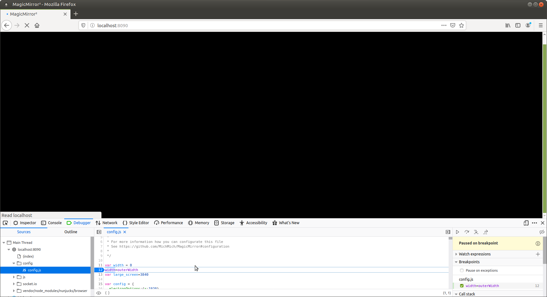
and electron (with the hover)
-
@sdetweil hang on… I see the bug on loading at node_helper time…
change it like this to capture the undefined error at startup
var width = 0
try {
width=outerWidth
}
catch(error){
}var config={ etc
-
in the config.js it does not like outerWidth. shows errors as loading up. It DOES get the correct value though…
I have at the top of my config file:
var small_size = 800;
var ss = outerWidth;
In debug mode I can see both vars getting their respective values.
-
@Radnor see my comments above workaround for not defined at node_module load time
-
@Radnor css and config.js are different things… no way to change the filenames of the css files…
-
Getting really close!
My config file is:
var small_size = 800;
var width = 0;
try {
	width=outerWidth
}
catch(error){
}

SNIP

		{
			module: "newsfeed",
			position: "bottom_bar",
disabled: width > small_size ? false:true,
			config: {
SNIP
On phone does not show. On laptop stuck at “Loading…”
-
@Radnor said in Is it possible to have CSS for normal screens and a custom CSS for 7in screen?:
disabled: width > small_size ? false:true,
because width =0
0 > 800 is false, so disabled=true
when loading the node_modules, so it doesn’t get loadedtry
var width=801
the node_helper might get loaded, but won’t execute cause they are waiting for module to send parmsthe value will be corrected on browser side
-
@sdetweil said in Is it possible to have CSS for normal screens and a custom CSS for 7in screen?:
@Radnor said in Is it possible to have CSS for normal screens and a custom CSS for 7in screen?:
disabled: width > small_size ? false:true,
because width =0
Dont think so. I started it up with DEV option. Loaded the config.js file in debugger hovered over the width and it showed 1280. Then hovered over the small_size and it showed 800. Then thought false and true might need double quotes because the rest in config has t/f in double quotes.
Thank you for sticking with me and getting this working I really appreciate your time. it is SO close.
-
I put in config width =801 and reran it. Same “Loading …”
And commented out try - catch block. -
@Radnor single or double quotes don’t matter, as long as both ends of the string have the same
I just set my code to
var width	= 1920  // make it so on big screen they get enabled
try {
  	width=outerWidth
}
catch(error){

}
var large_screen=1920  // expected size on computer
and the test for calendar at
module: "calendar", disabled: width< large_screen?true:false, // if the current screen is smaller than computer, disabled // you can flip too, ?false:true header: "US Holidays", position: "top_left", -
@Radnor I had to fix the size for node_helper loading…
I have them enabled if big screen, disabled if small screen
-
@sdetweil better
var width	= 801
try {
  	width=outerWidth
}
catch(error){

}
var small_screen=800
and module disabled
{ module: "calendar", disabled: width>small_screen ?false: true, -
OK, I think the disabled has something to do with the newsfeed.
I have several config files. config_WORKING has modules alert, notify, clock, wx, wx forecast, calendar, and newsfeed.
I have config_CLOCK with modules clock, wx, and wx forecast. In this config I told it via disable: width > small ? false:true. On my laptop get all 3. on phone no forecast (which should not be there).
In the newsfeed module the disable test is messing it up.
I rename either WORKING or CLOCK to just config.js to test.
Hello! It looks like you're interested in this conversation, but you don't have an account yet.
Getting fed up of having to scroll through the same posts each visit? When you register for an account, you'll always come back to exactly where you were before, and choose to be notified of new replies (either via email, or push notification). You'll also be able to save bookmarks and upvote posts to show your appreciation to other community members.
With your input, this post could be even better 💗
Register Login