Read the statement by Michael Teeuw here.
covid bell curve line graph tracker
-
@almostgithub Ok I’ve added some.
git pull in the module folder,
here are the things u can set… will get to the doc in the morning
legendTextColor:'white', chartTitleColor: 'white', chart_title: '', xAxisLabel:"by date", xAxisLabelColor:'white', xAxisTickLabelColor:'white', yAxisLabel:"Count", yAxisLabelColor:'white', yAxisTickLabelColor:'white', -
@sdetweil oh wow! Thanks so much, thats awesome!! They are grey on my mirror and makes it hard to read the legend and dates.
edit: after a git pull and npm install, it seems to be stuck on MyCovid19 Loading data for chart “cumulative_deaths”
edit: Saw this in the issues tab, will ask there
-
new update, data source changed … after git pull, need to run npm install again to update the library used to read the data (csv instead of xlsx)
-
@sdetweil can you drop an example of the config for two graphs displayed at once?
Edit: nevermind, I was overthinking it.
-
grrr… data source not yet updated today… waiting, sent them a note…
I switched to the csv file (available earlier)…
now xlsx is right, csv, json and xml files not updated… and in the xlsx, they changed the column headings…
-
@sdetweil after sending email, they have updated the csv file now…
also, uploaded new version with lots of text formatting control, see the now long readme
also added ability to change the start date for the chart, see startDate in the readme -
now supports states charts too
git pull,
in config states:[] vs countries:[]

-
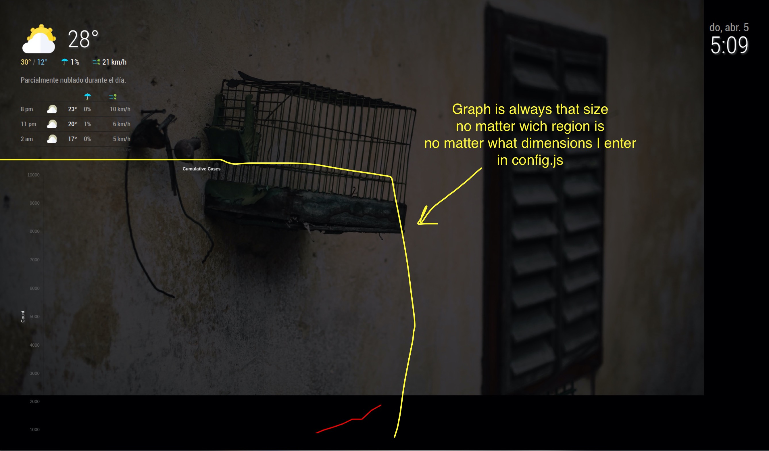
Looks great! I’m looking forward in using this module, but I just don’t get the chart dimensions to work, the size is always the same, big, and it doesn’t matter which region I use.
This is my config
            {
                            disabled: false,
                            module:"MyCovid19",
                            position:"top_left",
                            config:{
                                    countries:["Mexico"],
                                    line_colors:['red','white','green','yellow','blue'],
                                    chart_type:"cumulative_cases",
                                    chart_title:"Cumulative Cases",
                                    ranges:{min:0,max:10000,stepSize:1000},
                                    startDate: "03/01/2020",
                                    backgroundColor: "transparent",
                                    width: 300,
                                    height: 500,
                                    debug:false,
                            },
            },
And this is the result, I’ll try to attach a screen capture, let’s see if I can!

-
@rafaelcota hm… I usually have this
		{
			module:"MyCovid19",
			disabled:false,
			position:"top_left",
			config:{
				states:["Michigan", 'Texas','Illinois', 'Florida','California','Louisiana','Washington','New York',],
				// line colors can be any definition of color either a name ,or a hex string
				// one per country above, used in order,
				line_colors:['red','white','green','yellow','#34ebde','#34eb00','purple','orange'],
				//
				chart_type:"deaths",  // or "cumulative deaths"
				chart_title:"daily new deaths by state", // however u want to label
				// the vertical steps on the chart.. how tall u want it to be and how mant increments
				ranges:{min:0,max:000,stepSize:10},
				// size of the chart in pixels
			    width: 400,
			    height: 800,
			    // only used if we need to debug something
			    //debug:true,
			    startDate:'03/10/2020',
			    debug:true,
			//    startLabel:['2/1/2020','3/1/2020']
			    //backgroundColor: 'white',
			}
		}
400x 400 (w x h)

but changed to 400 x 800 (w x h)

-
I added the calendar and changed to 300 x 800

