Read the statement by Michael Teeuw here.
covid bell curve line graph tracker
-
@almostgithub lets try some new debugging
git clone again, make sure debug:true, in each MyCovid19 module def in config.js
the update now only downloads the data file ONCE across all the modules (1 for countries, 1 for states if both used)add this module
git clone https://github.com/sdetweil/MMM-Loggingadd it to the TOP of the module list like this
	modules: [    // < top of module list
	{
            module: 'MMM-Logging',
            disabled: false,
            config: {
                // Module functions out of the box with nothing set here.
                // See below for configurable options.
                echoLocal: true,
                echoRemote: true,
                format: "{{message}} ({{folder}}/{{file}}:{{line}} {{method}})",
            }
        },
start MM like this from a terminal window (make sure to stop the pm2 one if u use pm2)
cd ~/MagicMirror
npm start >>somefile.txt 2>&1
run your test with 0.0.0.0
please test both on system and remote browser access
ctrl-c to stop
change to localhost
restart same commandctrl-c when done
send me somefile.txt at my email sdetweil at gmail
-
@sdetweil You’re great, man. You’ve been working with MyCovid19 to fix the bug, a weird and difficult one to identify; you’ve done tests, modifications, sent me instructions how to debug, and more modifications, and tests, and debugging; and files and emails went between us and finally, I can say IT WORKS just fine!
Address is 0.0.0.0, so I can access it from any device at port 8080 and graphs are just the size I put in config.
Thank you again for all your time, effort and concern.
Stay safe
-
@rafaelcota glad we found it… now I gotta fix another toughie…
-
I’ve been keeping an eye on the NY data so i can compare it to my home state. Any idea whats happened there? It might be nice to have a 7 day rolling average option to smooth the data out. If that’s within the realm of “Not very difficult.”
-
@humdinger44 i see it too… will mess up the charts for a while… boooo
from the data source
**NEW:** Starting with data for May 6th, this data reports the total combined number of confirmed and probable Covid-19 cases and deaths where available. Many states and localities have started to report this data using criteria that were developed by states and the federal government. This will cause a spike in the cases and deaths data for some areas while we work to revise our historical data with those probable cases and deaths. -
I posted an update to github today,
supports displaying US state county dataa little bit trickier on the data entry
counties:[ { ‘county_name’ : ‘state_name’ }, { ‘county_name2’ : ‘state_name2’} ]
on the chart only the county name is shown
-
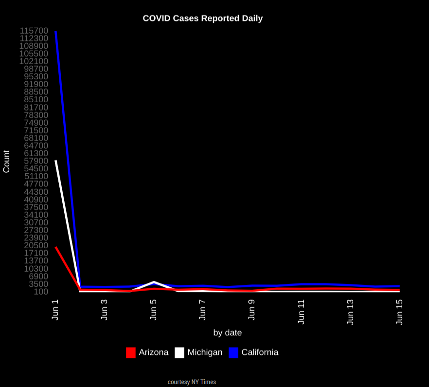
HI guys, thanks for making this! I am trying to show daily totales, I was trying to make it easy to see the totals for each day. However the graph is starting extremly high, see below. Can someone see what I am doing wrong?
THanks !
```{ module:"MyCovid19", position:"bottom_center", config:{ states:['Arizona','Michigan','California'], line_colors:['red','white','blue'], chart_type:"cases", chart_title:"COVID Cases Reported Daily", ranges:{min:0,max:000,stepSize:100}, backgroundColor: "transparent", width: 600, height: 500, debug: true, startDate: '06/01/2020' } -
@darbos max is 0???
-
@sdetweil I had it set at a higher number but took that from an example I found on here. What should those be set at? Ty
-
@sdetweil my goal is really to be able to look and see the daily totals for the past few days.
