Read the statement by Michael Teeuw here.
covid bell curve line graph tracker
-
@sdetweil my goal is really to be able to look and see the daily totals for the past few days.
-
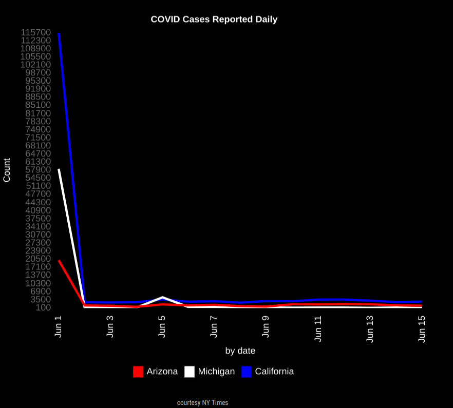
This is the big initial spike i dont know how to get rid of. Sorry last attachment wouldnt work.
-
@darbos I would start with a step of 50 and a max of 50. if the numbers are higher the chart engine will auto adjust.
if U have too many ticks on the left axis, then make the step higher (100) and raise the max to 100
-
@darbos for the spike, move the start day to the 2nd or 3rd
-
@sdetweil here is my cases by day by state
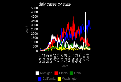
min 0, max 500, step 500
(chart 300x300)one cool thing, when u make the step low, u can turn off individual sources to see the remaining adjust
just click on the legend entry to turn it offlooks like Michigan had a reporting spike
-
Looks like the EU site used for the data is currently down
-
@sdetweil Sorry for just getting back. Thanks for taking the time to explain and help.
I follow what your saying and made the changes. Looks like the reporting site is down so I will have to wait to make sure mine looks as good as yours:)
Thanks again.
-
@sdetweil Would you mind double checking my config, Im still seeing a large spike at the begining…
Ive tried changing the start date to the 3rd, 10th, and 12th with the same result. Ive also tried both 0,100,100 and 0,500,500.
Thank you much!
	{
		module:"MyCovid19",
		position:"bottom_center",
		config:{
			states:['Arizona','Michigan','California'],
			line_colors:['red','white','blue'],
			chart_type:"cases",
			chart_title:"COVID Cases Reported Daily",
			ranges:{min:0,max:500,stepSize:500},
                            backgroundColor: "transparent",
		      width: 600,
		      height: 500,
		      debug: false,
		      startDate: '06/12/2020'
		}
    },
***EDIT: The copy/paste spacing is off, but I double checked and spacing is correct in my file…with no trailing white space.
-
@sdetweil Its like its pulling the total first and then displaying dailys no matter what date I start at…I think anyway.
-
@darbos I see the same will debug later tonight. family dinner first
-
@sdetweil ok thank you much!!!
-
@darbos nice bug, been there since the beginning…
the countries give me daily counts, and I have to calculate accumulative (1st day to last)
the states/counties give me cumulative and I have to calculate dailys… (last day to 1st)…but I had cut off the number of days to the start date, and needed ONE more day to calculate the daily for the requested start day
didn’t see it before, because back in feb/march the accum for states as near 0
thanks for the good recreate…
do a git pull in the module folder and restart magic mirror
-
@sdetweil Your awesome man. Working perfect now, thanks so much!!!
-
the country data is back online…
based on the emails i exchanged with them I expect the files will go offline again, but don’t have any idea when
they are moving things to a different server… the xlsx is already there, but we use the csv. -
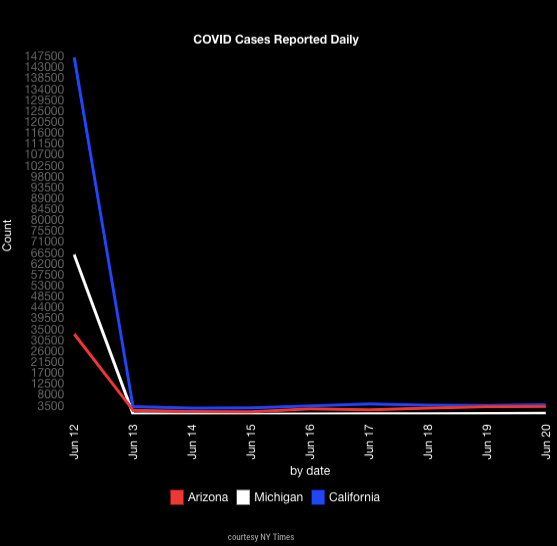
@sdetweil it looks like mine stopped updating. The past two days haven’t shown on my mirror or the one I made for my dad. I’ve rebooted them a few times, is anyone else seeing the same?
-
@darbos mine is updating… there was a problem with countries last week, but since resolved. and I just verified the data downloads with new data
can u open the developers window, ctrl-shift-i, select the tab labeled console and add My to the filter field?
also, look at the console where u start MM…
pm2 logs–lines=100 (if pm2)
or
the npm start window if you use npm -
@sdetweil awesome thanks for the quick response I’ll check it out
-
@sdetweil Sorry about the firedrill, after running pm2 restart mm it updated.
I know this isnt the best way, but I have it connected to a smart switch and just tell google to turn it off and on…i havent had an issue and had it this way over a year. Might have just got hung up, but issue is solved. Thanks again for the quick help sir.
-
@darbos ok, did u save the pm2 logs?? I’d love to see them
-
@sdetweil sorry I did not see this till now. If it happens again I’ll be sure to grab them. It happened on both mine and my dad’s mirror so I’ll let him know to give me a heads up too. Thanks !
Hello! It looks like you're interested in this conversation, but you don't have an account yet.
Getting fed up of having to scroll through the same posts each visit? When you register for an account, you'll always come back to exactly where you were before, and choose to be notified of new replies (either via email, or push notification). You'll also be able to save bookmarks and upvote posts to show your appreciation to other community members.
With your input, this post could be even better 💗
Register Login