Read the statement by Michael Teeuw here.
Question about layout position
-
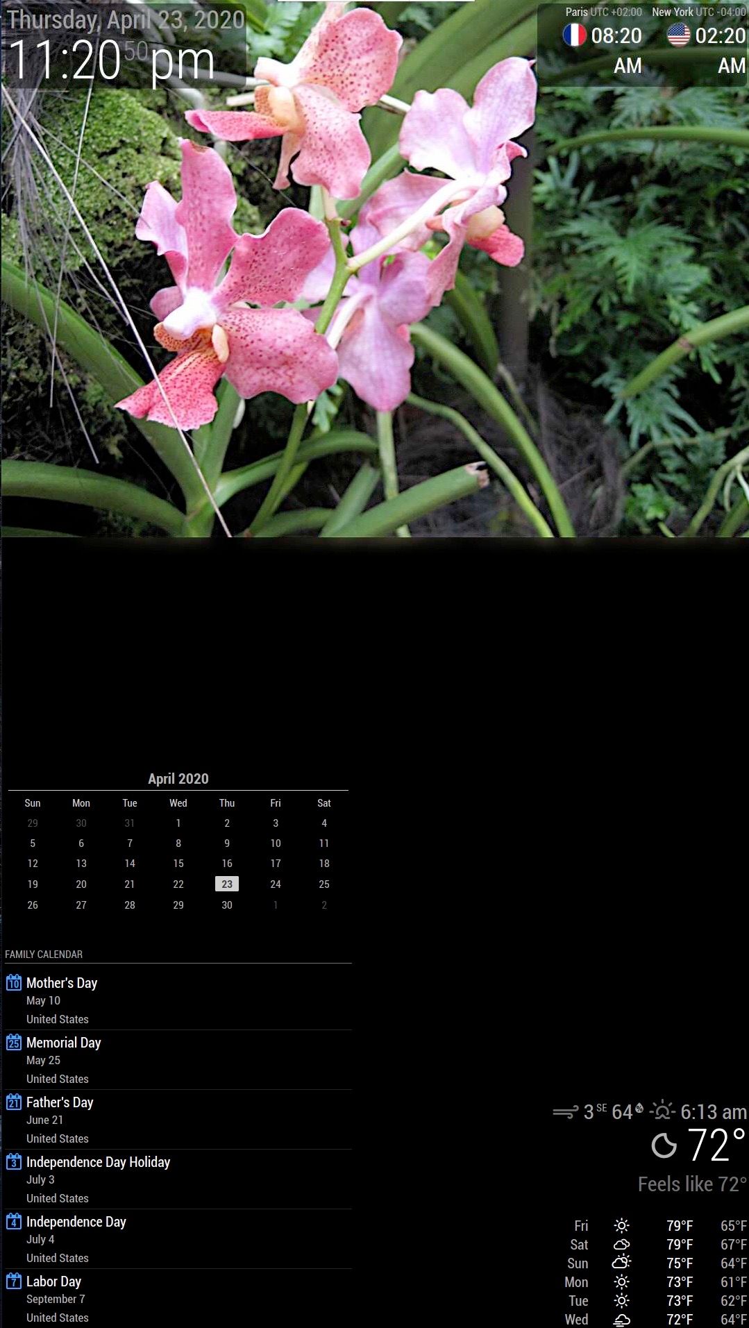
I spend a few days reading through CSS but I can’t seem to move module around. I want to create a header section where I can place different modules like clock, world_clock. Right below is family photos. I place my photos on fullscreen below with a height of 50% and I add padding-top=100px and remove all padding right left bottom to 0 px. Thinking that it will create a blank space at the top section of the photo.
It didn’t work. I place my clock module in the top bar but it just overlays on top of the photos. Now I change to top_left and top_right. I’ve attached my screenshot.
How do I fix my custom.css to push the picture below the clocks?
Also, my US holiday calendar is showing with 2 lines (the date and United States). I see others didn’t have the word United States on their screen. How can I fix so that United States doesn’t show up.
Thanks in advance.
-
@matelot20
The fullscreen-below section has a margin of -60px, so is extended 60px beyond the visible display. However a padding of 100px should show your picture 40px below the upper border of the screen.
I would consider trying the following:.fullscreen_below { margin-top: 100px }or check your padding-top entry for errors. Do you know how to work with the browser dev tools (F12 on your computer)?
There in the elements tab you can check the css coder for every element. Very handy! -
@matelot20 said in Question about layout position:
Also, my US holiday calendar is showing with 2 lines (the date and United States). I see others didn’t have the word United States on their screen. How can I fix so that United States doesn’t show up.
this seems to be MMM-MyCalendar and not the calendar default module.
MMM-MyCalendar has ashowLocationoption. Try setting this tofalse
https://github.com/jclarke0000/MMM-MyCalendar#configuration-options -
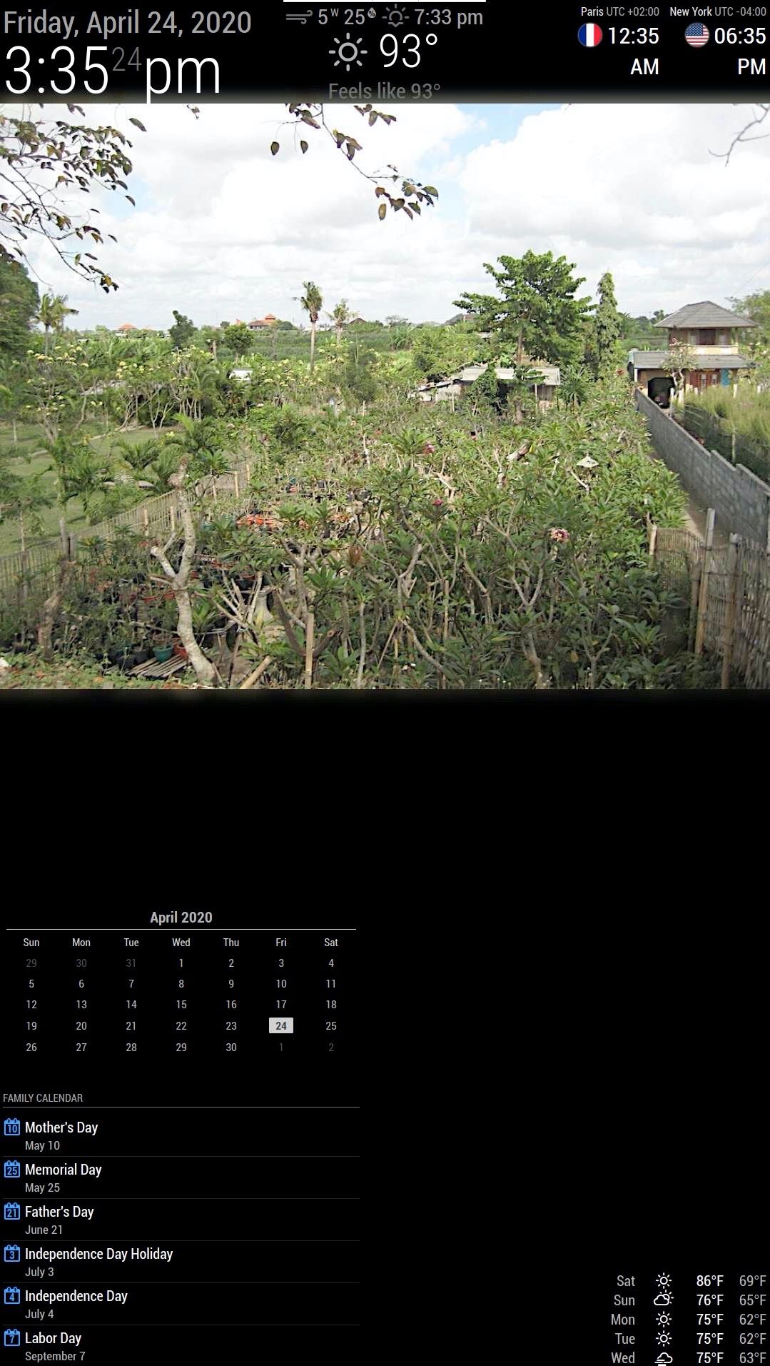
@lavolp3 Thank you so much for the pointer. I wouldn’t even know that the fullscreen margin is -60px. I used the margin-top to 180px as suggested and it works. The result is exactly what I want. I include the picture to see the update. Notice how my 7 day forecast is at bottom right. How do I move to be below the picture area? I try with middle_center but it shows over the picture.

Thanks again.
-
you have to understand the design here.
this is a stack, on the bottom (furthest away) is fullscreen-below (below all others)
then there is the positions
and then there is fullscreen-above (above all others)…fullscreen-below is for the background.
content goes here, sits on top of background
fullscreen-above is for a cover/screen-saver (hides all content and background)see the ~/MagicMirror/index.html for the layout of these areas…
and then css/main.css for the classes that give it a 3 dimensional layout (zorder - is down, zorder + is above, normal i 0) -
@matelot20 Try putting it into fullscreen_below but in the config below the picture module.
Or you could put it into bottom_bar and adjust the margin_bottom accordingly
Hello! It looks like you're interested in this conversation, but you don't have an account yet.
Getting fed up of having to scroll through the same posts each visit? When you register for an account, you'll always come back to exactly where you were before, and choose to be notified of new replies (either via email, or push notification). You'll also be able to save bookmarks and upvote posts to show your appreciation to other community members.
With your input, this post could be even better 💗
Register Login