Read the statement by Michael Teeuw here.
Weatherunderground - currently - hourly - daily - configurable
-
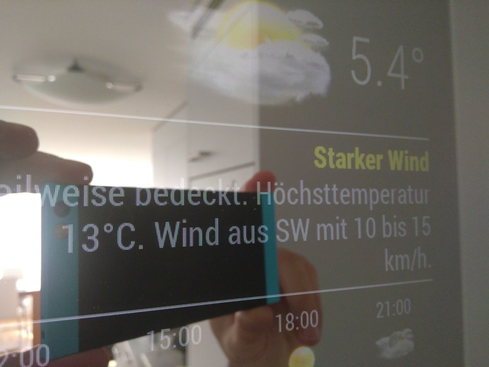
The yellow warning “strong wind” shows the whole time. How can i disable this warning?

-
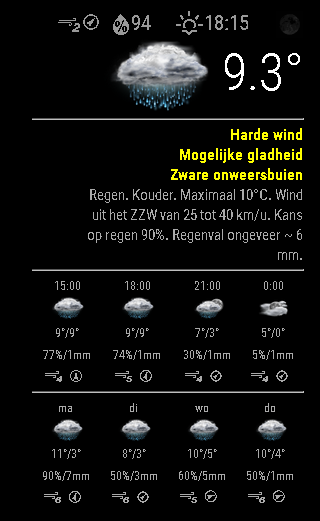
@trividar Same thing Here but with 3 Warnings
-
@ostfilinchen And you’re certain the warning isn’t present in the wunderground payload?
Mine shows three because the payload has three warnings:

"alerts": [ { "type": "WND", "wtype_meteoalarm": "1", "wtype_meteoalarm_name": "Wind", "level_meteoalarm": "2", "level_meteoalarm_name": "Yellow", "level_meteoalarm_description": "The weather is potentially dangerous. The weather phenomena that have been forecast are not unusual, but be attentive if you intend to practice activities exposed to meteorological risks. Keep informed about the expected meteorological conditions and do not take any avoidable risk.", "description": "Severe gusts of 80-90 km/h.BE AWARE of debris being blown around. Localised outdoor activity disruption is possible due to debris.>", "date": "1970-01-01 00:00:00 GMT", "date_epoch": "NA", "expires": "2017-02-23 23:59:00 GMT", "expires_epoch": "NA", "message": "Severe gusts of 80-90 km/h.BE AWARE of debris being blown around. Localised outdoor activity disruption is possible due to debris.>)", "phenomena": "NA", "significance": "NA", "attribution": "Information provided by , <a href='http://meteoalarm.eu/'>EUMETNET - MeteoAlarm</a> Note: Time delays between this website and <a href='http://meteoalarm.eu/'>Meteoalarm.eu</a> are possible. For the most up-to-date information about alert levels as published by the participating National Meteorological Services, please visit <a href='http://meteoalarm.eu/'>Meteoalarm</a>. For terms of use of this information, and copyright information, see <a href='http://meteoalarm.eu/'>Meteoalarm</a> Terms of Use." } , { "type": "WIN", "wtype_meteoalarm": "2", "wtype_meteoalarm_name": "Snow/Ice", "level_meteoalarm": "2", "level_meteoalarm_name": "Yellow", "level_meteoalarm_description": "The weather is potentially dangerous. The weather phenomena that have been forecast are not unusual, but be attentive if you intend to practice activities exposed to meteorological risks. Keep informed about the expected meteorological conditions and do not take any avoidable risk.", "description": "Potential disruption due to snow and ice from 6AM CET SAT until 8:59AM CET SAT", "date": "2017-02-25 06:28:03 GMT", "date_epoch": "NA", "expires": "2017-02-25 07:59:00 GMT", "expires_epoch": "NA", "message": "Potential disruption due to snow and ice from 6AM CET SAT until 8:59AM CET SAT)", "phenomena": "NA", "significance": "NA", "attribution": "Information provided by , <a href='http://meteoalarm.eu/'>EUMETNET - MeteoAlarm</a> Note: Time delays between this website and <a href='http://meteoalarm.eu/'>Meteoalarm.eu</a> are possible. For the most up-to-date information about alert levels as published by the participating National Meteorological Services, please visit <a href='http://meteoalarm.eu/'>Meteoalarm</a>. For terms of use of this information, and copyright information, see <a href='http://meteoalarm.eu/'>Meteoalarm</a> Terms of Use." } , { "type": "WRN", "wtype_meteoalarm": "3", "wtype_meteoalarm_name": "Thunderstorms", "level_meteoalarm": "2", "level_meteoalarm_name": "Yellow", "level_meteoalarm_description": "The weather is potentially dangerous. The weather phenomena that have been forecast are not unusual, but be attentive if you intend to practice activities exposed to meteorological risks. Keep informed about the expected meteorological conditions and do not take any avoidable risk.", "description": "Potential disruption due to thunderstorms from 4PM CET MON until 9:59PM CET MON", "date": "2017-02-27 11:46:02 GMT", "date_epoch": "NA", "expires": "2017-02-27 20:59:00 GMT", "expires_epoch": "NA", "message": "Potential disruption due to thunderstorms from 4PM CET MON until 9:59PM CET MON)", "phenomena": "NA", "significance": "NA", "attribution": "Information provided by , <a href='http://meteoalarm.eu/'>EUMETNET - MeteoAlarm</a> Note: Time delays between this website and <a href='http://meteoalarm.eu/'>Meteoalarm.eu</a> are possible. For the most up-to-date information about alert levels as published by the participating National Meteorological Services, please visit <a href='http://meteoalarm.eu/'>Meteoalarm</a>. For terms of use of this information, and copyright information, see <a href='http://meteoalarm.eu/'>Meteoalarm</a> Terms of Use." } ] -
@RedNax I don’t know, But the dwd warningmodule doesn’t Show any warnings. And btw the warnings are since friday there
-
@ostfilinchen Could you have at the wunderground payload? It’s present in your logs/console…
-
@RedNax I check this in the evening. Now I have no Mirror here at work.
-
@RedNax How can I see this logs? I just know pm2 logs, but there is nothing…
-
@ostfilinchen There appears to be an issue at weather underground. Just noticed that all but one warnings have expired already. Usually they wouldn’t be present in the api payload when expired. I’ll have to start checking for expiration in the code…
Update: new version now checks alert expiration
-
I installed your module some days ago and I really like it. The only thing I don’t like is its verboseness in both the browsers log (module) and the console (node_helper). I commented out most of the Log.info() lines, which of course will bring some trouble once you release an update.
Maybe you could add a config option “quiet” (or something similar) for guys like me who like to keep logs clean? :innocent: -
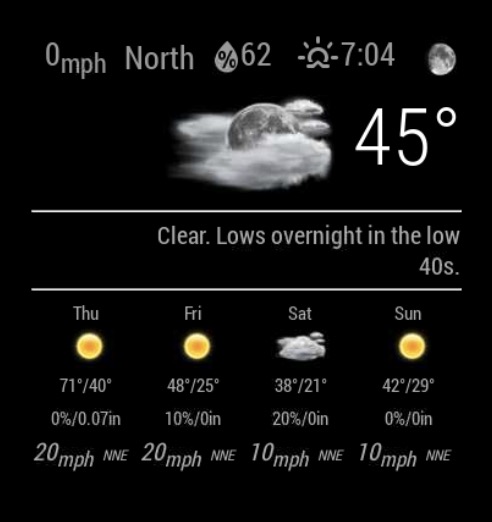
Has anyone ran into an issue with the wind speeds? The wind speeds shown in the forecast do not match that of the forecast on the Wunderground site. The wind speed displayed is always higher than the real forecast found on the main site. It has been as much as 20mph over the forecasted speed.
Ex: The forecast tomorrow calls for wind of 20mph on the module while the Wunderground site has 13mph.
I am using the rounded numbers to round off the temperature (have had no issues there).
It’s not a huge deal, however just one of those annoying little things.

