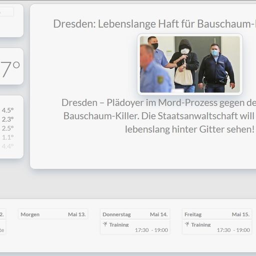
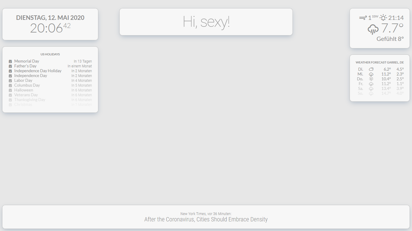
Read the statement by Michael Teeuw here.
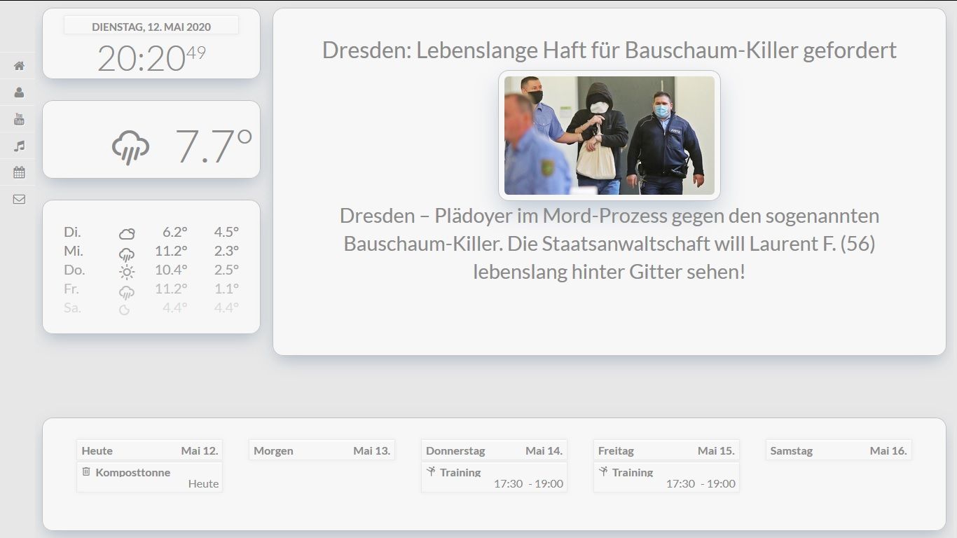
Bright UI
-
@electros
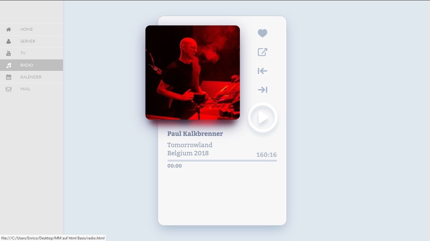
As already described above, it is a website in which the MagicMirror only runs as an iFrame; the radio and the menu are not in the MagicMirror. -
@Piranha1605 Ok, I understand now thanks.
-
Is that Tileboard or something similar you are running for the menu on the left?
-
@cyberphox said in Bright UI:
Is that Tileboard or something similar you are running for the menu on the left?
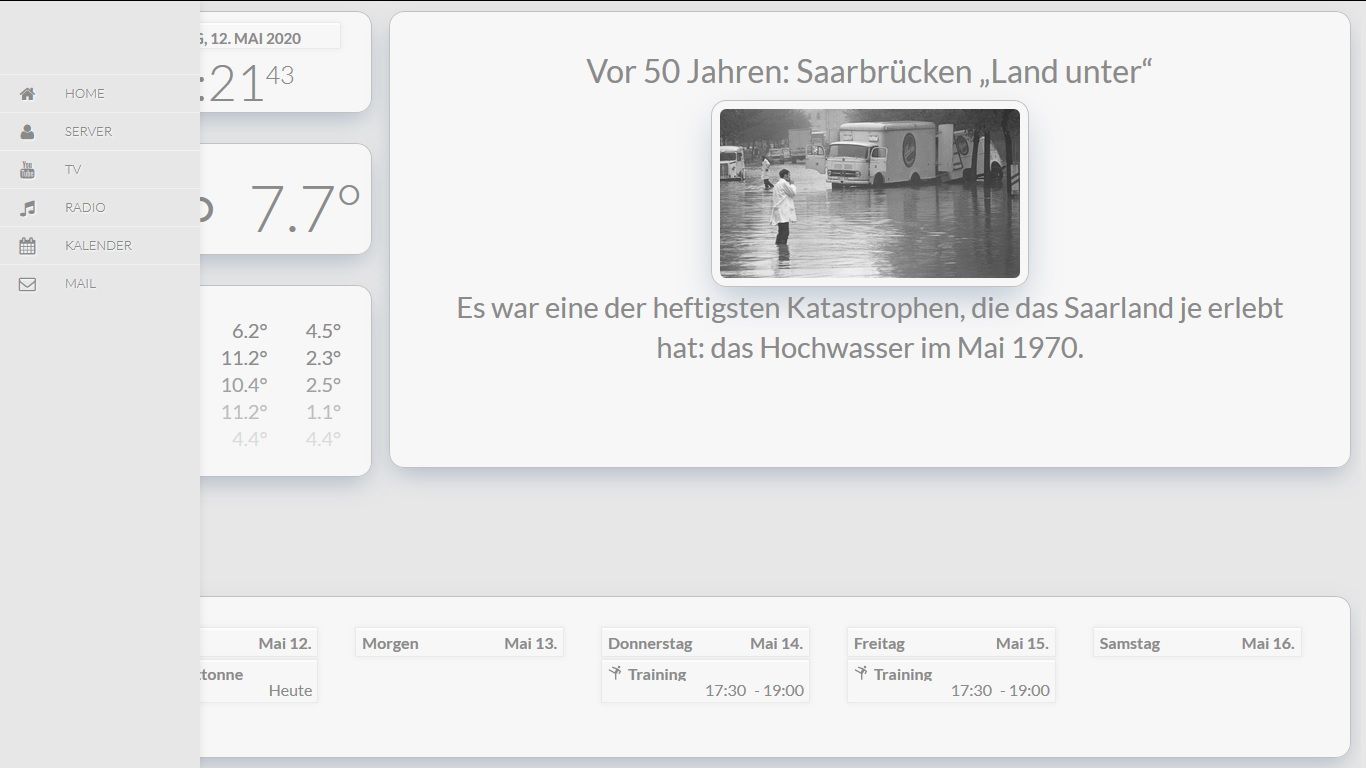
No is a css menu that runs in a website
-
WOW that looks fantasic!!!
-
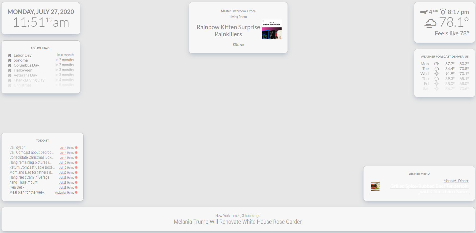
I have this mostly working and absolutely love it on our TV. 2 questions though.
- I am using MMM-PaprikaMenu to show our meal plan for the week and the font is the same color as the background. How can I fix that so it looks like the other?
- Is there a way with CSS to make the album art from MMM-sonos larger?
-
Please post me all three CSS, from the paprika menu, from Sonos and your custom.css, and I’ll get you ready
-
Thanks for the help
Custom.css
@import url("https://fonts.googleapis.com/css?family=Lato:300,400,700");

html {
  cursor: hidden;
  overflow: hidden;
  background: #e7e7e7;;
}


body {
  margin: 10px;
  position: absolute;
  width: calc(100% - 20px);
  height: calc(100% - 20px);
  background: #e7e7e7;
  color: #8a8a8a;
  font-weight: 400;
  font-size: 2em;
  font-family: "Lato", sans-serif;
  line-height: 1.5em;
  margin-bottom: -10px;
  -webkit-font-smoothing: antialiased;
}

header {
  text-transform: uppercase;
  font-family: "Lato", sans-serif;
  text-align: center;
  font-weight: bold;
  background: #F7F7F7;
  border-bottom: none;
  color:#8a8a8a;
}

 .module.compliments,
 .module.newsfeed,
 .module.clock,
 .module.weatherforecast,
 .module.calendar,
 .module.MMM-Todoist,
 .module.MMM-Sonos,
 .module.MMM-PaprikaMenu,
 .module.currentweather {
  font-family: "Lato", sans-serif;
  background-color: #f7f7f7;
  color: #8a8a8a;
  border: 1px solid #c1c1c1;
  box-shadow: 0px 10px 25px -5px rgba(50, 88, 130, 0.32);
  border-radius: 15px;
  padding: 30px;
}

.dimmed {
  color: #8a8a8a;
}

.normal {
  color: #8a8a8a;
}

.bright {
  color: #8a8a8a;
}


/**
 * module.width_height
 */

 .module.compliments {
  width:800px;
}

/**
 * clock.
 */

.clock .time {
 text-align: center;
 font-family: "Lato", sans-serif;

}
.clock .date {
  text-transform: uppercase;
  text-align: center;
  font-weight: bold;
  color: #8a8a8a;
  font-family: "Lato", sans-serif;
}


/**
 * weather.
 */

.currentweather .bright {
  font-family: "Lato", sans-serif;
}

.weathericon {
  color: #8a8a8a;
}
PaprikaMenu.css
.MMM-PaprikaMenu * {
  box-sizing: border-box;
}

.MMM-PaprikaMenu .module-content {
  width: 500px;
}

.MMM-PaprikaMenu table.menu {
  font-size: 17px;
  line-height: 1;
  border-collapse: collapse;
  table-layout: fixed;
  width: 100%;
}

.MMM-PaprikaMenu table.menu tr {
  border-bottom: solid 1px #222;
}

.MMM-PaprikaMenu table.menu tr.fade {
  opacity: 0.33;
}

.MMM-PaprikaMenu table.menu > tbody > tr > td:first-child {
  width: 55px;
  height: 55px;
}

.MMM-PaprikaMenu .menu .img-cell > img {
  float: left;
  width: 45px;
  height: 45px;
  margin: 5px;
}

.MMM-PaprikaMenu .menu .img-cell > img.rounded {
  border-radius: 10%;
}

.MMM-PaprikaMenu table.inner td {
  line-height: 24px;
  height: 28px;
}

.MMM-PaprikaMenu .menu > span {
  text-align: left;
  white-space: nowrap;
}

.MMM-PaprikaMenu .menu .date {
  font-size: 14px;
}

.MMM-PaprikaMenu .menu .meal {
  font-size: 17px;
  text-overflow: ellipsis;
  overflow: hidden;
}

.MMM-PaprikaMenu .menu .today .date {
  font-size: 17px;
}

.MMM-PaprikaMenu .menu .today .meal {
  color: #FFF;
  font-size: 24px;
}
Sonos.css is empty, might have mucked it up when logged on with my phone. I’ll need to check the github page for that one.
-
and the default sonos.css that I just reloaded from github.
.sonos ul { list-style-type: none; padding: 0; margin: 0; } .sonos ul .name, .sonos ul .art { display: inline-block; vertical-align: middle; } .sonos ul .name { padding: 0 .25em; } .sonos ul .art img { height: 100px; } .sonos ul .room { font-size: 50%; padding: .25em .5em; } .sonos ul.flip { direction: rtl; } /* This beautiful CSS-File has been crafted with LESS (lesscss.org) and compiled by simpLESS (wearekiss.com/simpless) */ -
I’ve been poking around and figured out how to make the Image art larger in the sonos module but could still use some help with the paprika font color.
-
At first glance, I think that these are the entries attached below.
.sonos ul .art img {
  height: 400px;
}

.MMM-PaprikaMenu .menu .today .meal {
  color: #8a8a8a;
  font-size: 24px;
}
But it may also be that something is written about the .js or .njk, so have a look
-
That fixed Sonos and paprika like I wanted. Thanks for the help.
-
Any one using this with MMM-calendarext2? Would love to get everything styled together.
-
@potts-mike
I got it with the calendar, you just have to adjust the CSS.Here is an example with which entries you can customize it.
} .CX2 .agenda .eventSub { display:none; } .CX2 .daily .fullday .eventTime { display:none; font-size: 18px; } .CX2 .slot .event{ background: inherit; font-size: 18px; } .CX2 .slot .slotHeader{ background-color:Transparent; text-transform: uppercase; font-size: 20px; font-weight: 400; border-bottom: 1px solid #1ed760; line-height: 15px; padding-bottom: 5px; margin-bottom: 10px; color: #999; } .CX2 .today .slotHeader * { text-transform: uppercase; color: #999; font-size: 20px; } .CX2 .event.fullday { color: inherit; } .CX2 .slot .slotFooter { display: none; } .CX2 .event[data-calendar-name="Die Fischers"] { border-left: 2px #ce4138 solid; border-bottom: 1px solid #424242; } .CX2 .event[data-calendar-name="Karate"] { border-left: 2px #3288ff solid; border-bottom: 1px solid #424242; } .CX2 .event[data-calendar-name="Abfall"] { border-left: 2px #6bff32 solid; border-bottom: 1px solid #424242; } .CX2 .slot > .slotContent{ position:relative; width:100%; background-image:inherit; } .CX2 .event.fullday { border-radius:0px; } -
Awesome, thanks.
This would be for the custom.css for the module?
-
@potts-mike yes
-
@Piranha1605 Hallo your mirror looks verry nice.
can you tell me how you make that menu on the left side. can you post the css of that menu
-
note that MM is running in an iframe and the menu is outside
The MagicMirror runs in an iFrame of an html page, the other pages are all written in html and css.
-
@sdetweil ok and is there a turoial how i do that running Magic Mirror in an iframe and the menu outside?
-
@rdwilbrink I don’t know.
-
 K karsten13 referenced this topic on
Hello! It looks like you're interested in this conversation, but you don't have an account yet.
Getting fed up of having to scroll through the same posts each visit? When you register for an account, you'll always come back to exactly where you were before, and choose to be notified of new replies (either via email, or push notification). You'll also be able to save bookmarks and upvote posts to show your appreciation to other community members.
With your input, this post could be even better 💗
Register Login