Read the statement by Michael Teeuw here.
CSS for small fullscreen display
-
I have come to appreciate having the info from my MagicMirror so much that I want to have little "mini"MagicMirrors in various rooms of my house.
This is quite easy using the drawerful of old smartphones I have and MM’s serveronly function on a secondary port. It’s great because the phones need very minimal configuration, just put the MM’s serveronly address in a browser.
The only snag I’m running into is that I would like the info to take up the whole screen rather then just part of the screen as would be typical with MM. (see images below)
I’m hoping someone can suggest a simple CSS trick that would scale the whole MM content. If possible, something that would scale based on the width of the screen would be even better – allowing for phones of different sizes or even tablets.
Thanks!
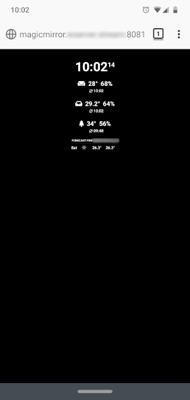
What I have with the default CSS is:
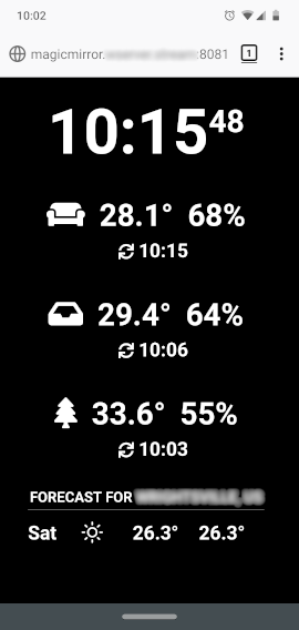
What I want is:
-
@cweinhofer I have a css that is view size vs pixel size.
don’t know if it will work as is
https://www.dropbox.com/s/o07lc85wnn1hcsm/mainvh.css?dl=0
replace main.css w this
save old main
css of course -
@cweinhofer you could also try zoom in on the browser, not sure how to do that
on phone/tablet -
@cweinhofer had to enable zoom in the settings/accessibility setting on chromium. slider there to adjust
-
@sdetweil Thanks for the suggestions. The browser options didn’t seem to work for me, but the viewport CSS did. I couldn’t use your file as-is, but was able to borrow from it to add to my custom CSS.
I ended up adding custom sizes for each element – one of the things I was trying to avoid – but it was the only workable solution I could come up with for now.
I was wondering if the CSS
transform: scale(x);might be a solution for scaling the whole layout, but I’m not sure what element to apply it to. Maybe someone who is more knowledgeable can comment.I know that the body margin, height, and width all need to be adjusted, not just the font size, so it would need to accommodate for that.
Here’s my custom CSS if anyone’s interested:
body { margin: 6vw; height: calc(100% - 12vw); width: calc(100% - 12vw); font-size: 9vw; line-height: 9vw; } .small { font-size: 9vw; line-height: 9.5vw; } .medium { font-size: 6vw; line-height: 6.5vw; } .large { font-size: 36vw; line-height: 36vw; } header { font-size: 6vw; line-height: 6vw; padding-bottom: 2vw; margin-bottom: 3vw; } .module { margin-bottom: 12vw; } -
What you mean is called responsive web design. for example, you could use the tablet in portrait or landscape format and thus adjust the position of the modules.You have to change the index.html for this with the meta name viewport, but with an update the index.html will probably be overwritten.
-
@cweinhofer I am glad it helped
Hello! It looks like you're interested in this conversation, but you don't have an account yet.
Getting fed up of having to scroll through the same posts each visit? When you register for an account, you'll always come back to exactly where you were before, and choose to be notified of new replies (either via email, or push notification). You'll also be able to save bookmarks and upvote posts to show your appreciation to other community members.
With your input, this post could be even better 💗
Register Login