Read the statement by Michael Teeuw here.
MMM-Jast 2 Tickers on top of each other
-
I was trying to figure out how to position the ticker frame inside the body of module on screen because it runs off right side of monitor using CSS. I was not able to figure out how to make that happen but it created another question when I was messing with the Jast CSS.
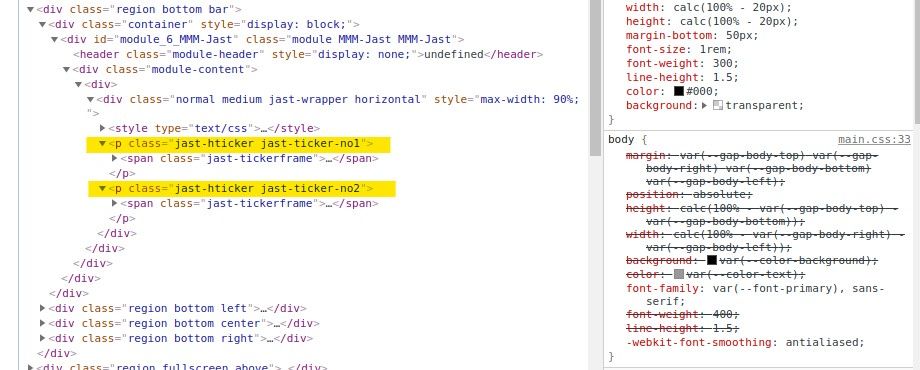
Why are there two tickers that lay on top of each other. The seem identical to me. At first blush the ticker looks fine with exception of running of right side of screen. This picture looks okay.

In my hunt for CSS for module I used dev tools and came across this.

Often times there are other configuration items or CSS in the modules CSS or JS files, so went to look atMMM-Jast.jsfile which was a dead end for me other than generally understanding he was pulling from a different location.
That is this image.

So turned to theMMM-Jast.cssfile. to look at that file and saw this one which haspadding-left: 100% }
Since the ticker does stop short of where it should, changed that padding value off off 100%. This was how I discovered there where two ticker frames laying on top of each other.

So I have two unanswered puzzles.
1)Why 2 tickerframes?
2)How do I shift the ticker frame to left? -
Hi @ankonaskiff17 ,
there are very simple answers to both of your questions ;-)
-
Imagine the horizontal ticker like one long strip of text, which just moves/flies over your screen from the outer right to the outer left position:
|<<- Stock1 - Stock2 - Stock3 - Stock4 |
Now, if Stock4 reaches the left corner of your screen, there would be a gap on the screen to its right.
That’s why there is a second “clone” of the ticker that fills that gap and moves right after the first one. Once the first one completely left the screen, it lines up again after the first one.
With that, you get an infinite loop. -
Jast is built with TypeScript. What you see, is a minified and uglyfied, transpiler generated version of the module. If you are interested in the source code, just check the files in the /src folder.
Please feel free to submit a Pull Request, if you found a way to avoid that the module runs out of the screen. I think a minor css change should fix that.
-
Hello! It looks like you're interested in this conversation, but you don't have an account yet.
Getting fed up of having to scroll through the same posts each visit? When you register for an account, you'll always come back to exactly where you were before, and choose to be notified of new replies (either via email, or push notification). You'll also be able to save bookmarks and upvote posts to show your appreciation to other community members.
With your input, this post could be even better 💗
Register Login