Read the statement by Michael Teeuw here.
MMM-Nest
-
Module works quite well for me as installed, but I do have one thing I can’t seem to puzzle out.
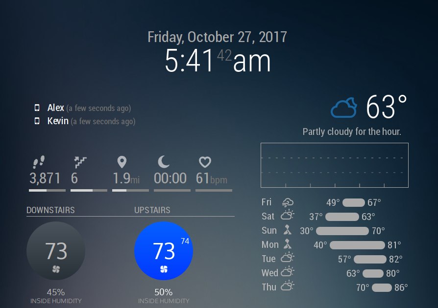
I may well be missing something - and my apologies if so - but I can’t seem to find it based on everything I’ve read. Is there a way to display multiple thermostats in a single row with a visual display? Right now I’ve enabled both by adding separate instances in the config, which works just fine to make them stack on top of each other, but it looks kinda silly having the two circles on top of each other with a big space to the side.
I’m assuming there’s some form of custom CSS magic involved, but I’m new to that and can’t seem to get a single module instance to display both thermostats in the first place.
Either way, thanks so much!!
-
@pyrosmiley No, sorry. You’re doing it the way I would have recommended. If you want to throw a feature request on the githuib page, I’d be more than happy to try and figure something out.
-
@mochman Okay! I put up a request right here for it, and tossed up a picture for reference.
Really appreciate you checking this out for me, what you have is already great
-
@pyrosmiley In the mean time, this might work for you.
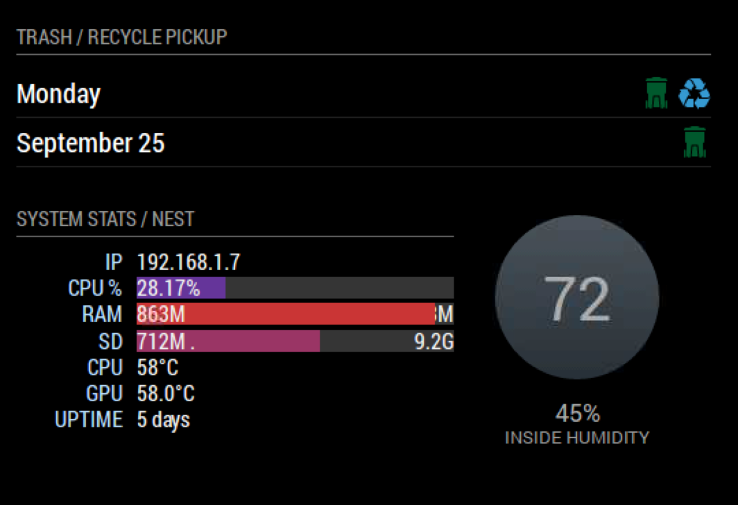
I did some dirty css to make this work with MMM-Tools

Try adding this to your custom.css filers and make MMM-Tools your first MMM-Nest instance
.MMM-Nest {
margin-top : -190px;
margin-left:350px;
}.MMM-Tools {
width : 320px;
}you might need to make it margin-right if you are calling it on the right hand side… I’m am terrible at CSS
-
@onetwankyfive Quick update:
I basically took your advice to use crazy negative CSS margins and it worked beautifully! I’m not actually sure how to address only one instance of a Thing in CSS so what I ended up doing was to clone the module into Nest2, and then used the CSS to bump that up next to the original. Sadly the headers don’t display leading spaces so I can’t really fix the alignment of the second instance but beyond that it looks pretty great!
Not sure if anyone else wanted to do this and wasn’t sure how, but in case there is someone: The duplicated Nest2 module can be found linked above. I’ll try my best to keep it up-to-date with the original, but in case I haven’t gotten to it yet it should be easy to do yourself – all I did was add a
2next to every instance of the wordNest. Then I just added the following to Nest2.css, but you can even just add it to your custom CSS:.MMM-Nest2 { margin-top: -211px; margin-bottom: 65px; margin-left: 220px; }That theoretically should automatically line it up right? It looks a little janky when the MM app is loading but it all works out fine for me. It also is set to use a different font but I made sure to have it fall back on Roboto.
For anyone smarter/better at computer than me, if there’s a way to achieve this without a whole forked module, let me know! Simpler is better!
-
After ran the getToken.sh, I got multiple thermostats detected. How do I add the 3 thermostats I have to the config.js?
Thanks
-
Please use these steps. If you have any questions after that, I’ll be happy to answer.
