Read the statement by Michael Teeuw here.
Need help with resizing regions
-
Hi everyone,
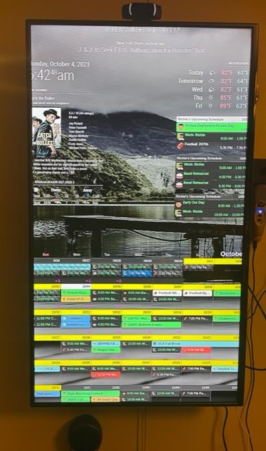
I have my magic mirror running on a PI 4. It is starting to look like I want, but I need help resizing everything so that it fits on my tv. The tv is 42 in. As you will see in the picture, I have the default weather module, weekly view of Cal Ext2 , and a different module in the top right region. In the top left region are the clock, NFL, and a Movie titles module. In that top bar are the newsfeed and compliments module. The bottom bar has the month view of Cal Ext 2. Any suggestions would be greatly appreciated.
-
@techlady too much stuff. the regions grow longer as more stuff is added.
u can make the font smaller, but makes it harder to read
others have gone to pages, and rotate thru to manage all the info
-
@techlady As Sam mentioned, MMM-Pages is good to use. I use this and split my modules over different pages and I use the MMM-page-indicator with it. Works best for me.
-
@techlady
Unfortunately, MMM-CalendarExt2 doesn’t respect MM’s default show/hide mechanism, so you need some tweek to achieve your goal with some paging modules.
I’m regretting that I made that way, I thought it was a nice idea at that time. Anyway CalExt2 is going to its life ends due to dying dependencies. So at this moment I have no plan to improve. (Maybe new module instead?) -
@techlady First of all I would adjust the borders at the custom.css
:root {

  --gap-body-top: 40px;
  --gap-body-right: 40px;
  --gap-body-bottom: 40px;
  --gap-body-left: 40px;
  }
The 40 pixels are examples.
-
@mmrize I think the “fixed” feature should work for that?
-
Here’s a tip. The sizing is all within the main.css file.
do not adjust main.css
add your changes to custom.css in the same directory.
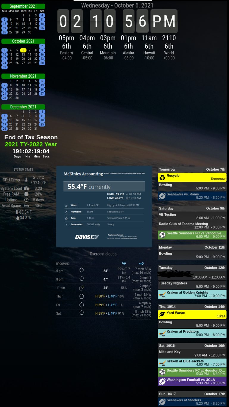
As an example, here’s how I adjusted mine on my mirror. It provides a thin left side, wide middle, and other minor changes without too much of a hassle.
The top blank area in my mirror is for an external ran instance of OMX for my security camera. The bottom blanks is currently unused because of how my mirror is set up.
/* Global changes */
/* Use the entire screen */

html {
	cursor: none;
}

body {
	margin: 0px;
	height: 100vh;
	width: 100vw;
 }

/* Adjust all modules */

 .module {
        padding: 2px;
        margin-bottom: 0px;
 }

/* disable dimmed text */

.dimmed {
	color: #FFFFFF
}


/* Region mods */

.region.left {
	text-align:center;
	}

.region.right {
	right: 0%;
}

.region.top.center {
  left: 52%;
  transform: translateX(-50%);
}

.region.fullscreen {
  position: absolute;
  top: 0px;
  left: 0px;
  right: 0px;
  bottom: 0px;
  pointer-events: none;
 }

.region.fullscreen * {
	background: rgba(0,0,0,0.7);
}
-
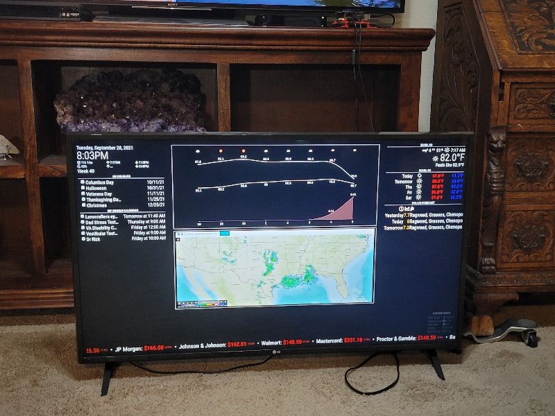
@techlady Here is my project in progress. My intent is to mount Pi to back of TV and treat MM as another HDMI input.
As others have said, module writers that stick with the convention of using main.css to format their module make it real easy to format multiple modules by using the appropriate block of main.css and dropping it in custom.css.
Gets sticky when a module author does their own formatting top to bottom.

Hello! It looks like you're interested in this conversation, but you don't have an account yet.
Getting fed up of having to scroll through the same posts each visit? When you register for an account, you'll always come back to exactly where you were before, and choose to be notified of new replies (either via email, or push notification). You'll also be able to save bookmarks and upvote posts to show your appreciation to other community members.
With your input, this post could be even better 💗
Register Login