Read the statement by Michael Teeuw here.
custom css for module question
-
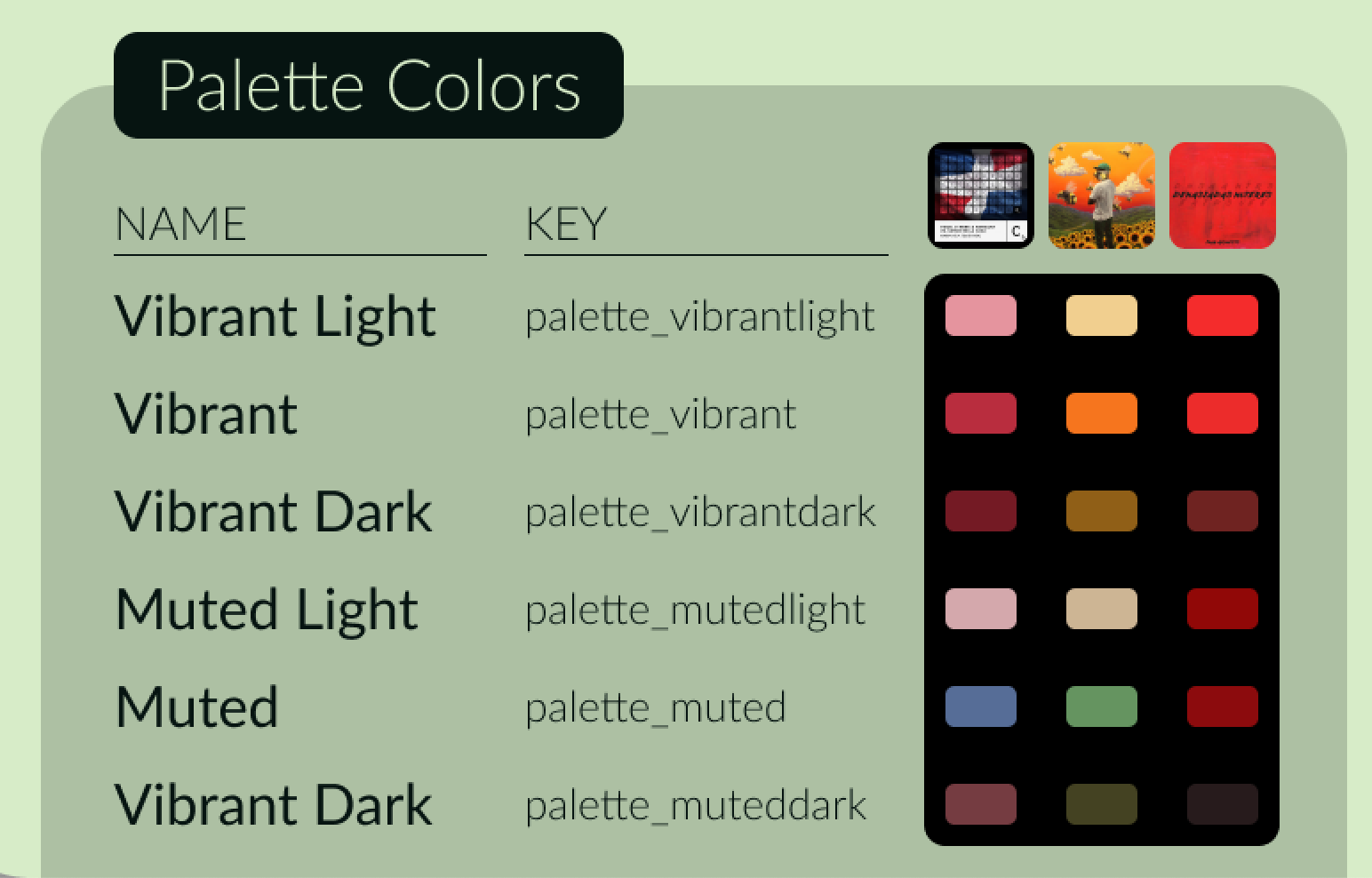
is it possible to float the header of a module above it like in this image?
as if “Palette Colors” said “New York CIty” for the weather
I tried using the developer feature in the browser to find it but it’s not specific, it just says “.module.header” -
@greedyvegan
Like this?
/* css/custom.css */ .region .container .module { padding: 20px; border-radius: 10px; background-color: rgba(255 255 255 / 10%); min-width: 300px; position: relative; } .module-header { position: absolute; top: -10px; left: 10px; background-color: darkslateblue; color: white; font-weight: bold; border: none; padding: 5px; border-radius: 5px; }
-
ahhhh region container
yes, thank you -
last series of questions (for today)
are these options available?
- move TUE, MAR 19 to the far right
- OR eliminate “Today, tomorrow, in five days” and leave the date or vice versa
- move event(s) like “Trash day” all the way to the right to make the row narrow
- add an element to the bright or dimmed class
.CX3A .dateParts literal seq_2 unit_none {text-align:right} isn’t working for me
please and thank you
-
- move TUE, MAR 19 to the far right
/* css/custom.css */ .CX3A .cellHeaderSub { display: none; } .CX3A .cellHeaderMain { display: flex; justify-content: space-between; width: 100%; }
- OR eliminate “Today, tomorrow, in five days” and leave the date or vice versa
/* css/custom.css */ /* Select one of below */ /* To remove `relative day` identifier. */ .CX3A .cellHeaderMain .relativeDay { display: none; } /* OR */ /* To remove date of the cell */ .CX3A .cellHeaderMain .cellDate { display: none; }
Of course, you can use more extended selectors like these;.CX3A .cell:not(.today) .cellHeaderMain .cellDate { ... .CX3A .cell.thisMonth .cellHeaderMain .relativeDay { ...
- move event(s) like “Trash day” all the way to the right to make the row narrow
- add an element to the bright or dimmed class
I can’t understand what those mean. Have you any example or sketch?
-
@MMRIZE said
- move event(s) like “Trash day” all the way to the right to make the row narrow
- add an element to the bright or dimmed class
I can’t understand what those mean. Have you any example or sketch?
1 - multi-day or single event, can I move that to the right
to make the row narrower ? “Tuesday, March 19th” is a little redundant because the mini month tells me that.
I understand IF a day happens to have multiple events it would create multiple rows.2 - this is related but unrelated to the calendar, some modules don’t have the simple {font-size: 12px;color red;} they use classes of bright and dimmed and or use “1em” for the size or “var(–color-text)”
forgive me, I’m slowly learning CSS and command/terminal with error, repetition and trial.
-
I wanted to shrink the rows (blue paint)
by taking the (green) event and moving it to the right.
using this will give me space- .CX3A .cellHeaderMain .cellDate {display: none;}
with the red paint, I’ve tried
- border-radius:15px;
but it doesn’t work
- .CX3A .cellHeaderMain .cellDate {display: none;}
-
@greedyvegan said in custom css for module question:
1 - multi-day or single event, can I move that to the right
to make the row narrower ? “Tuesday, March 19th” is a little redundant because the mini month tells me that.
I understand IF a day happens to have multiple events it would create multiple rows.As you know already, Events could be more than one. So what you want is; if there is only one event, it should be one-liner with the date(or with relative day identifier), but if there are N events, makes multi-rows.
Maybe if it is possible, it will not be so pretty. And the look would be similar to the default calendar module. If so, use the default calendar module instead.2 - this is related but unrelated to the calendar, some modules don’t have the simple {font-size: 12px;color red;} they use classes of bright and dimmed and or use “1em” for the size or “var(–color-text)”
There is no standard style guide for modules, so every module has it’s own look & feel. You have to override each style by yourself.
Anyway, some modules respects the style of the default modules. They might use the values those are defined incss/main.css
You can override some of the default styles incss/custom.css
like below;/* css/custom.css */ :root { --color-text: darkorange; --color-text-dimmed: darkgreen; --color-text-bright: crimson; --font-size: 16px; --font-size-small: 12px; }
original
transformed
-
@greedyvegan said in custom css for module question:
with the red paint, I’ve tried
border-radius:15px;
It needs some tricks. ;)
/* css/custom.css */ .CX3A .miniMonth .weeks.thisWeek { background-color: darkolivegreen; /* I've put the color to show clearly */ } .CX3A .miniMonth .weeks.thisWeek td:first-child { /* left border round */ border-radius: 10px 0 0 10px; } .CX3A .miniMonth .weeks.thisWeek td:last-child { /* right border round */ border-radius: 0 10px 10px 0; }
For your blue/red directions. If it is possible or not, this module has not been designed for this. So I can’t help about it.
I recommend hiding empty cells to save some unnecessary (empty) lines./* css/custom.css */ .CX3A .cell[data-events-counts="0"] { display: none; }
original
transformed
-
@greedyvegan
Anyway I just show whether it is possible. (Yes, everything is possible… even though I hate this kind of looks…)
But… Is it really useful or pretty?
/* css/custom.css */ .CX3A .cellHeader { width: fit-content; } .CX3A .cellFooter { display: none; } .CX3A .cell[data-events-counts="1"] { display: flex; justify-content: space-between; } .CX3A .cell[data-events-counts="1"] .cellBody .fullday .event { max-width: 100%; }