Read the statement by Michael Teeuw here.
Positioning Google Photo Module
-
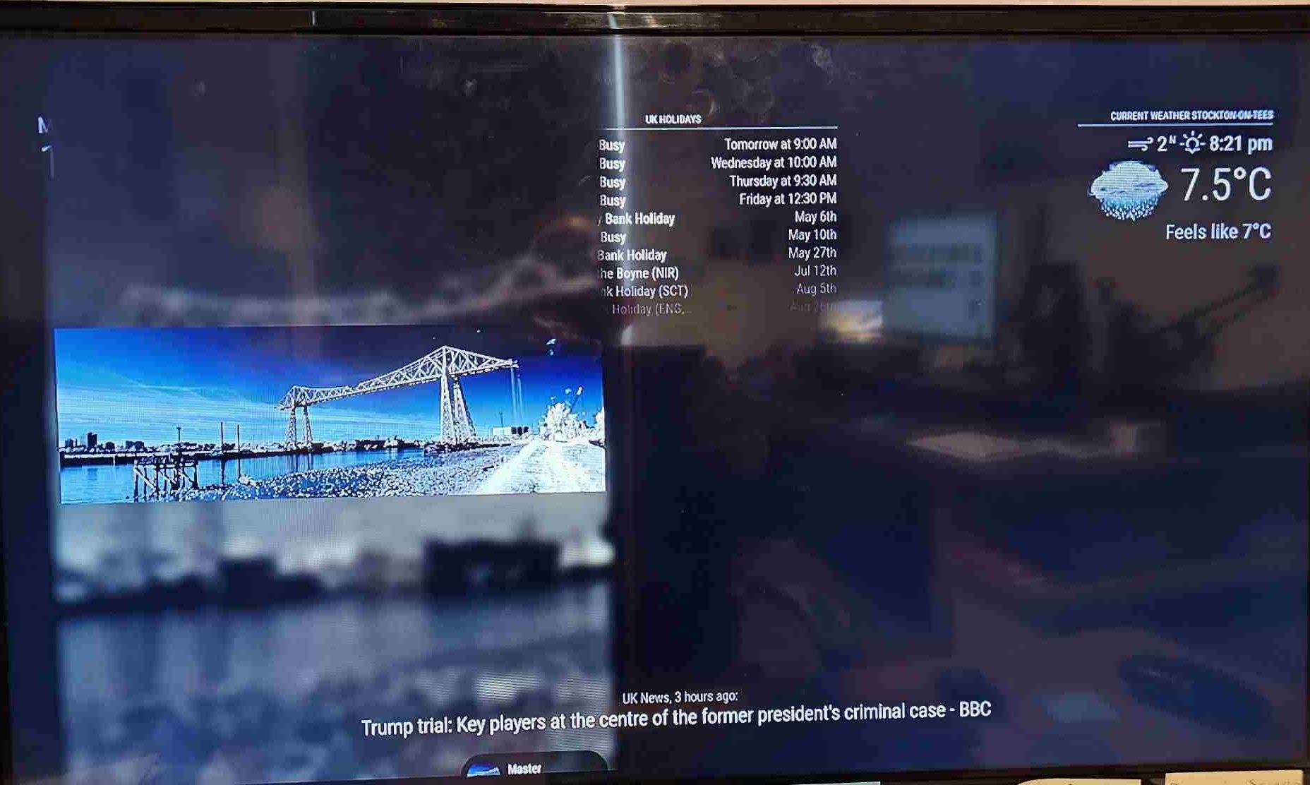
I have managed to set up Google Photos on my MagicMirror but I am having difficulty positioning the photos below the three items located on the top bar e.g Clock, Google Calendar and Weather. My preference would be to have the photos in the middle of the MagicMirror
You can see below the code in the Config file I am using and I have also include a image of how the MagicMirror crrently looks. I am thinking it may have something to do with image sized in the Google Album.
Any help or guidance would be appreciated.
Cheers,
John{ module: "MMM-GooglePhotos", position: "middle_center", config: { albums: ["Master"], // Set your album name. like ["My wedding", "family share", "Travle to Paris"] updateInterval: 10 * 10, // minimum 10 seconds. sort: "new", // "old", "random" uploadAlbum: null, // Only album created by `create_uploadable_album.js`. condition: { fromDate: null, // Or "2018-03", RFC ... format available toDate: null, // Or "2019-12-25", minWidth: 800, // Or 400 maxWidth: 2500, // Or 8000 minHeight: 400, // Or 400 maxHeight: 800, // Or 8000 minWHRatio: null, maxWHRatio: null, // WHRatio = Width/Height ratio ( ==1 : Squared Photo, < 1 : Portraited Photo, > 1 : Landscaped Photo) }, showWidth: 800, // These values will be used for quality of downloaded photos to show. real size to show in your MagicMirror region is recommended. showHeight: 1200, timeFormat: "YYYY/MM/DD HH:mm", // Or `relative` can be used. } }, ] };
This is the image I am trying to post:

-
@sdetweil Sorry Sam should have mentioned it in the last post. I set the maxWidth and maxHeight to the mointor size which is a TV e.g. 1366px x 768px. I also changed the postion of the moduler to Fullscreen_below and re booted. I do not know if this helped but reduced my images size to less than 1366px x 768px. Does not look exactly as I originally envisaged but looks good enough. I did not chane the CSS file settings as this is beyond my knowledge but afeter looking athe CSS settings realised by changing them you can get it to look exactly how you want it. Cheers, John
-
@synint 2 things
1 always use a code block for config info
paste the text
select the text you just passed, blank line above and below
hit the button the looks like </>- comment out the size values as a test
-
@synint is there any custom.css for this?
-
Apologies for my lack of knowledge. I have commented out sizes vales using // but did not resolve the situation. I am using Geany text editor to amend the config file but but do not see a button that looks like </>. The only CSS file I can find looks like this:
:root { --color-text: #999; --color-text-dimmed: #666; --color-text-bright: #fff; --color-background: #000; --font-primary: "Roboto Condensed"; --font-secondary: "Roboto"; --font-size: 20px; --font-size-xsmall: 0.75rem; --font-size-small: 1rem; --font-size-medium: 1.5rem; --font-size-large: 3.25rem; --font-size-xlarge: 3.75rem; --gap-body-top: 60px; --gap-body-right: 60px; --gap-body-bottom: 60px; --gap-body-left: 60px; --gap-modules: 30px; } html { cursor: none; overflow: hidden; background: var(--color-background); user-select: none; font-size: var(--font-size); } ::-webkit-scrollbar { display: none; } body { margin: var(--gap-body-top) var(--gap-body-right) var(--gap-body-bottom) var(--gap-body-left); position: absolute; height: calc(100% - var(--gap-body-top) - var(--gap-body-bottom)); width: calc(100% - var(--gap-body-right) - var(--gap-body-left)); background: var(--color-background); color: var(--color-text); font-family: var(--font-primary), sans-serif; font-weight: 400; line-height: 1.5; -webkit-font-smoothing: antialiased; } /** * Default styles. */ .dimmed { color: var(--color-text-dimmed); } .normal { color: var(--color-text); } .bright { color: var(--color-text-bright); } .xsmall { font-size: var(--font-size-xsmall); line-height: 1.275; } .small { font-size: var(--font-size-small); line-height: 1.25; } .medium { font-size: var(--font-size-medium); line-height: 1.225; } .large { font-size: var(--font-size-large); line-height: 1; } .xlarge { font-size: var(--font-size-xlarge); line-height: 1; letter-spacing: -3px; } .thin { font-family: var(--font-secondary), sans-serif; font-weight: 100; } .light { font-family: var(--font-primary), sans-serif; font-weight: 300; } .regular { font-family: var(--font-primary), sans-serif; font-weight: 400; } .bold { font-family: var(--font-primary), sans-serif; font-weight: 700; } .align-right { text-align: right; } .align-left { text-align: left; } header { text-transform: uppercase; font-size: var(--font-size-xsmall); font-family: var(--font-primary), Arial, Helvetica, sans-serif; font-weight: 400; border-bottom: 1px solid var(--color-text-dimmed); line-height: 15px; padding-bottom: 5px; margin-bottom: 10px; color: var(--color-text); } sup { font-size: 50%; line-height: 50%; } /** * Module styles. */ .module { margin-bottom: var(--gap-modules); } .module.hidden { pointer-events: none; } .module:not(.hidden) { pointer-events: auto; } .region.bottom .module { margin-top: var(--gap-modules); margin-bottom: 0; } .no-wrap { white-space: nowrap; overflow: hidden; text-overflow: ellipsis; } .pre-line { white-space: pre-line; } /** * Region Definitions. */ .region { position: absolute; } .region.fullscreen { position: absolute; inset: calc(-1 * var(--gap-body-top)) calc(-1 * var(--gap-body-right)) calc(-1 * var(--gap-body-bottom)) calc(-1 * var(--gap-body-left)); pointer-events: none; } .region.right { right: 0; text-align: right; } .region.top { top: 0; } .region.top.center, .region.bottom.center { left: 50%; transform: translateX(-50%); } .region.top.right, .region.top.left, .region.top.center { top: 100%; } .region.bottom { bottom: 0; } .region.bottom.right, .region.bottom.center, .region.bottom.left { bottom: 100%; } .region.bar { width: 100%; text-align: center; } .region.third, .region.middle.center { width: 100%; text-align: center; transform: translateY(-50%); } .region.upper.third { top: 33%; } .region.middle.center { top: 50%; } .region.lower.third { top: 66%; } .region.left { text-align: left; } .region table { width: 100%; border-spacing: 0; border-collapse: separate; } -
@synint don’t edit our files
all css updates go in custom.css
if it doesn’t exist, create itthe design is custom.css overrides anything specified before it is loaded (last)
the paste thing is in the forum message editor
-
@sdetweil Hi Sam I now have a MagicMirror that works and would not have been possibe without your support and help which I would like to thank you for.
-
@synint awesome… what made it right?
-
@sdetweil Sorry Sam should have mentioned it in the last post. I set the maxWidth and maxHeight to the mointor size which is a TV e.g. 1366px x 768px. I also changed the postion of the moduler to Fullscreen_below and re booted. I do not know if this helped but reduced my images size to less than 1366px x 768px. Does not look exactly as I originally envisaged but looks good enough. I did not chane the CSS file settings as this is beyond my knowledge but afeter looking athe CSS settings realised by changing them you can get it to look exactly how you want it. Cheers, John
-
@synint cool, thanks. that might help someone else…
-
S sdetweil has marked this topic as solved on
Hello! It looks like you're interested in this conversation, but you don't have an account yet.
Getting fed up of having to scroll through the same posts each visit? When you register for an account, you'll always come back to exactly where you were before, and choose to be notified of new replies (either via email, or push notification). You'll also be able to save bookmarks and upvote posts to show your appreciation to other community members.
With your input, this post could be even better 💗
Register Login