Read the statement by Michael Teeuw here.
Messed up CSS between Portrait and Landscape monitors
-
Hello,
In order to use Mykle1 MMM.Lucy, on my spare PC, I thought to save a lot of time by simply adding all the files from my Pi folder which is connected to a portrait monitor, that I have obviously altered CSS to suit that, and my PC Monitor being Landscape, makes MM squashed using the same CSS files for the several modules - Wunderground, Simple Logo, Calendar monthly, Compliments, News feed.I have only needed to perform these changes once, and that was over a year ago, so obviously I cannot remember what I done/altered, and what the defaults were, so I could get things looking perfect on the Landscape, as they do on the portrait.
Can anyone please push me towards how/what I can change in the CSS so that it looks right? I will include the files from each Module if you want to see them all?
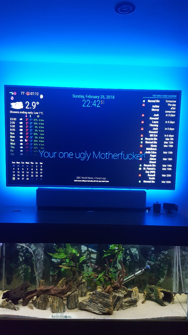
I am not sure if the padding needs altered back, as that was altered last year to maximise screen width for the portrait mirror, so unsure if that same padding will be okay on Landscape?As you can see from image, it looks like the bottom half has overlaid on top half, so I removed simple logos so you can see better, and also waited until news feed faded, and compliments faded, to let you see how odd things are, although I am happy enough with clock date size.
Many thanks for all pointers given
-
-
I have been playing about with the font sizes and line height for the last 2 hours, but all I am doing is messing things up worse, and reverting back again to try other things, but really not sure what to try.
Is this a simple case of making the zones smaller so everything fits accordingly? if so, can someone point me where to alter those to try? Thanks
-
Have you tried renaming your custom.css file and using the default (empty)? Then, taking the entries from your renamed css file, one by one, and adding them to your new custom.css file? That would be my approach, for what it’s worth.
-
Hi @Damian,
I’m on my phone atm, so will try to look in more detail later. It depends on the screen resolution, but also (as I’m sure you realize) you can fit less vertically with a landscape display.
You’re is a complicated question. I recommend a combination of repositioning and resizing.
First, you may want to see what (else) you can move to
top_centerandbottom_centerto make more room. Alternatively, if you don’t want to use those, you could make.region.leftand.region.rightwider (say, 50%). But you don’t have any text “wrapping” to new lines in your module, so in your case won’t help much.Second, you can resize by changing the
font-sizefor the entire page (in yourcustom.css) like this:body { font-size: 73%; }This value will then be inherited by (or “cascade to”, hence CSS) by all other elements in the DOM (i.e. on the page). You can also change the
font-sizeof a specific module; your “family home” calendar seems like a great contender.Finally, you may also want to limit the width of your newsfeed.
I think this should put you on the right course. Post any questions, let us know how you fare. I’ll check in later to help if I can.
-
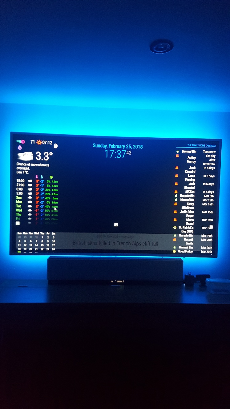
Thanks for the input guys, I have managed to reduce the news feed, which now looks more in keeping with screen size, but I cannot make compliments any slimmer - more central and not spreading over my weather and calendars?
I have just removed simple logo as that was just impossible to place anywhere.
The weather, calendar monthly, on left, and home calendar on right, goes weird with any alteration to font sizing, half of calendar goes off screen to right, and weather icons drop from grouping, meaning the temp now goes under the cloud instead of being close together.
I understand what you mean by having more flexibility when using in portrait, but I would have thought that there was some way of reducing say the weather sizing as a whole, same as calendars? By shrinking the zone/padding or whatever constraints they work under?
Portrait seems really easy and straight forward, but surely there must be another set of rules for landscape users of calendar and wunderground?
I wanted to sort all this out perfect before I started on MMM. Lucy, so I can fit the image in there somehow, but looks like I have my work cut out to re-arrange and minimise what I have now, first.
Edit. Even if there was a way to shrink Compliments, for now that would be acceptable until I get more time to play around trying to shrink wunderground, calendar monthly, and my family calendar. It just takes up whole width of screen and looks horrible 😯
-
-
@Damian Does this work?
.module.compliments { font-size: 73%; } -
Unfortunatley not ☹
I am now at a loss as to what to try now as this is first time trying MM on Landscape, and I am not liking it at all because I am unsure how to minimise the modules… a simple Zoom out would be perfect as my screen looks like its 100% zoomed in.😣 -
@Damian Use the built-in DOM inspector to see what styles are currently applied. Right-click on the compliments module and select “Inspect”.
Worst case, using
!importantshould work:.module.compliments { font-size: 73% !important; } -
Nope, that never worked either😣
I cannot fathom out what is going on, even when I first loaded up the default MM it all looked too big. Thats why I then added in my config.js and CSS stuff from my Pi foders to see if they would help minimise things any.
-
@Damian Inspect the element, and share a screenshot of the
div.module.complimentselement styles. At this point, either (1) your CSS is not being applied, or (2) those aren’t the right classes to use to target that element. I suspect the latter. -
Thanks, but do I download something onto the Pc to view? How do i inspect the element? There is nothing on that page to download, so how does the Dom inspector work?
-
@Damian You don’t need to download anything. Use your mouse on the MagicMirror. Right-click the compliments module, and select “Inspect element”. Or, stop MM, then run
npm start devwhich will start in development mode with Chromium’s developer tools already open. You then just need to navigate the DOM to find the.complimentselement. Follow these instructions to take a screenshot on an RPi. -
😂… by pure fluke I just found the very setting I was looking for, and never even knew it was there, or even noticed it until now when instead of my usual > alt > File > Exit… or >Window > Minimise, my mouse flicked on View, and there right in front of me was Zoom In - Zoom Out!
Only trouble is if I restart/reload MM it reverts back, and I have to zoom out again x 6 so it looks good… anyone know how to set it so it stays at my set zoom?
Thanks to all who assisted here to try and solve this… I will now sneak off in embarrasment😶
-
@Damian I was hoping you wouldn’t have to resort to it, but you can use CSS
transform: scale():body { transform: scale(0.8); /* for 80% */ }Some CSS transforms are processor intensive, although without animation should be fine on an RPi.
-
Thanks, but this is on a PC not a Pi … I have posted another post incase it gets lost in here, to find out if there is a setting to make to keep my MM Zommed out x 6, but I will try your suggestion here and see if that helps, as being a PC it should handle it eh?
-
While MM is running, press these keys at the same time:
Default Display Size = Control and 0 (That’s a zero)
Zoom In = Control and Shift and = (That’s an equals sign)
Zoom Out = Control and - (That’s a dash/minus sign)
-
@Damian Do you want 6x or 60%? (The former seems very small). Sorry I misunderstood about your PC; most of us use PCs as dev machines for the RPi.
If 6x (or, inverted, 1/6 or 16.7%):
body {
transform: scale(0.167); /* this might get messy, at least with any raster assets (like images) */
}
Or 60%:
body {
transform: scale(0.6);
}
According to this very interesting StackExchange question, you can also set the
document’szoomproperty in JavaScript (and via CSS, too):document.body.style.zoom = 2; -
Sorry, what I meant by x 6 was pressing the Zoom Out six times to get everything fitting the way I like it on screen. I’m home in a few hours so will play about with your suggestions and see how they fare.
Hello! It looks like you're interested in this conversation, but you don't have an account yet.
Getting fed up of having to scroll through the same posts each visit? When you register for an account, you'll always come back to exactly where you were before, and choose to be notified of new replies (either via email, or push notification). You'll also be able to save bookmarks and upvote posts to show your appreciation to other community members.
With your input, this post could be even better 💗
Register Login