Read the statement by Michael Teeuw here.
Ecobee
-
@stephenmelody @E3V3A @getsarcasm @majik655
Here is the git repo for you to download the module.
https://github.com/fabbr/MMM-Ecobee
Code is very messy because I haven’t cleaned up anything yet, but it’s working.
Please report any problems, ideas, suggestions, configuration, question, etc. etc. to me (PM or at gitHub) so I can improve this. Also if you can help in any way, please let me know.
This is my first module, I have spent way too many hours on it but I am proud to give something back to this amazing community.
-
Where do I find the code to enter on the ecobee portal??
-
@stephenmelody I will be installing this tonight but in theory the code should be given to you on the device you are trying to connect…
So start the module and it should give a code on the screen…then you can put that in on the portal at ecobee.com
Again sorry I am answering without actually installing it but the way ecobee works is the code is given from the device connecting to ecobee.
I will update tonight when I get it installed.
-
@majik655 @stephenmelody That is correct. you will get the code after you do the git clone and added the module to the config.js
Code refresh every 5min so you need to be quick on adding it to your account :)
-
Got it… I had it hidden due to some other module, my bad…
Quick question, can it show Celsius instead of Fahrenheit?
-
@stephenmelody Yes, but not correctly. I added this suggestion for the next release. Let me know if you have more :)
-
Ok, I can do that, although you might regret it!!
Some questions that might turn into requests… but these all seem to be minor tweaks
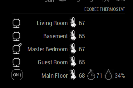
Does the heat symbol change colour depending on whether the system is heating or cooling, like it does on the app? (orange flame for heating, blue snowflake for cooling). In the example below, it’s currently 68, targeting 71. The app shows the flame in orange, that would be nice to quickly visualise if the system is running.
Can the order in which the sensors are presented be set? For example, I’d like my Thermostat to be at the top, not the bottom
It would be nice to be able to toggle what you see, for example, on my thermostat, I’m not too bothered about the humidity, so it would be nice to toggle that off - that would make the module smaller on my screen.
Great work by the way, I’m happy this is a new module, I’ve been hoping for this one for a while!!!
Here’s what I see

-
@stephenmelody said in Ecobee:
Does the heat symbol change colour depending on whether the system is heating or cooling, like it does on the app? (orange flame for heating, blue snowflake for cooling). In the example below, it’s currently 68, targeting 71. The app shows the flame in orange, that would be nice to quickly visualise if the system is running.
Currently No. I could add that tho. Currently the way you can check if the system is running or not is by checking the icon of the thermostat. It will change depending on the running status. I did that because a lot of people don’t like to have colors on their Mirrors. However, if you think this would make it better, elaborate on the different status and what should be displayed and I will work on having that as an option!
If you haven’t notice, when there’s motion the icon of the sensor also changes :)
Can the order in which the sensors are presented be set? For example, I’d like my Thermostat to be at the top, not the bottom
Not currently. The results of the API will always give the Thermostat as the last “device” I can have that as an option also. Any other order change that you think should happen?
It would be nice to be able to toggle what you see, for example, on my thermostat, I’m not too bothered about the humidity, so it would be nice to toggle that off - that would make the module smaller on my screen.
I will add that an option, keep in mind that you won’t save any space on the module, you only will see less information.
Great work by the way, I’m happy this is a new module, I’ve been hoping for this one for a while!!!
Here’s what I see

I am happy that it’s working! I have spend countless hours working on it.
-
Checking the icon of the thermostat - what are the options here? mine says ON, but the system is in idle (neither heating nor cooling). Is that what you meant? I have noticed the motion icon - I like that!
If you could toggle the displayed info, wouldn’t all the icons shift over to the right, if there was less on the line?
Elaboration, I think these would be the options, to be honest, I think it would just be System Heat Mode and System Cool Mode that I would be intereted in, I don’t have the capabilities for the other icons. I know a number of modules that I have allow for the toggle of colour on / off:
-
@stephenmelody said in Ecobee:
Checking the icon of the thermostat - what are the options here? mine says ON, but the system is in idle (neither heating nor cooling). Is that what you meant? I have noticed the motion icon - I like that!
Right now it will show if the Thermostat is set to a mode (ON) or off (OFF)
First image is OFF, Second is set to AUTO (69-64):


That being said, to show when it’s ACTUALLY running I need to figure what is the best way. (if that is important)
If you could toggle the displayed info, wouldn’t all the icons shift over to the right, if there was less on the line?
Not the way the I have the code running right now :(
Elaboration, I think these would be the options, to be honest, I think it would just be System Heat Mode and System Cool Mode that I would be intereted in, I don’t have the capabilities for the other icons. I know a number of modules that I have allow for the toggle of colour on / off:
So you want to see the colors in the module? or see them when the machine is running only?
Thanks for the feedback. I can’t way to go back to work on it :)
-
OK, what would be “important” to me, would be to show what the system is doing:
So if the AC is running, then a Blue Snowflake, if the Heating is running, an Orange Flame, it would just need to be one of them, not both, as per the app example. If nothing is actually running, then white would be fine.
For example:
Heating:

Cooling:

-
@stephenmelody GOT it! I will add to the module! Let me know if you have other changes you want and how the module is working for you!
-
let’s start with that and Celsius. Let me know when it’s ready and I’ll test it for you!
Thanks, this module is going to be great!!
-
Installed module last night … Great work! and Thank you again for creating this module!
While installing I now understand why the CODE from ecobee module may have been missed by others.
I was expecting to see the code and still took a minute or second look to see the code at the very bottom of the last sentence in the instructions on screen. If this CODE could maybe be larger or maybe a color that stands out?? Might help a little .I too would like to choose which sensors are shown…or show them in a specific order.
One more thing that I would love would be making the module smaller.
I am still learning all of this and I played with Custom.css but of course the module will start to cut the wording and sensors off from visually being seen from the bottom up.I will play more with it tonight… but this is awesome already! Thank you!
-
@fabbr any updates?
I’ve had the module running for a while now, but I’ve been away. When I got back, it had forgotten the ecobee module was authorised so I had to do that again.
-
@stephenmelody The way ecobee API works is: if you don’t check the status for a period of time it will make you reauthorize. Let’s say: You turn your mirror off for a couple of days, when you turn on you most likely will have to reauthorize. I don’t see a way around that :(
And I will be working on the changes this week and post a branch for the new code here for us to test.
Thanks :)
-
OK, it wasn’t a complaint, just some feedback in case it helps. I have my mirror set up so that only the screen turns off when no one is home, but the pi keeps on trucking in the background. I’d have to look and see what happened, but I got it reauthorised and I’ll see if it does it again.
Looking forward to new code!!!
-
@stephenmelody hahah I took it as feedback :) I need a lot of it to make this as usable as possible. keep them coming
-
The module is working fine. Thanks! Is there any way to change the output temperature to Celsius instead of Fahrenheit?
-
first off thanks I really enjoy the module!! great work! I do not have any colors on my dashboard at all and reading the thread I see that when my furnace is running the flame should be red?
Hello! It looks like you're interested in this conversation, but you don't have an account yet.
Getting fed up of having to scroll through the same posts each visit? When you register for an account, you'll always come back to exactly where you were before, and choose to be notified of new replies (either via email, or push notification). You'll also be able to save bookmarks and upvote posts to show your appreciation to other community members.
With your input, this post could be even better 💗
Register Login