Read the statement by Michael Teeuw here.
MMM-CalendarExt2
-
@cskenney
Wait a sec. I think found something. -
@cskenney
You have a mistyping indefaultSet. Notcalendars, Fix it tocalendar -
@Sean You can also do it through PM2 directly.
In a second session run “pm2 logs” – it’ll live update the logs on that session’s screen.
-
@Sean That did the trick. You used Calendars (with an S) for the main code section but the default section only used calendar (without the s). I didn’t notice the syntax difference. Thanks for the help.
-
@cskenney
BecausecalendarofdefaultSetwould be applied to eachcalendarofcalendars:[]. But anyway, my English is not so good so there could be confusing. -
@Sean No, it’s fine. I just didn’t notice the syntax difference when I created the default section.
Thanks again for your help.
-
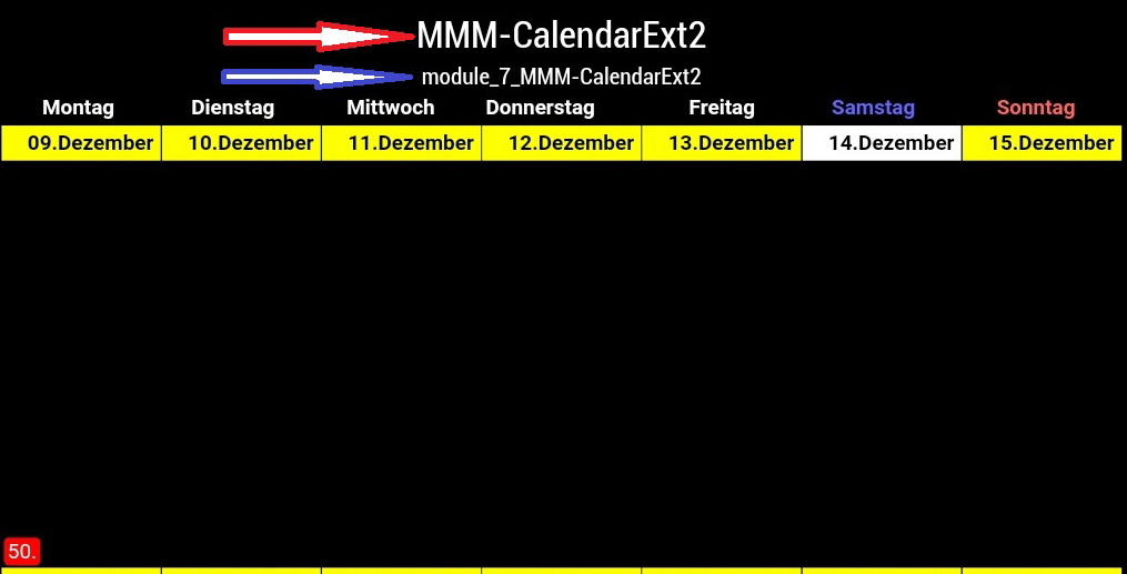
The two things were only added after the installation of “MMM-Page-Selector”.
Do you know how I remove the “module name (red)” and the “module counter blue”?
It is somehow related to the module.
I hope Sean, can you help me? -
@Lordy
Removepostionof module. This module doesn’t need it. -
@Sean said in MMM-CalendarExt2:
Remove postion of module. This module doesn’t need it.
I tried it, unfortunately without success. Or what exactly do you mean? Here is my config.
{
module:“MMM-CalendarExtMinimonth”,
disabled: false,
position: “bottom_bar”,
pages: {main: ‘bottom_bar’},
calendars: [ ],
},
{
module: ‘MMM-CalendarExt2’,
disabled: false,
pages: {main: “bottom_bar”},
config: {
rotateInterval: 5601000,
scenes:[
{
name: “”,
views: [“”],
},
],
views:[
{
position: “bottom_bar”,
name: “”,
title: “”,
mode: “week”,
colored: true,
type: “row”,
slotCount: 2,
slotSubTitleFormat: “dddd”,
slotTitleFormat: “DD.MMMM”,
slotAltTitleFormat: “DD.MMMM”,
slotMaxHeight:“325px”,
calendars: [“xxx”],
locale: “de”,
maxItems:2000,
hideOverflow: false,
},
],
calendars: [ -
@Lordy
Hmmm. this module would manage its hiding/revealing by itself. So there is no need setpostionof this module itself. But you set the position bypages: {main: “bottom_bar”},throughMMM-Page-Selectorby force.
Unfortunately, MM would show the module name and id even when the module has nothing to draw at that position.Hmmm…
I think the easiest way is to hide it by CSS.
#module_7_MMM-CalendarExt2 {
  display:none;
}
The only problem is, if you change the order of modules(adding a new module or removing) in configuration, the module Id will be changed. In that case, you should modify again.
-
@Sean said in MMM-CalendarExt2:
The only problem is, if you change the order of modules(adding a new module or removing) in configuration, the module Id will be changed. In that case, you should modify again.
Thank you for your prompt reply. And always, you were right about that. :thumbs_up_medium-light_skin_tone:
-
This post is deleted! -
Sean:
Looks like we’re getting screwed over here:
Starting February 15, 2021, G Suite accounts will only allow access to apps using OAuth. Password-based access will no longer be supported.
Calendar
If you use CalDAV to give an app or device access to your calendar, switch to a method that supports OAuth. We recommend the Google Calendar app [Web/iOS/Android] as the most secure app to use with your G Suite account. -
@nmeldre
i’ve been asked this already countless times, however still the answer is same.
i regard week/month view as a kind of brief overview or summary of long periods. so have no idea to provide details on these both views.Because;
- wrapping usually looks ugly anyhow.
- the more title means the less events to show at a same time in same area.
- can use transforming for abbreviation or using icon or assigning styles for better distinguishing than long text
- additional better views exist to show detailed info of more important and close future events. like upcoming or daily.
- real web or desktop application - google calendar and apple calendar - also don’t provide title wrapping in month style views.
So, sorry.
-
@BKeyport
hmm i don’t use G suit, so at this moment, have no idea how things going. I’ll research.
(maybe 3rd party converter module could be possible to solve that issue without modification of this module directly) -
@Sean I figure Google’s gonna do that to main accounts sooner or later. GSuite is usually the test bed.
I’m likely going to be moving my
calendaragenda system, depends on what my appointment manager supports. -
@Sean,
I’m trying to add an ICS file, but it’s throwing an error, but other calendars accepts it.
The url is http://www.tax.gov/calendar/employer/calendar.ics
Log from PM2 LOGS shows this error:
[CALEXT2] calendar:irs >> invalid date-time value: “2016-12-30T::”
Is it the US Government not knowing what’s going on, or is it a bug in the code?
Thanks!
-
@Sean
Thanks for the great module, it is the main reason for my Magic Mirror / picture frame.Could you explain the syntax for using the “transform” command to change the title of an event to a shorter abbreviation (e.g. “jack climbing” = > “J.C.”)? I have some items in my calendar that are displayed on the monthly view with a title “Dinner: Taco Soup” and I would like to use transform to remove the "Dinner: " from the title. I have searched the documentation and the forum, but am having a tough time figuring out how I need to specify this in my config.js (or custom.css).
-
Basically, read this.
https://github.com/eouia/MMM-CalendarExt2/wiki/Filtering-and-Sorting#transforming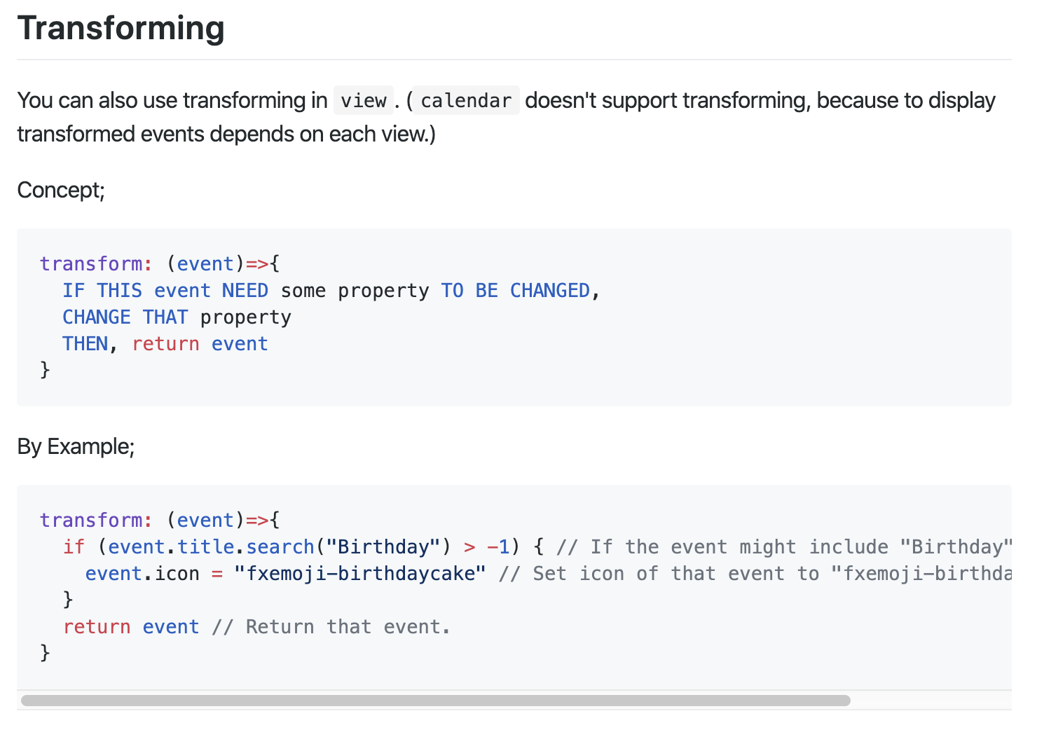
You need some basic skills in JavaScript. Anyway, I’ll show some examples;
- Original
I’ve added two events on 25th Dec.
Lunch:Taco Soup OnceandDinner:Taco Soup Twiceon my Google calendar.
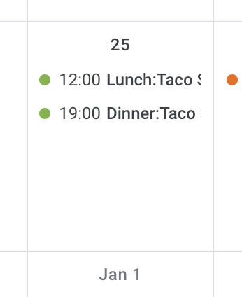
Hmmmm Taco Soup on Christmas, what a poor…It will be shown like this on MMM-CalendarExt2 without transforming;
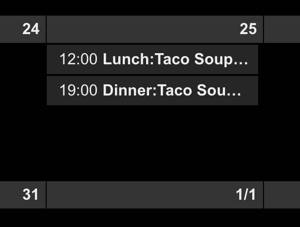
- Remove
Dinner:
transform: (event)=>{
  event.title = event.title.replace("Dinner:", "")
  return event
}
will make this;
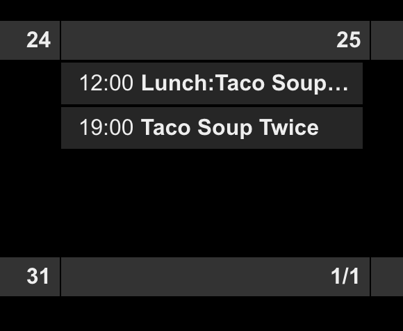
- give more transforming.
transform: (event)=>{
  if (event.title.search("Dinner:") > -1) {
    event.title = event.title.replace("Dinner:", "")
    event.icon = "emojione-pot-of-food"
    event.className = "myDinnerClass"
  }
  return event
}
I’ve added icon and specific CSS class selector. So you can define your CSS class on
MagicMirror/css/custom.csslike this;.CX2 .myDinnerClass { color: Black; background-color: Yellow; }It will be shown like this;
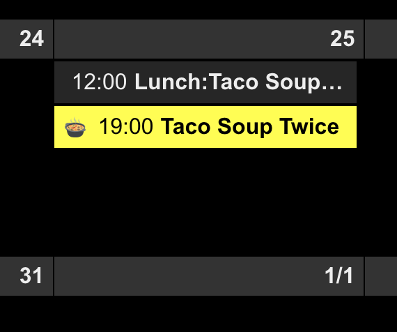 !
!Of course, there would be more tricks if you know javascript somehow.
If you are not familiar with Javascript,… hmmm sorry for you. Anyway, this is DIY project. There is no ready-made out-of-box arts.
-
Hello together.
Is it possible to Show two different calendars, on two different pages (mmm-pages)?
Hello! It looks like you're interested in this conversation, but you don't have an account yet.
Getting fed up of having to scroll through the same posts each visit? When you register for an account, you'll always come back to exactly where you were before, and choose to be notified of new replies (either via email, or push notification). You'll also be able to save bookmarks and upvote posts to show your appreciation to other community members.
With your input, this post could be even better 💗
Register Login