Read the statement by Michael Teeuw here.
MMM-CalendarExt2
-
That looks absolutely incredible ! I would really appreciate it, if you could publicate this or that I could test it! As well maybe you could drop me a pm with your PayPal data ;)
-
@Sean Hi Sean, any news regarding the module ?
-
@gekberlin
Sorry, almost done. But always writing manual is boring work. Only manual remains. I hope I can release this in a few hours. (Maybe… after my lunch. :D) -
@gekberlin
Released.
[card:eouia/MMM-CalendarExtMinimonth] -
Hi everybody! I’m setting up Calendar-ext2 but I’m not able to read the location and the description of the event. Is there a specific setting to show it? Thanks!😁
-
@Doni90
By Default,upcomingandcurrentview shows location and description automatically by default. (Inweekandmonthviews, not allowed - you can modify CSS to reveal even in those views, but not recommended)
If you want to show location/description ondaily,weekly, andmonthlyviews, add this into yourcss/custom.css.CX2 .eventSub { display:block; } -
@Sean said in MMM-CalendarExt2:
@Doni90
By Default,upcomingandcurrentview shows location and description automatically by default. (Inweekandmonthviews, not allowed - you can modify CSS to reveal even in those views, but not recommended)
If you want to show location/description ondaily,weekly, andmonthlyviews, add this into yourcss/custom.css.CX2 .eventSub { display:block; }Thank you! :D
-
Okay. This is all amazing. I was starting to configure MMM-CalendarExt when I found a reference to this. It has some features that I like a lot but I’m having some issues.
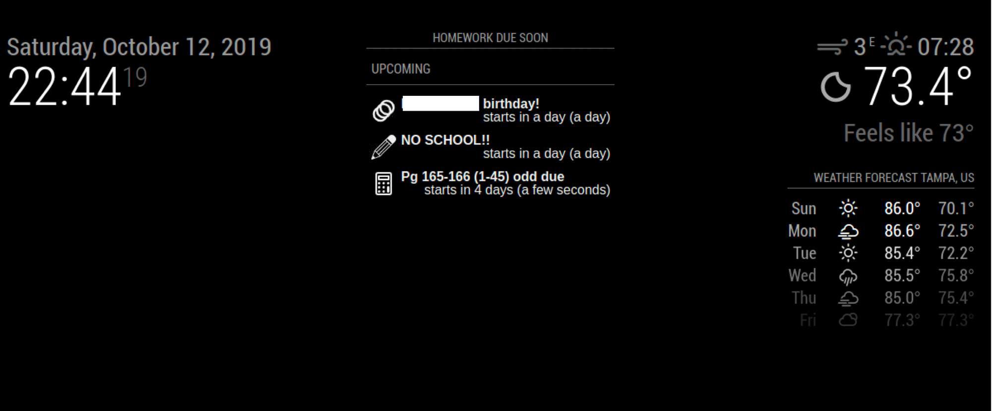
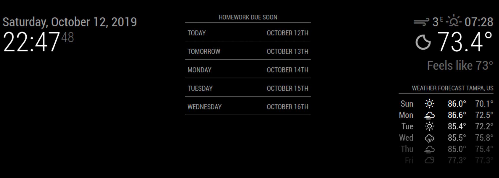
- It doesn’t seem to always load the data. Sometimes it works, sometimes it doesn’t. I’ve been trying to narrow this down. I’ve got 6 calendars I’m loading to show my sons homework. I put them in an upcoming and I see some data so I know they are loading (at least 3 of them), but I switch to daily (5 slots) and I get nothing even though some of the data is for the next few days.
One second view it loads one calendar fine, but the moment I add a second the data disappears. I
Config for upcoming view -
{
name: “Homework”,
mode: “upcoming”,
title: “Homework Due Soon”,
position: “top_center”,
calendars: [“Algebra”, “Latin”, “Transitions”, “Ceramics”,“English”, “Biology”],
maxItems: 50,
maxDays: 5,
},

for daily view (not working)-
{
name: “Homework”,
mode: “daily”,
title: “Homework Due Soon”,
position: “top_center”,
calendars: [“Algebra”, “Latin”, “Transitions”, “Ceramics”,“English”, “Biology”],
slotCount:5,
hideOverflow: false
},

-
In a daily view when the data is getting cut off because it’s too long for the column width. What do I need to change to remove some of the column spacing or expand the height of each data cell based on the data.

-
How do I hide the Week count (41st ,42nd, etc) in a monthly view.

-
-
I think
maxItemsshould be bigger for using many calendars at the same time. Your config says 50 events to be loaded in that view and many of those events were old to be displayed in that view.
Smaller values will make performance better but by that value, some events would be dropped. You can usefilterto filter UNNECESSARY events, but somewhat difficult, so just giving a bigger value tomaxItemswould work. -
Width of horizontal MM is not enough wide to display 5 columns :D If you are using 1920x1080 resolution, the width will be 1080(max) or somehow narrower. It means usually each column will take 200px or smaller in 5 columns.
Anyway, there could be a few solutions.
-
remove the outer frame margin/padding of MagicMirror itself.
-
adjust the column size of MMM-CalendarExt2
It is not such an easy because it is hard-coded.
https://github.com/eouia/MMM-CalendarExt2/blob/e7535e8fda1fdad1078af158d6e299f730292174/CALEXT2_View.js#L284
if (this.config.type == "row") slotDom.style.width = ((100 / count) - 3) + "%"You can modify this. (change
3to1or0and save it) But not recommended.-
make font smaller
redefine--font-sizein CSS(in yourcss/custom.css. referenced byMMM-CalendarExt2.css). Adjusting details might be needed. -
Title as multi-lines. (Recommended)
add this into yourcss/custom.css
.CX2 .period .eventTitle {
  white-space:normal;
}
- Or you can abbreviate long title to shorter by using
transform
- add this into your
css/custom.css
.CX2 .weeksmark { display:none; } -
-
Thanks for the quick reply!
I think it’s much closer to where I want it now. It takes some time for the data to load initially, but it seems to be working. Still some visual tweaks to make.
I kinda miss the built in styles from CalendarExt. It made it easy to just make each calendar different.
-
Howdy @Sean something weird is happening. I have this module setup and it’s been working great for a while. It is a scene with two views. The first view is great, but the second view which has the exact same calendars only shows today. The rest of the month is blank. Have you seen this happen before?
-
@Fr8Trayne
show me the configuration. -
I’ve removed the actual links to calendars solely for this . Please note that it has been working up until 2 days ago. I love this module just not sure this stopped working. Also note I have a second version of this one a weekly view that still is working just fine.
{
module: “MMM-CalendarExt2”,
pages: {second: “fullscreen_above”},
defaultset: {
view: {
slotCount: 5,
},
},config: { scenes: [ { name: "Month Calendar", views: ["family"], className: "scene_1", }, ], views: [ { name: "family", mode: "week", fromNow:0, className: "view_1", calendars: [], slotTitleFormat:"MM/DD", slotSubTitleFormat: "dddd", beforeDays: "7", hideOverflow: false, type: "row", }, ], calendars: [ { name: "Family Calendar", url: "https://calendar.google.com/calendar/ical", scanInterval: 2000, className: "family_calendar", maxIterations: 100, }, { name: "Dad's Calendar", url: "https://calendar.google.com/calendar/ical", scanInterval: 2000, className: "dads_calendar", maxIterations: 100, }, { name: "Mom's Calendar", url: "https://calendar.google.com/calendar/ical", scanInterval: 2000, className: "moms_calendar", maxIterations: 100, }, { name: "Alana's Calender", url: "https://calendar.google.com/calendar/ical", scanInterval: 2000, className: "alanas_calendar", maxIterations: 100, }, { name: "John's Calendar", url: "https://calendar.google.com/calendar/ical", scanInterval: 2000, className: "johns_calendar", maxIterations: 100, }, { name: "Holiday Calendar", url: "https://calendar.google.com/calendar/ical, scanInterval: 2000, className: "holiday_calendar", maxIterations: 100, }, ], }, }, -
@Fr8Trayne
I think this could be alsomaxItemsissue of view.
You have several calendars in a view, it means you might have tons of events in the memory of RPI.(You can check how much events are selected to load on your log.)
Which events should be displayed would be decided by some rules with some condition -filter,sort, … In this case, you haven’t set your rule, so the view would contain100events(set as default, sorted by time) from whole calendars. And most(or all) of them would be too old events to display in this view.Just set the
maxItemsof view bigger, or set your rule offilterorsortevents to display. -
@Sean thanks. I have added those changes with no effect. Would you mind guiding me to find those stores events in the RPI? I’d like to see if that is the issue.
-
@Fr8Trayne
Could you share with me your real ical url or file to inspect? you can send it via email. (eouia0819@gmail.com) -
Can someone show me what I am doing wrong. I have this configuration:
	{
		module: 'MMM-CalendarExt2',
		config: {
			//firstDrawingDelay: 1000*10,
			scenes:[
				{
					name: "DEFAULT",
					views: ["VIEW1"],
				},
				],
			views:[
				{
					name: "VIEW1",
					mode: "daily",
					title: "Bard Family Schedule",
					position: "bottom_right",
					maxItems: 100,
					maxDays: 5,
					locale: "en",
					hideOverflow: true,
					filterPassedEvent: true,
					slotCount: 4,
					calendars: ["Steve","Tracie","Alex"],
				},
				],
			calendars: [

				{
					name: "Steve",
					url: "https://calendar.google.com/calendar/ical/",
					beforeDays:0,
					afterDays: 5,
				},

				{
					name: "Tracie",
					url: "https://calendar.google.com/calendar/ical/",
					beforeDays:0,
					afterDays: 5,
				},
				{
					name: "Alex",
					url: "https://calendar.google.com/calendar/ical/",
					beforeDays:0,
					afterDays: 5,
				},


				],
			},
	},
The actual calendars have the correct url in my setup. If I set one calendar to show in the view ie. [“Alex”] it works but if I try to do all of them I get nothing. Only the headings for the days.
Here is the startup sequence:
Starting MagicMirror: v2.9.0
Loading config …
Loading module helpers …
No helper found for module: alert.
Initializing new module helper …
Module helper loaded: updatenotification
No helper found for module: clock.
Initializing new module helper …
Module helper loaded: MMM-GooglePhotos
No helper found for module: currentweather.
No helper found for module: weatherforecast.
Initializing new module helper …
Module helper loaded: MMM-MyScoreboard
No helper found for module: MMM-pages.
Initializing new module helper …
Module helper loaded: MMM-OnScreenMenu
No helper found for module: MMM-SmartWebDisplay.
Initializing new module helper …
Module helper loaded: MMM-CalendarExt2
All module helpers loaded.
Starting server on port 8080 …
Server started …
Connecting socket for: updatenotification
Connecting socket for: MMM-GooglePhotos
MMM-GooglePhotos started
Connecting socket for: MMM-MyScoreboard
Starting node_helper for module [MMM-MyScoreboard]
Connecting socket for: MMM-OnScreenMenu
Connecting socket for: MMM-CalendarExt2
Sockets connected & modules started …
Launching application.
MMM-GooglePhotos initialized after loading.
[CALEXT2] calendar:Steve >> Scanning start with interval:1800000
[CALEXT2] calendar:Tracie >> Scanning start with interval:1800000
[CALEXT2] calendar:Alex >> Scanning start with interval:1800000
[CALEXT2] calendar:Alex >> Scanned: 3, Selected: 3
[GPHOTO] Scan finished : 66
[CALEXT2] calendar:Steve >> Scanned: 0, Selected: 0
[CALEXT2] calendar:Tracie >> Scanned: 7, Selected: 7Can you see anything I am doing wrong?
-
@lotusvball
Could you share with me your real ical(.ics) file or URL? By only inspection of real ical, I can tell what’s wrong.
email : eouia0819@gmail.com -
@Sean Just emailed it. from sabard@gmail.com
-
@wegz15 Hey!! your layout is the exact one I have been trying to do for many hours over the last months. May you please paste the code you used to make it looks like that? thx ( the doc’s are confusing and do not show where the part of the codes go to make it work. i liked the first Ext docs better.)
Hello! It looks like you're interested in this conversation, but you don't have an account yet.
Getting fed up of having to scroll through the same posts each visit? When you register for an account, you'll always come back to exactly where you were before, and choose to be notified of new replies (either via email, or push notification). You'll also be able to save bookmarks and upvote posts to show your appreciation to other community members.
With your input, this post could be even better 💗
Register Login