@earlman Hiyaa! Thanks for your reply. I will try the linked module - I am quite new to js and css, would you mind to share some of your calendar related CSS? I am especially curious of the upper border styiling in the second image you posted. Thanks in advance, have a great day!
Read the statement by Michael Teeuw here.
Posts
-
RE: Magic Mirror Redesign WIP :D
-
RE: Magic Mirror Redesign WIP :D
@earlman HI! That looks fantastic, very nice work! Which calendar modul are you planning to use? I would love something like this - in weekly view. I would be greatful if you could point me in the right direction with this. Thanks for sharing!
-
RE: Region/module positioning on Servermode (on docker, Synology) and client (web-browser)
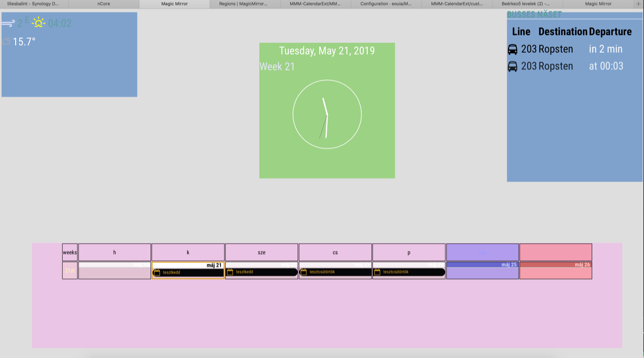
A short update: I was able to move the modules manually using css. It seems to work but it’s not an elegant solution. Any ideas/suggestions how to do it right?

tml { height: 1080px; width: 1920px; } header { text-transform: uppercase; font-size: 26px; font-family: "Roboto Condensed"; font-weight: 600; border-bottom: 1px solid white; line-height: 15px; padding-bottom: 5px; margin-bottom: 10px; color: cadetblue; } body { margin: 10px; position: absolute; height: 1080; width: 1920px; background-color: rgba(214, 214, 214, 0.8); background-repeat: no-repeat; /*background-size: 1920;*/ font-family: "Roboto Condensed", sans-serif; font-weight: 400; font-size: 2em; line-height: 1.5em; -webkit-font-smoothing: antialiased; } .region.top.left .container .module.currentweather { width: 400px; height: 250px; position: absolute; left: 90px; top: 90px; background-color: rgba(20, 102, 186, 0.5); /*kek*/ } .module.clock { width: 400px; height: 400px; position: absolute; left: 760px; top: 90px; background-color: rgba(80, 196, 0, 0.5); /*zold*/ } .region.top.right .container .module.MMM-SL-PublicTransport { width: 400px; height: 500px; position: absolute; left: 1490px; top: -00px; background-color: rgba(20, 102, 186, 0.5); } .region.bottom.bar .container { width: 1740px; height: 310px; position: absolute; left: 90px; top: 680px; background-color: rgba(247, 173, 236, 0.5); /*magente*/ } -
Region/module positioning on Servermode (on docker, Synology) and client (web-browser)
Hi MagicMirror Builders!
I’ve got stuck with the positioning of modules/regions. My setup:
MagicMirror2 running in servermode in a docker container on a Synology.
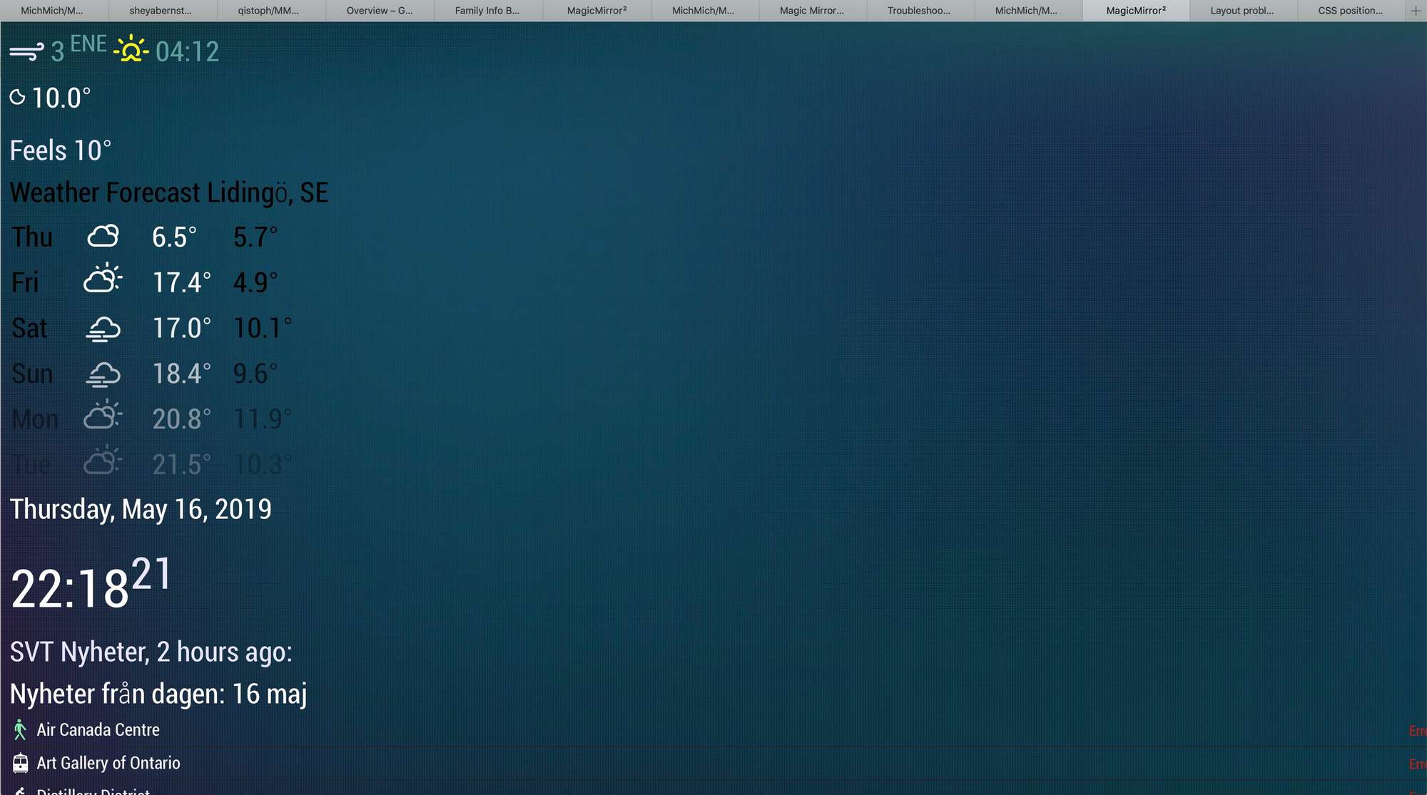
The client would be a tablet (untill I fix a monitor and a PI), I am planning to show the info board in a browser.Setup is finished, I am able to install/config modules, apply css. The problem is that when I open the ip of the mirror in a browser, the alignment of the regions is not ok. It seems like the _left and _right regions are just on top each other. I tried to modify the “body” in the custom.css, it works (the modules become wider), but the alignment is the same, I can not place the top_left and top_right regions nex to each other.
I have no experience in css or js, but tried to find a solution on the forum, without luck. Can you please point me in the right direction? How could I set the window size for the MM?
My modules config:
modules: [

		{
			module: "clock",
			position: "top_right"
		},

		{
			module: "currentweather",
			position: "top_left",
			config: {
				location: "Lidingö",
				locationID: "",  //ID from http://bulk.openweathermap.org/sample/; unzip the gz file and find your city
				appid: ""
			}
		},
		{
			module: "weatherforecast",
			position: "top_left",
			header: "Weather Forecast",
			config: {
				location: "Lidingö",
				locationID: "",  //ID from https://openweathermap.org/city
				appid: ""
			}
		},
		{
Thanks in advance!
Balint