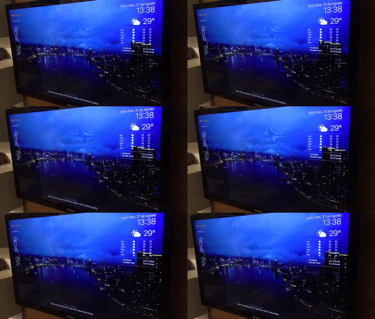
One of my favorite features from Apple TV is those beautiful Aerial screensavers, they are super relaxing and elegant, but I always wondered why Apple didn’t add some information on top of it, just like the Chromecast does.
After spending a lot of time trying to find the perfect Dashboard app for Apple TV, I decided to go for the MagicMirror Project and I’m so happy with the way it turned out. Now, every day when I wake up or arrive home, my bedroom TV greets me with useful information. I was already running Homebridge on the same Pi3 so I use it with an IR blaster (Broadlink RM mini) to automate this.

The best part is that I can say “Hey Siri, turn the dashboard on” and the Broadlink sends an ON and an HDMI1 signal to my tv. If I’m watching Netflix in HDMI2 for example, it sends an ON (which does nothing) and an HDMI1 so I can see what I want.
I downloaded iOS 8 Vector kit UI from Rusty Mitchel to get those weather icons, and the default San Francisco Pro Display font, according to tvOS Human Interface Guidelines. In the Calendar module, I’m using circle icons with the same colors as the official calendar app.
You can download the icons here. Put the icons folder inside you css folder and to paste the code below into your custom.css
@font-face{
 	  font-family: SF;
 	  src: url("SF-Pro-Display-Light.otf") format("opentype");
 	}

.currentweather .weathericon {
  position: absolute;
  z-index: 0;
  height: 120px;
  margin-top: -30px;
  margin-left: -25px;
  right: 60px;
}

.weathericon {
  position: absolute;
  left: 110px;
  z-index: 1;
  margin-top: -15px;
  height: 35px;
  -webkit-svg-shadow: 0 0 7px #53BE12;
}

.wi-day-sunny {
content: url("/css/icons/Mostly Sunny Icon Group.svg");
}

.wi-day-cloudy {
content: url("/css/icons/Partly Cloudy Icon Group.svg");
margin-left: -2px;
}

.wi-rain {
content: url("/css/icons/Heavy Rain Icon Group.svg");
}

.wi-night-clear {
content: url("/css/icons/Clear Night Icon Group.svg");
}

.wi-night-cloudy {
content: url("/css/icons/Partly Cloudy Night Icon Group.svg");
}

.wi-cloudy {
content: url("/css/icons/Mostly Cloudy Icon Group.svg");
}

.wi-showers {
content: url("/css/icons/Scattered Showers Icon Group.svg");
}

.wi-thunderstorm {
content: url("/css/icons/Mix Rainfall Icon Group.svg");
}

.wi-snow {
content: url("/css/icons/Blizzard Icon Group.svg");
}

.wi-cloudy-windy {
content: url("/css/icons/Partly Cloudy Icon Group.svg");
}

.wi-night-rain {
content: url("/css/icons/Heavy Rain Night Icon Group.svg");
}

.wi-night-snow {
content: url("/css/icons/Blizzard Night Icon Group.svg");
}

.wi-night-thunderstorm {
content: url("/css/icons/Severe Thunderstorm Night Icon Group.svg");
}

.wi-night-showers {
content: url("/css/icons/Scattered Showers Night Icon Group.svg");
}

.wi-fog {
content: url("/css/icons/Fog Icon Group.svg");
}

.wi-night-alt-cloudy-windy {
content: url("/css/icons/Partly Cloudy Night Icon Group.svg");
}
I downloaded some of my favorite Aerial videos from here and converted then to WebM format to reduce the choppiness with MMM-htmlvideo.
Also added a drop-shadow to make text always readable in different backgrounds, and some minor padding adjustments to make everything pixel perfect.
Another idea I want to share is my customized transparent MMM-GoogleMapsTraffic you can see on the top left corner: First, I set the background of the map to transparent in the module’s .js file.
var self = this;
        	script.onload = function () {
            	var map = new google.maps.Map(document.getElementById("map"), {
            		zoom: self.config.zoom,
                	mapTypeId: self.config.mapTypeId,
            		center: {
            			lat: self.config.lat,
            			lng: self.config.lng
            		},
			styles: self.styledMapType,
			disableDefaultUI: self.config.disableDefaultUI,
			backgroundColor: 'hsla(0, 0%, 0%, 0)' //THAT'S THE TRICK!!!
            	});

            	var trafficLayer = new google.maps.TrafficLayer();
            	trafficLayer.setMap(map);
        	};
After that, I created a Map Style with transparent geometries, you can play around with your favorite colors in Google Styling Wizard, I also recommend to use Snazzy Maps to get the perfect center location, width, height and zoom level, to show precisely the roads you use every day.
Using CSS, it’s possible to remove the Google logo, “Report an error” and “terms of use” buttons from the map to achieve a super clean look. (Note that this violates Google API rules, research purpose, and private use only).
a[href^="http://maps.google.com/maps"]{display:none !important}
a[href^="https://maps.google.com/maps"]{display:none !important}

 .gmnoprint a, .gmnoprint span, .gm-style-cc {
     display:none;
 }
 .gmnoprint div {
     background:none !important;
 }
Finally, MMM-WatchDog keeps an eye on that heavy UI, in conjunction with PM2 it restarts the app in case of UI failure.

I’d like to thank everyone responsible for this project, this was my first experience using css and I’m inspired to study even more. Sorry for my poor English :)