Read the statement by Michael Teeuw here.
Title of two modules in one line
-
Hi guys,
I’m using two modules (MMM-DWD-WarnWeather and the default Calendar Module).
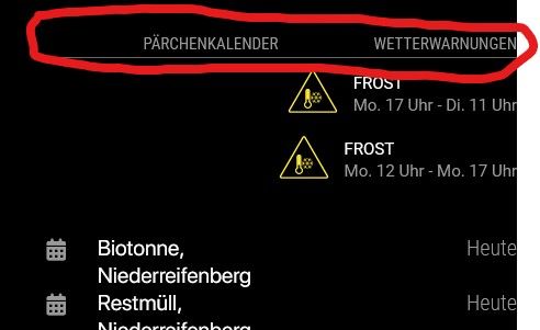
Somehow the titles of both modules are in one line, but the content is undeaneath each other.
What can I do (CSS?) in order to get the title of the calendar Module underneath the content of the MMM-DWD-WarnWeather module?I’ve tried it with padding-bottom, but it just shifts the MMM-DWD-WarnWeather content further down, the title remains where it is.
Any suggestions?
-
@codac wherever are they located, position?
-
@sdetweil both are at top_right
-
@codac Hi, i think the problem is caused of the CSS settings of
MMM-DWD-WarnWeather.
I already forked the module and tried to change some things. Currently i do not have time to make a proper pull request to get the changes merged to the original module but i will do this in the future.If you want to give it a try you can use my fork and following settings in your
custom.css:.MMM-DWD-WarnWeather .wrapper { display: flex; flex-direction: column; align-items: flex-start; width: 320px; gap: 5px; } .MMM-DWD-WarnWeather .warning { width: 100%; display: flex; flex-direction: row; gap: 10px; margin-bottom: 0px; } .MMM-DWD-WarnWeather .status { margin-top: 0px; } .MMM-DWD-WarnWeather .description { padding-left: 0px; margin-left: 0px; } .MMM-DWD-WarnWeather .small-icon{ float: unset; zoom: unset; -moz-transform: unset; -moz-transform-origin: unset; width: 46px; height: 46px; position: relative; } -
@wishmaster270 said in Title of two modules in one line:
.MMM-DWD-WarnWeather .wrapper {
display: flex;
flex-direction: column;
align-items: flex-start;
width: 320px;
gap: 5px;
}.MMM-DWD-WarnWeather .warning {
width: 100%;
display: flex;
flex-direction: row;
gap: 10px;
margin-bottom: 0px;
}.MMM-DWD-WarnWeather .status {
margin-top: 0px;
}.MMM-DWD-WarnWeather .description {
padding-left: 0px;
margin-left: 0px;
}.MMM-DWD-WarnWeather .small-icon{
float: unset;
zoom: unset;
-moz-transform: unset;
-moz-transform-origin: unset;
width: 46px;
height: 46px;
position: relative;
}Hi Tom, this totally worked out and fixed the issue.
Do you have one more hint about shifting the text/icon more to the right?

-
-
@wishmaster270 I did change it the way you suggested, but it wont change anything unfortunately.
-
@codac Hi,
i setup a quick dev environment to test the possibilities. You are right. Please keep thealign-itemsoption set toflex-start.There are different ways to move the warnings to the right. Depending what you want it to be you can either set:
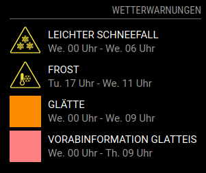
1: Reduce the module width
.MMM-DWD-WarnWeather .wrapper {
  width: 280px;
}
Which will look like
Screenshot 1
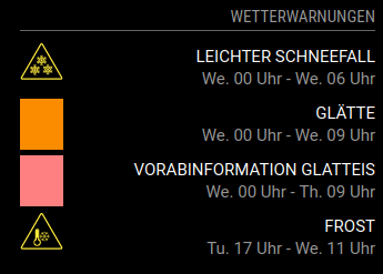
2: Only the description to the right
.MMM-DWD-WarnWeather .description {
  width: 100%;
  text-align: right;
}
Which will look like
Screenshot 2
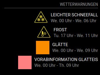
3: Or you can move the warnings totally to the right
.MMM-DWD-WarnWeather .warning {
  justify-content:flex-end;
}
Which looks like
Screenshot 3
-
@wishmaster270 I prefer the third version. I’ve tried a couple of combinations but none of them led to the requested result.
What am I missing?From my understanding I would suggest this CSS code (which doesnt work this way):
.MMM-DWD-WarnWeather .wrapper { display: flex; flex-direction: column; align-items: flex-start; width: 320px; gap: 5px; } .MMM-DWD-WarnWeather .warning { justify-content:flex-end; } .MMM-DWD-WarnWeather .status { margin-top: 0px; } .MMM-DWD-WarnWeather .description { padding-left: 0px; margin-left: 0px; } .MMM-DWD-WarnWeather .small-icon{ float: unset; zoom: unset; -moz-transform: unset; -moz-transform-origin: unset; width: 46px; height: 46px; position: relative; } -
Hi,
sorry for my unprecise description. I meant adding the the
justify-content: flex-end;additionally. The whole CSS settings need to look like the following:.MMM-DWD-WarnWeather .wrapper { display: flex; flex-direction: column; align-items: flex-start; width: 320px; gap: 5px; } .MMM-DWD-WarnWeather .warning { width: 100%; display: flex; flex-direction: row; gap: 10px; margin-bottom: 0px; justify-content: flex-end; } .MMM-DWD-WarnWeather .status { width: 100%; text-align: right; margin-top: 0px; } .MMM-DWD-WarnWeather .description { padding-left: 0px; margin-left: 0px; } .MMM-DWD-WarnWeather .small-icon{ float: unset; zoom: unset; -moz-transform: unset; -moz-transform-origin: unset; width: 46px; height: 46px; position: relative; }
Hello! It looks like you're interested in this conversation, but you don't have an account yet.
Getting fed up of having to scroll through the same posts each visit? When you register for an account, you'll always come back to exactly where you were before, and choose to be notified of new replies (either via email, or push notification). You'll also be able to save bookmarks and upvote posts to show your appreciation to other community members.
With your input, this post could be even better 💗
Register Login