Read the statement by Michael Teeuw here.
JSON request module
-
@ELMAGO
Sorry, my fault.
Can you please remove thevoption of the curl command. It needs to becurl -s .... -
It’s same
//TEMPERATURE MAISON { module: "MMM-CommandToNotification", disabled: false, config: { updateInterval: 10, commands: [ { script: "/usr/bin/curl", args: "-s http://192.168.100.244:3000/TEMPSALLE", timeout: 5, notifications: [ "TEMPSALLE", ], }, ] }, }, // AFFICHAGE { module: "MMM-ValuesByNotification", position: "top_right", header: "TEMPERATURE MAISON", config: { groups: [ { items: [ { notification: "TEMPSALLE", itemTitle: "TEMPSALLE", values: [ { valueTitle: "TEMPSALLE", valueUnit: "C", jsonpath: "data", }, ] }, ] }, ] }, }, -
@ELMAGO
Sorry, took me a moment to set up a test environment…
I think if your webserver is not very very fast you need to increase the timeout value in the command module.
The timeout is in milliseconds and you configured5. I guess it should be5000.
This config works fine in my development environment.{ module: "MMM-CommandToNotification", disabled: false, config: { updateInterval: 60, commands: [ { script: "/usr/bin/curl", args: "-s http://192.168.100.244:3000/TEMPSALLE", timeout: 5000, notifications: [ "TEMPSALLE", ], }, ] }, }, { module: "MMM-ValuesByNotification", position: "top_right", header: "TEMPERATURE MAISON", config: { groups: [ { items: [ { notification: "TEMPSALLE", itemTitle: "TEMPSALLE", values: [ { valueTitle: "TEMPSALLE", valueUnit: "C", jsonpath: "data", }, ] }, ] }, ] }, },Edit: I increased the
updateIntervalto60 -
@wishmaster270
You are phenomenal…but I still have three problems:
1 - When I look for several values, it only shows me the first one.
2- The Celsius symbol does not seem to be accepted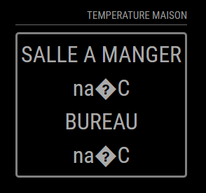
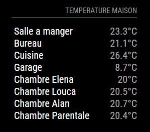
3- 3- If I may abuse…is it possible to do the same formatting as this one. CSS and me…

Here is my code :
//TEMPERATURE MAISON

{
   module: "MMM-CommandToNotification",
   disabled: false,
   config: {
    updateInterval: 60,
    commands: [
     {
      script: "/usr/bin/curl",
      args: "-s  http://192.168.100.244:3000/TEMPSALLE",
      timeout: 5000,
      notifications: [
       "TEMPSALLE",
       ],

     },
     ]
   },
  },

{
   module: "MMM-CommandToNotification",
   disabled: false,
   config: {
    updateInterval: 60,
    commands: [
     {
      script: "/usr/bin/curl",
      args: "-s  http://192.168.100.244:3000/TEMPBUREAU",
      timeout: 5000,
      notifications: [
       "TEMPBUREAU",
       ],

     },
     ]
   },
  },


// AFFICHAGE

{
   module: "MMM-ValuesByNotification",
   position: "top_right",
   header: "TEMPERATURE MAISON",
   config: {
    groups: [
     {
      items: [
       {
        notification: "TEMPSALLE",
        values: [
         {
          valueTitle: "SALLE A MANGER",
		valueUnit: "°C",
		jsonpath: "data",
         },
        ]
       },
	          {
        notification: "TEMPBUREAU",
        values: [
         {
          valueTitle: "BUREAU",
		valueUnit: "°C",
		jsonpath: "data",
         },
        ]
       },
      ]
     },
    ]
   },
  },
Once again thank you for everything.
-
@ELMAGO Step by Step closer to the goal😉
1: You can/need to use one instance of the command module to fetch the data of the to urls.
2: I use the Celsius sign in my setup without any problems but it may depend of the encoding of your operating system and Browser. You can try to use the html encoding°instead.//TEMPERATURE MAISON { module: "MMM-CommandToNotification", disabled: false, config: { updateInterval: 60, commands: [ { script: "/usr/bin/curl", args: "-s http://192.168.100.244:3000/TEMPSALLE", timeout: 5000, notifications: [ "TEMPSALLE", ], }, { script: "/usr/bin/curl", args: "-s http://192.168.100.244:3000/TEMPBUREAU", timeout: 5000, notifications: [ "TEMPBUREAU", ], }, ] }, }, // AFFICHAGE { module: "MMM-ValuesByNotification", position: "top_right", header: "TEMPERATURE MAISON", config: { groups: [ { items: [ { notification: "TEMPSALLE", values: [ { valueTitle: "SALLE A MANGER", valueUnit: "°C", jsonpath: "data", }, ] }, { notification: "TEMPBUREAU", values: [ { valueTitle: "BUREAU", valueUnit: "°C", jsonpath: "data", }, ] }, ] }, ] }, },3: I provided a lot examples with screenshots in the modules
docdirectory (screenshots). You will find the corresponding config and css of each screenshot in the configs. Maybe there is a styling included you like. If not feel free to ask again. -
This post is deleted! -
@wishmaster270 said in JSON request module:
valueTitle
I’m really sorry but I’m really bad at this.
I did this:
config://TEMPERATURE MAISON { module: "MMM-CommandToNotification", disabled: false, config: { updateInterval: 60, commands: [ { script: "/usr/bin/curl", args: "-s http://192.168.100.244:3000/TEMPSALLE", timeout: 5000, notifications: [ "TEMPSALLE", ], }, { script: "/usr/bin/curl", args: "-s http://192.168.100.244:3000/TEMPBUREAU", timeout: 5000, notifications: [ "TEMPBUREAU", ], }, ] }, }, // AFFICHAGE { module: "MMM-ValuesByNotification", position: "top_left", header: "TEMPERATURE MAISON", config: { updateInterval: 10, reuseCount: 100, addClassesRecursive: true, groups: [ { items: [ { notification: "TEMPSALLE", itemTitle: "Salle: ", classes: "withIcons", values: [ { valueIcon: "fa fa-thermometer-full", valueUnit: "°C", valueFormat: "Number(${value}).toFixed(2)", jsonpath: "data", }, { valueUnit: "%rH", valueFormat: "Number(${value}).toFixed(1)", jsonpath: "humidity", }, ] }, { notification: "TEMPBUREAU", itemTitle: "Bureau ", values: [ { valueUnit: "°CC", valueFormat: "Number(${value}).toFixed(2)", jsonpath: "data", }, { valueUnit: "%rH", valueFormat: "Number(${value}).toFixed(1)", jsonpath: "humidity", }, ] }, ] }, ] }, },And use css :
.MMM-ValuesByNotification .vbn .itemWrapper {
  flex-direction: row;
}

.MMM-ValuesByNotification .vbn .itemTitle {
  min-width: 105px;
  text-decoration: none;
}

.MMM-ValuesByNotification .vbn .itemTitle.withIcons {
  margin-top: 17px;
}

.MMM-ValuesByNotification .vbn .itemWrapper.withIcons {
  line-height: 22px;
}

.MMM-ValuesByNotification .vbn .itemWrapper:not(.withIcons) {
  line-height: 10px;
}
and nothing is displayed
-
@ELMAGO
Great to see the data beeing displayed. We get the styling, too.
Please do not edit files in the module folder. You can modify/override all css in the custom.css file in the css directory of MagicMirror.
The examples only overrides the things needed.
Currently I only have my mobile and can not test any things. Maybe I can look at it tomorrow. -
@wishmaster270
The custom file?there is no problem, you help me already it is a lot.
There is nothing urgent, I just have this display to do on a whole home automation installation.
I await your return and thank you again.
-
@ELMAGO the CSS design is a stack, top down
css/custom.css
module_provided_css (in the module folder)
css/main.css (provided by MM).so a search for a css setting starts with custom.css and stops at the 1st occurrence.
-
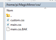
I correct myself, it is displayed but thus, having created the custom.css file in css:

Here is my config file:
// AFFICHAGE { module: "MMM-ValuesByNotification", position: "top_right", header: "TEMPERATURE MAISON", config: { updateInterval: 10, reuseCount: 100, addClassesRecursive: true, groups: [ { items: [ { notification: "TEMPSALLE", itemTitle: "Salle ", classes: "withIcons", values: [ { valueUnit: " °C", valueFormat: "Number(${value}).toFixed(2)", jsonpath: "data", }, ] }, { notification: "TEMPBUREAU", itemTitle: "Bureau ", values: [ { valueUnit: " °C", valueFormat: "Number(${value}).toFixed(2)", jsonpath: "data", }, ] }, ] }, ] }, }, -
@ELMAGO
Today, with my notebook ready things are getting easier.
I styled the module like the example you provided…

Let’s look at the steps to do this now:
First we tell the
itemWrapper? to display the items in rows and not columns and set the line height to the regular value1.0` to avoid a great space in between:.MMM-ValuesByNotification .vbn .itemWrapper { flex-direction: row; line-height: 1.0; }Next we tell the
itemsWrapperto set a small space of5pxbetween the rows:.MMM-ValuesByNotification .vbn .itemsWrapper:first-child, .MMM-ValuesByNotification .vbn .itemsWrapper { gap: 5px; }We then remove some margins of the title if items, remove the underlining and set the min-with to
60pxto get a straight lining of the values:.MMM-ValuesByNotification .vbn .itemTitle { margin-top: 0px; margin-bottom: 0px; min-width: 60px; text-decoration: unset; color: white; }If you do not like the gray border around the items you can remove it with:
.MMM-ValuesByNotification .vbn .groupWrapper { border-style: none; }If you copy all these contents to the
MagicMirror/css/custom.cssfile and restore the originalvaluesByNotification.cssyou should the style of above. -
@wishmaster270
good evening
thank you for your return, for the config file I put back yours or mine is good? I would test this tomorrow morning, tonight it’s rugby.
good evening and thank you again -
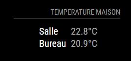
Good evening,
I couldn’t wait…it’s almost great, I just have to find how to align the text on the left and the temperatures on the right.
Thank you very much for your help
-
@ELMAGO
Do you mean something like this…
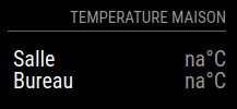
We first define a width for the most outer wrapper. I choose 200px but can adjust it to the value you want:
.MMM-ValuesByNotification .vbn .groupsWrapper{ width: 200px; }Then we configure the next two deeper wrappers to expand to the maximum width:
.MMM-ValuesByNotification .vbn .groupWrapper, .MMM-ValuesByNotification .vbn .itemsWrapper { width: 100%; }And we tell the itemWrapper to expand to maximum width and justify its content by putting space around the items equally:
.MMM-ValuesByNotification .vbn .itemWrapper { flex-direction: row; line-height: 1.0; width: 100%; justify-content: space-between; }The rest stays the same as before:
.MMM-ValuesByNotification .vbn .itemTitle { margin-top: 0px; margin-bottom: 0px; min-width: 60px; text-decoration: unset; color: white; } .MMM-ValuesByNotification .vbn .groupWrapper { border-style: none; } -
-
Hello
sorry to bother you again but is it possible to display an answer following the answer of the request.
example :
The JSON request returns false I would like to display “NON” -
@ELMAGO Sorry, but i do not understand exactly what you mean. You can override the “na” value which is the one displayed if no value could be parsed in the JSON.
The config option is:
naValue: "NON"There might also be a chance to do add a
valueFormatwhich checks for the “false” value in the JSON but that would be a little more complex and i need to know the exact format of the output. -
@wishmaster270
HelloNo, not al all.
the returned value will be “false” or “true” and I would like to replace it with “Non” or “Oui” in French. -
@ELMAGO
You can usevalueFormatfor this purpose.valueFormat: "\"${value}\".replace(\"false\",\"Non\").replace(\"true\",\"Oui\")",This will convert the value to a string (if needed) and replaces all “false” with “Non” and “true” with “Oui”.
Hello! It looks like you're interested in this conversation, but you don't have an account yet.
Getting fed up of having to scroll through the same posts each visit? When you register for an account, you'll always come back to exactly where you were before, and choose to be notified of new replies (either via email, or push notification). You'll also be able to save bookmarks and upvote posts to show your appreciation to other community members.
With your input, this post could be even better 💗
Register Login