Read the statement by Michael Teeuw here.
multiple modules in a region
-
@sdetweil said in multiple modules in a region:
@MMRIZE said in multiple modules in a region:
Only for those modules on the screen, the CSS is severely overridden. So when you add additional modules, you should carefully handle them.
just be careful , as he whacked the css pretty hard here to make this work, and other modules may no longer fit properly…
MM is after all, just a web page…
understood. as of now i only have the mmm_wallpaper and mmm_calenderext3 added in. i have half of the default modules turned off and only the clock+2 weathers still on atm. even if i do add something, it will be something like the default modules. something light and simple over the top of the photos
-
@sdetweil that’s half the fun of MM - whacking the CSS until you get what you want. :)
-
I was able to pop that code in easy enough and its all working well. this is all still running on my Mac to my monitor via electron so ill wait until I get it into my actual pi and wall display before going crazy with the finishing touches. (spacing, colors, boarders, edges, etc). hoping ill be able to get that part up and running this weekend.
one thing I was playing around with now trying to tweak but not having any luck is the fade of the calendar pictures to the right side of them. I tried the fadeedges config option for the calendar in the main config file but it was breaking it. would it be a module/config thing? or a css thing?
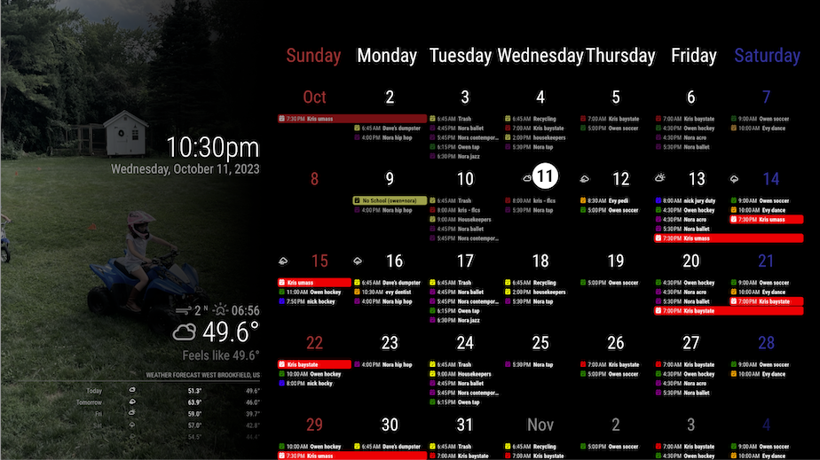
here’s what it looks like at the moment

-
@roth_nj
That is not faded. It only assigns a pale blue colour to Saturday on cellHeader in CSS.
You can find.weekday_6things inMMM-CalendarExt3.cssthen override it in yourcustom.css..CX3 .weekday_6 { color: #339; }And long-full-day name looks somewhat ugly, So you’d better consider
headerWeekDayOptions: "short",or “narrow”. -
@MMRIZE
a little misunderstanding here. i am talking about this zone at the wallpaper background to the calendar.i already changed the sunday red and saturday blue to both be white at this point
-
-
@roth_nj
See “.region.top.bar”. I put a gradient layer there. -
bingo… awesome thanks again. I was looking for anything with fade. gradient makes sense — I’m not a programmer in any sense. after changing that, I spread the wallpaper out to 40% but left the calendar overlapping a little bit still at 66%
its getting real close now. but like I said I’m not going to mess with too much more until I get it up on my pi+monitor
thanks again for the help

-
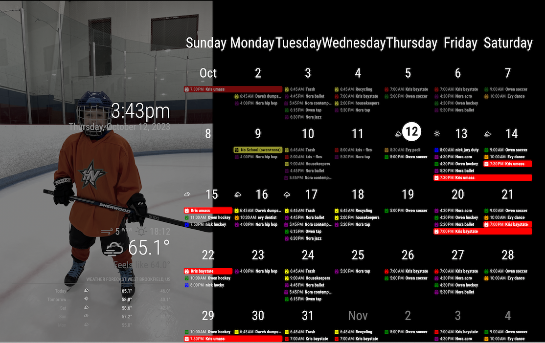
@roth_nj Been playing around, and here’s what I came up with.

-
@MMRIZE it got my pi programmed and the mirror up and running on the screen. i have started doing some minor graphical tweaks like font/color/size etc and changed the 33% wallpaper size to 40%… all that stuff is pretty clear to me on what/where to edit and theres a ton of into on the forum/github
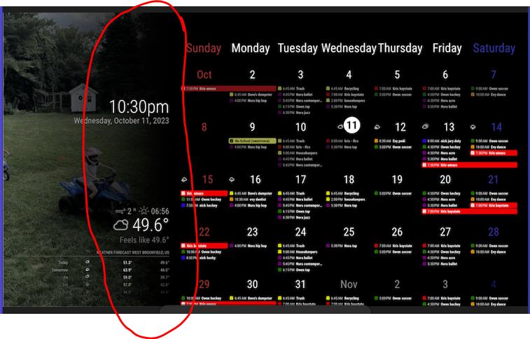
i have a couple follow up questions for you now: i want to adjust the position of the calendar top and clock. you can see in this picture that they are off set from the “top” of the screen. i want to get them to the edge. thanks again

