Read the statement by Michael Teeuw here.
My custom mirror
-
Raspberry Pi 4 connected to a 40" tv, mounted on a wall, vertically.
I built a box around the tv and used paint stirrers for the front of the frameModules:
MMM-anotherNewsFeed (default newsfeed with image of article)
MMM-Breathwork (a reminder to inhale and exhale)
MMM-CalendarExt3Agenda (mini month view and agenda)
MMM-Chuck-Norris (silly Chuck Norris ‘jokes’)
MMM-Chess-Daily (visibly hidden until you play a game)
MMM-Dad-Jokes
MMM-GooglePhotos (slideshow of google photos folder)
MMM-iHaveBeenThere (the places that my wife &. I have visited
MMM-OnSpotify (displays the currently playing song)
MMM-OnThisDayWikiApi (things that happened on today’s date)
MMM-Snake (play vintage snake game in full screen)
MMM-text-clock (the current time written in words)
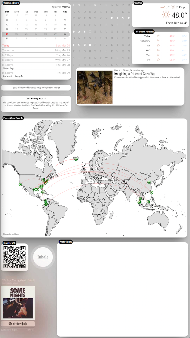
Here’s what gives each module its own “floating” background.
(you have to modify the positions & regions in custom.css)/* css/custom.css */
html { cursor: default; overflow: hidden; background: #c4c4c4; } body { margin: 10px; position: absolute; width: calc(100% - 20px); height: calc(100% - 20px); margin-bottom: -10px; font-size: 1rem; font-weight: 300; line-height: 1.5; color: black; background: transparent; } header { background: transparent; padding: 0.5rem; text-align: center; border-bottom: 0.7px solid rgba(0, 0, 0, 0.1); color: black; font-size: 20px; } .dimmed { color: black; } .normal { color: black; } .bright { color: black; } /** * module.color_border_shadow */ .module.clock, .module.calendar, .module.newsfeed, .module.weatherforecast, .module.currentweather, .module.compliments { padding:8px; border-radius: 10px; box-shadow: 0 15px 20px -15px rgba(0, 0, 0, 0.3), 0 55px 50px -35px rgba(0, 0, 0, 0.3), 0 85px 60px -25px rgba(0, 0, 0, 0.1); background: white; } .clock .time { font-size: 80px; text-align: center; margin-top: 25px; color: black; padding: 15px; } .clock .date { background: transparent; padding: 5px; text-align: center; border-bottom: 0.7px solid rgba(0, 0, 0, 0.1); color: black; font-size: 20px; } /** * module.width_height */ .module.calendar { width:450px; height: 320px; } .module.weatherforecast { width:400px; height: 220px; } .module.currentweather { height: 180px; width:400px; text-align: center; } -
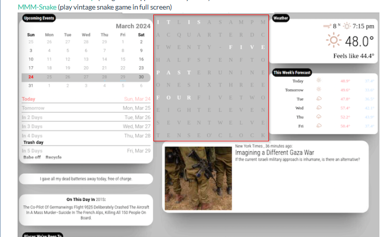
@greedyvegan very cool! Which module are you using for the word clock?
-
@greedyvegan
It will look better to arrange newsfeed module more harmonized.
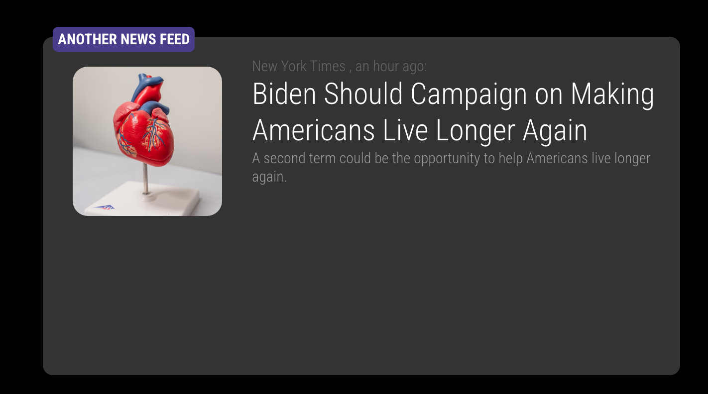
/* css/custom.css */ /* This is just and example. Adjust to your color and dimensions */ .MMM-anotherNewsFeed .newsfeed-image { min-width: 150px; min-height: 150px; max-width: 150px; max-height: 150px; margin: 10px 20px 10px 10px; border-radius: 15px; background-repeat: no-repeat; background-position: center center; background-size: cover; } .region .module.MMM-anotherNewsFeed { width: 600px; height: 300px; border-radius: 15px; margin-top: 0; background-color: #333; } -
@MMRIZE nice, I like that; thank you
-
-
@MMRIZE
how do I get the news article image to have a permanent position, whether it appears/loads or not?? just like in your image.is that float or margin?
|(image) (text text text text) |
-
@greedyvegan
newsfeed item could have a container with selectorwithImageor not.<div class="container {% if config.showImage and image %} withImage {% endif %}"> {% if config.showImage and image %} <div class="newsfeed-image" style="background-image: url({{image}})"></div> {% endif %}So you can specify your style for each case, withImage or not.
.MMM-anotherNewsFeed .module-content .container {
  text-align: right;
  ...
}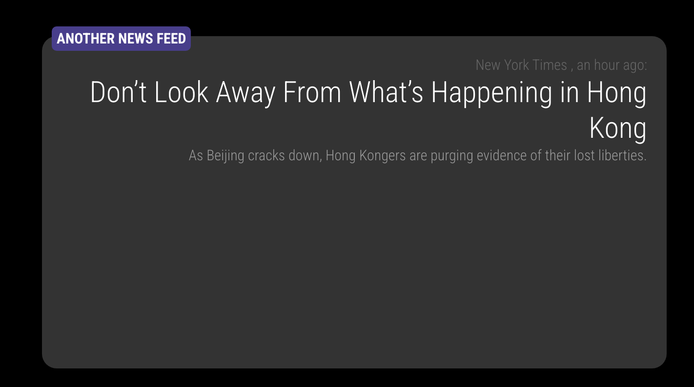
.MMM-anotherNewsFeed .module-content .container.withImage {
  text-align: left;
  ...
}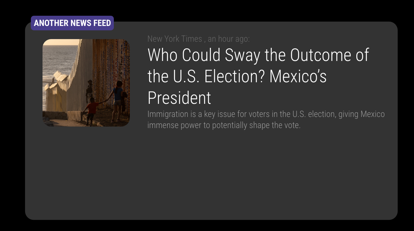
Image and contents are arranged by container’s
display:flexso you can reorder or justify with flex-related attributes. -
@greedyvegan Thanks!
-
@MMRIZE
thank you very much, what’s the hierarchy levels as far as region, container, module in css? -
@greedyvegan use the developers window elements view to see it
-
-
@greedyvegan absolutely does.
unless overridden, they are element ordered, outer to inner. some styles can be inherited from parent, never from grandparent
the text above the console box shows the stack for the selected element.
the right window shows the exact inheritance and override, and sources for styles
the most specific style setting wins unless overridden ( !important)
-
@sdetweil ok, thanks. I need to look up web developers for dummies now.
-
 B bugsounet referenced this topic on
-
I like the colours of the agenda and weather module. Can you tell me how you changed the colours? Thank you
-
sorry for the delay , I’ve updated the post with the custom css
-
thank you
Hello! It looks like you're interested in this conversation, but you don't have an account yet.
Getting fed up of having to scroll through the same posts each visit? When you register for an account, you'll always come back to exactly where you were before, and choose to be notified of new replies (either via email, or push notification). You'll also be able to save bookmarks and upvote posts to show your appreciation to other community members.
With your input, this post could be even better 💗
Register Login