Read the statement by Michael Teeuw here.
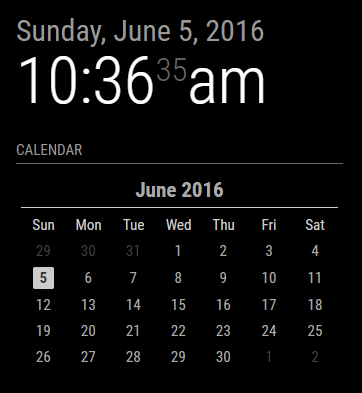
Monthly Calendar View
-
A bit late to the party thanks to a delightful holiday, but I must say: nice work on the calendar.
One small suggestion: change the green color to an inverted black and white digit. I prefer the MM to be fully B&W. -
@MichMich, it is, by default, B/W. Users can set a custom CSS to change the colors, like I did as a test.
-
@KirAsh4 Nice work!
-
I can spend days coming up with style ideas, but I think I’m done fiddling with this. It’s time to move on to the next step in the process. I’m cleaning up the branches on GitHub and getting ready to open the flood gates. In the mean time, here’s the 4 styles that I’m including. Note that the ‘slate’ style is really meant for people who have a mirror-less display as the colors probably won’t show very well through a 2-way mirror.
- The calendar is language aware, meaning it will translate to your language setting.
- The calendar will automatically start on either Monday or Sunday depending on your language setting.
- The header (month and year) can be suppressed (not shown) if desired.
- Customization can be done through the custom CSS file
- Current day is highlighted through CSS styling.
- Probably more stuff I forget at the moment … I’ll have it all written out in the README file, including the full styling tree.

-
Could you try a version where the active day is black text on a white background? So a little white square with a black number in it? Preferably with rounded corners. (Radius 1 or 2).
-
Oh I suppose …

Keep in mind that the styling can be changed by the user to whatever they want it to look like. The sky isn’t the limit … it’s their imagination. :)
-
@KirAsh4 I understand. But I think this is the best default style … 😈
-
It won’t be the “default” style, but the config will set it as'default'. The reason is because the actual'styleDefault.css'file needs to be clean and not have anything in it other than setting the proper margin, padding, and table/cell views for the calendar and it gets included always. Custom CSS files are pulled in on top of that. That way, the user doesn’t need to set any of that themselves, but rather just over ride what they want with their own styles. So I can have a'styleMichMich'[*] that I can set as the default style to have today highlighted in a white box.[*] actual name to be determined still …Never mind, went a slightly different route …
-
@KirAsh4 Don’t you just love it when you type loads of useless text online … LOL.
-
I left it all for posterity. :)
-
Ok all, for all intents and purposes, the current state of the monthly view calendar is done. While I do plan on incorporating more features in it, there’s really nothing that is preventing me from releasing it … except maybe a proper name for the module. And the reason I say that is because of the future plans I have. I could easily call it ‘monthlycalendar’, however when I roll in the weekly view as well, that makes the name not accurate anymore. So yeah … bit of a conundrum. Either I will split out the weekly one into a separate module all together, or I will end up naming this ‘that-calendar-thats-not-the-default-but-has-other-features-in-it’ … you get what I’m saying here.
Time to ponder some things I guess …
-
name it “AliceInCalendarLand.module”
I have solved the problem.
-
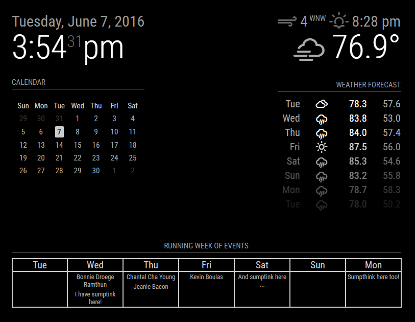
Spent the day wrangling code. Apparently I have a lot of ‘sumptinks’ coming up! :)
This is just raw data processing. Stuff comes in, gets processed, and placed in the array which I then fetch. There’s no formatting in the code yet. Just don’t ask.
-
I really like that running week of events!!
Much better than the current calendar list
Great work!
-
Thanks. It’s still in it’s very early stages. A lot can and will change still.
-
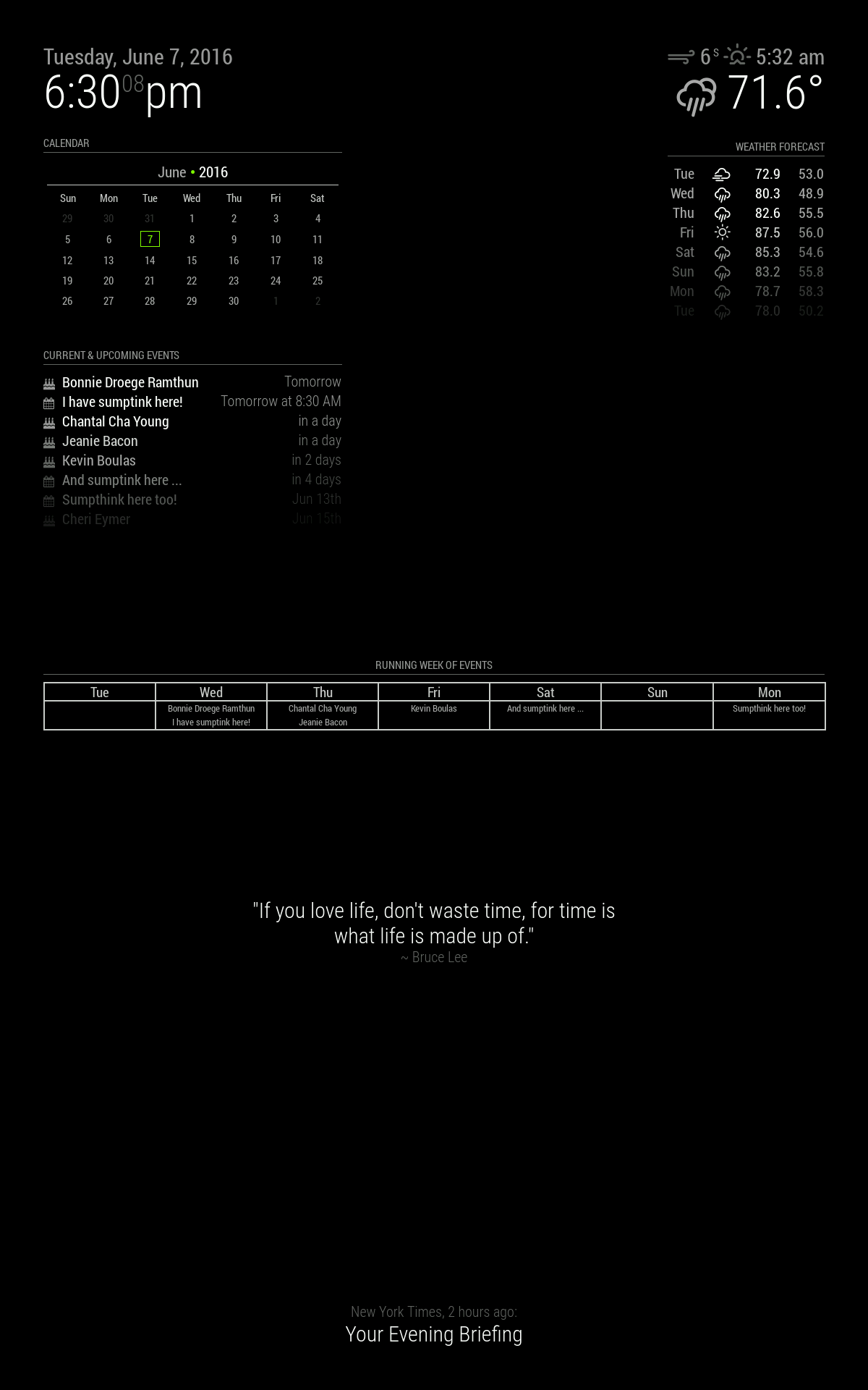
And now that I’m home, on the vertical layout, I left the other calendarS turned on:

-
Is this using the currrent caladers?
is it possible to add the starting/end time and the icon selected? when I add my and my girlfriend her calender both will show the same text “work” so it’s really difficult to see who is who.
-
There are three different calendars on that screen, the default one which is the list of events, the monthly calendar, and the running week. Both the monthly calendar and running week are unreleased code because they’re both still being developed.
-
Please read about the release here: https://forum.magicmirror.builders/topic/238/monthly-calendar
-
This post is deleted!
Hello! It looks like you're interested in this conversation, but you don't have an account yet.
Getting fed up of having to scroll through the same posts each visit? When you register for an account, you'll always come back to exactly where you were before, and choose to be notified of new replies (either via email, or push notification). You'll also be able to save bookmarks and upvote posts to show your appreciation to other community members.
With your input, this post could be even better 💗
Register Login